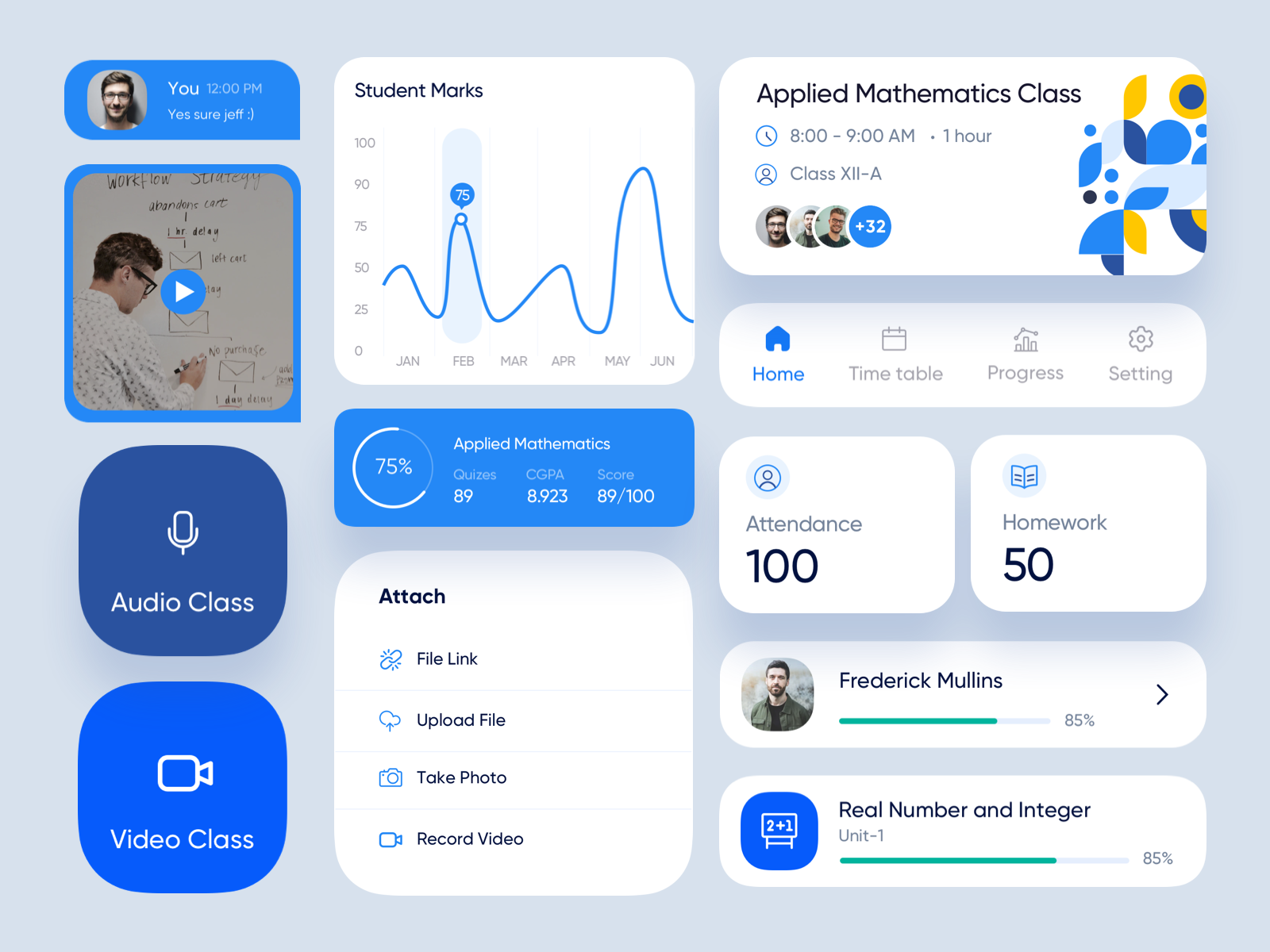
Before starting a design system project, it’s important to gather inspiration from other design systems and design resources. This can help you understand what works well and inform the development of your own design system. Some places to find inspiration include Pinterest, Dribbble, and open source design systems like Material Design and Polaris.
Looking for the best way to start your design system? Begin with our Ultimate Guide to Design Systems to understand the fundamentals before gathering your inspiration.
Examples of popular design systems
Here are a few examples of design systems:
Material Design: Material Design is a design system developed by Google that provides guidelines for the design of digital products and services. It includes a set of design principles, a style guide, and a library of reusable components and patterns.
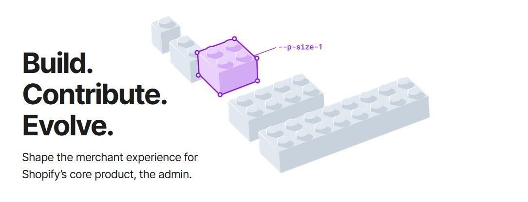
Polaris: Polaris is a design system developed by Shopify that provides a consistent visual language and set of design standards for the company’s products and services. It includes guidelines for typography, color, layout, and other design elements.

Lightning Design System: The Lightning Design System is a design system developed by Salesforce that provides a common design language and set of design standards for the company’s products and services. It includes a style guide, a set of design principles, and a library of reusable components and patterns.
https://www.lightningdesignsystem.com/
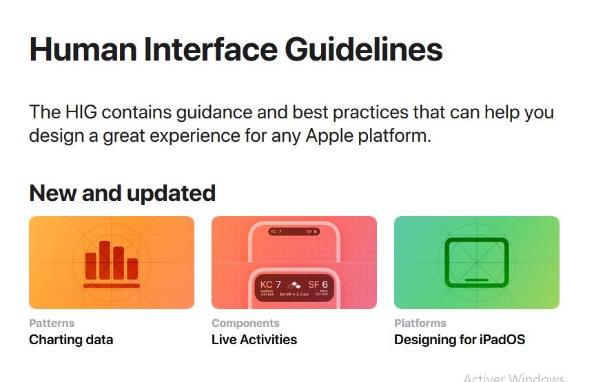
Apple Human Interface Guidelines: The Apple Human Interface Guidelines is a design system that provides guidelines for the design of iOS, iPadOS, macOS, watchOS, and tvOS products. It includes guidelines for user interface design, interaction design, and visual design.
https://developer.apple.com/design/human-interface-guidelines/guidelines/overview/

IBM Design Language: The IBM Design Language is a design system that provides a set of design standards and guidelines for the company’s products and services. It includes a style guide, a set of design principles, and a library of reusable components and patterns.
https://www.ibm.com/design/language/
How to organize your inspiration
To organize your inspiration, you can create a Figma file with different pages for each design element, such as a mood board, buttons, selection controls, forms, and more. On each page, collect screens and references that you can use to create a complete design system. For example, on the mood board page you might collect different style guides and design system components to help you structure and organize your design system file, and choose the design style, typography, and color styles. You can also create pages for buttons, selection controls, text fields and forms, navigation, and cards.
My process collecting inspiration for a design system
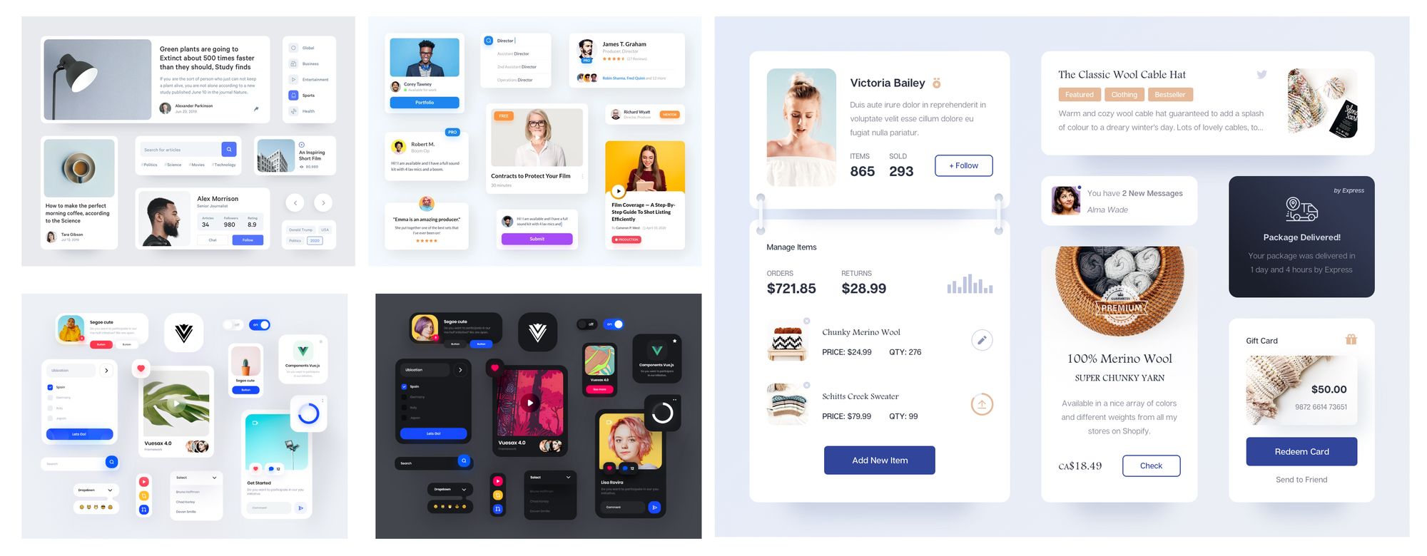
To begin the process of designing my design system, I gathered inspiration from various websites such as Pinterest and Dribbble. I used Figma to create a file with multiple pages, including a Mood board, buttons, selection controls, and Forms. Each page was dedicated to a specific aspect of the design system, and I collected all the necessary screens and references to complete the design system. For instance, the Mood board page helped me structure and organize my components in the design system file, as well as choose the design style, typography, and color styles for the design system.
Buttons page: The buttons page of my design system file includes a collection of various button styles.
Selection controls page: The selection controls page includes radio buttons, checkboxes, and switch controls in multiple states and styles.
Text fields & Forms: The text fields & forms page includes all the necessary form elements and components, with multiple states and variants.
Navigation: The navigation page includes different types of navigation for both web and mobile applications, in various styles and screen sizes.
Cards: Finally, the cards page includes a collection of different types of cards, such as content cards and pricing cards.
This file is always a work in progress and it is my first go to place for all the process of the creation the design system. Every piece of inspiration will go there.
Here’s a link where you can download the file for free with all the inspiration resources
Download here : https://captaindesign.gumroad.com/l/sypxn
Master UI Design System – Streamline Your Design Process
Are you tired of constantly reinventing the wheel with every new project, struggling to maintain consistency in your designs? The Master UI design system may be the solution you’ve been seeking.
Download here : https://captaindesign.gumroad.com/l/vtbiq
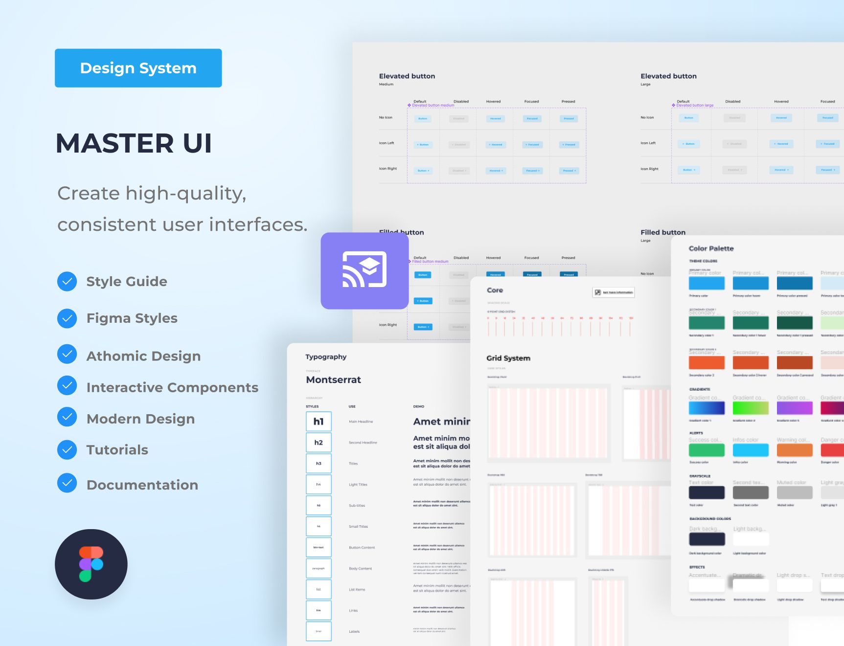
The Master UI design system is a powerful tool that helps you create high-quality, consistent user interfaces. With Master UI, you have everything you need to streamline your design process and create stunning interfaces that delight your users.
Here’s what you can expect from Master UI:
- A comprehensive style guide
- Interactive Figma components
- A wide range of components
- Intuitive navigation
- Step-by-step tutorials:
- Comprehensive documentation
With Master UI, you have everything you need to create beautiful, functional interfaces.
Download here : https://captaindesign.gumroad.com/l/vtbiq
If you have any additional resources or links that you think would be helpful to include in this post, please feel free to share them in the comments below. Your contribution would be greatly appreciated.
Now that you’ve gathered your inspiration, head back to our Ultimate Guide to Design Systems for more tips on building and organizing your system.
