Creating a style guide is an important step in the process of building a design system. A style guide defines the look and feel of your design system and helps to ensure that all design elements are consistent and cohesive. Here are some steps you can follow to create a style guide for your design system.
- Determine your design principles: Identify the design principles that will guide your style guide. These should be based on your brand values and the needs of your users.
- Define your typography: Choose a typography system that is legible, readable, and consistent across different devices and screen sizes.
- Define your color palette: Choose a color palette that reflects your brand identity and is appropriate for your target audience.
- Define your layout and grid system: Establish a layout and grid system that allows for flexibility and consistency in your design.
- Create guidelines for using your design system: Create guidelines for how to use your design system, including best practices for creating new design elements and incorporating existing ones.
By following these steps, you can create a comprehensive and effective style guide for your design system. It’s important to keep your style guide up to date and maintain it as your design system evolves.
Creating a style guide is a key step in building your design system. To get started on the right foot, explore our Ultimate Guide to Design Systems for insights into organizing and developing your system.
A Practical Example of a Style Guide
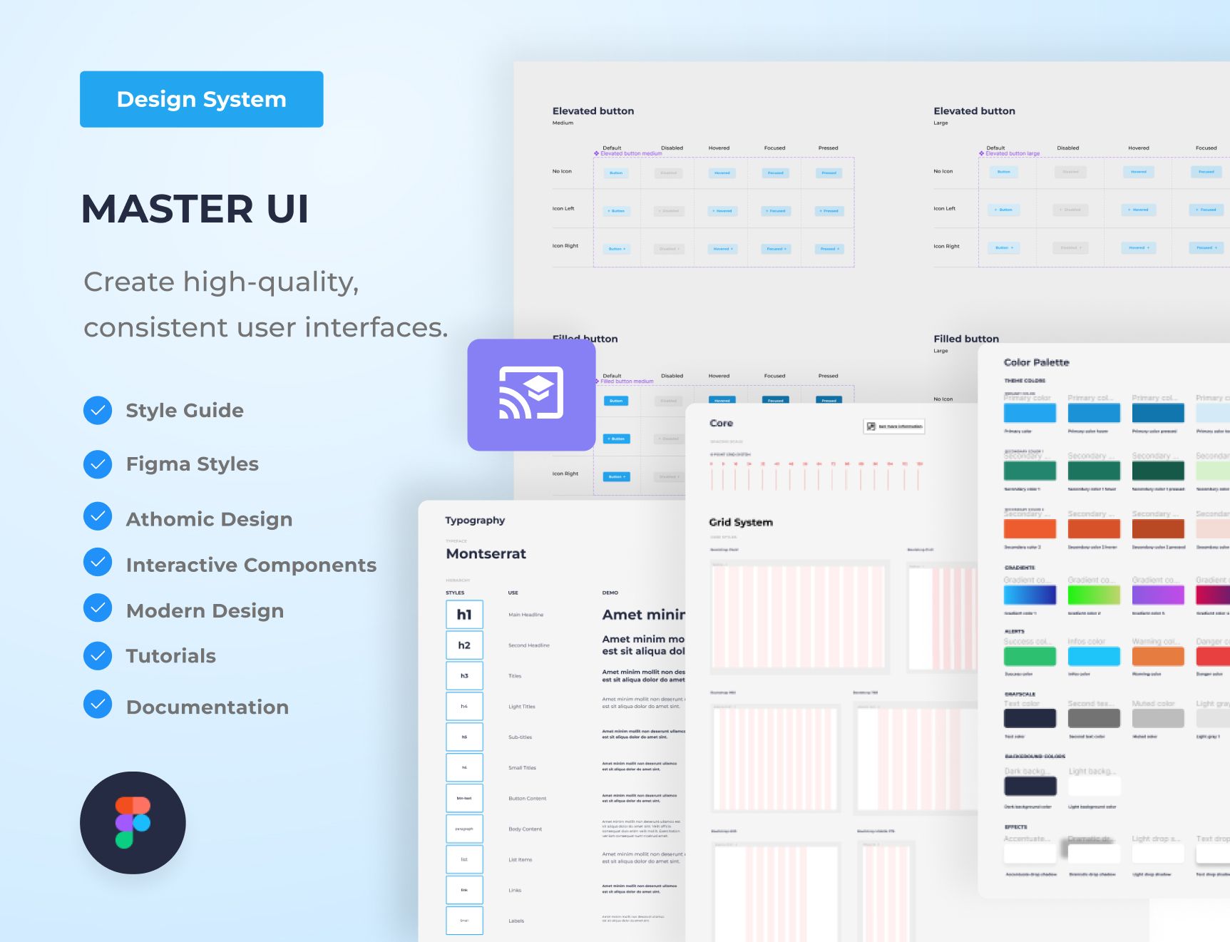
I want to share with you the process of designing the style guide for the Master UI design system that I created. On the style guide page for Master UI, you’ll find three main sections: Typography, Color Palette, and Spacing.
Download Master Ui Here: https://captaindesign.gumroad.com/l/vtbiq
1. Typography
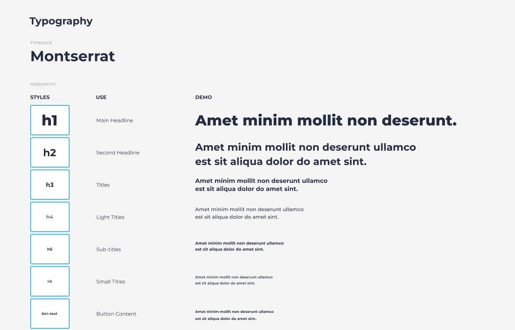
The typeface and text hierarchy are organized in the Typography section.
Typeface: Montserrat
Text Hierarchy: We have defined an eleven-level hierarchy for text size.
1. h1:
- Use: h1 can be used for main headlines and large titles.
- Weight: ExtraBold
- Size: 58
- Line height: 80
- Line spacing: 0.2
2. h2:
- Use: h2 is for second-level headlines.
- Weight: Bold
- Size: 40
- Line height: 32
- Line spacing: 0.2
3. h3:
- Use: h3 is for titles.
- Weight: Bold
- Size: 24
- Line height: 32
- Line spacing: 0.1
4. h4:
- Use: h4 is for light titles.
- Weight: Medium
- Size: 20
- Line height: 30
- Line spacing: 0.2
5. h5:
- Use: h5 is for sub-titles.
- Weight: Bold
- Size: 16
- Line height: 24
- Line spacing: 0.1
6. h6:
- Use: h6 is for small titles.
- Weight: Bold
- Size: 14
- Line height: 24
- Line spacing: 0.2
7. btn-text:
- Use: btn-text is for button content.
- Weight: Bold
- Size: 14
- Line height: 28
- Line spacing: 0.2
8. paragraph:
- Use: paragraph is for body content.
- Weight: Medium
- Size: 14
- Line height: 20
- Line spacing: 0.2
9. list:
- Use: list is for list items.
- Weight: Regular
- Size: 20
- Line height: 30
- Line spacing: 0.2
10. link:
- Use: link is for link text.
- Weight: SemiBold
- Size: 14
- Line height: 24
Each level of the text hierarchy is converted into a Figma text style and added to the library of components. Any text style can be used or modified in the file, and the changes will be automatically applied throughout the entire design system.
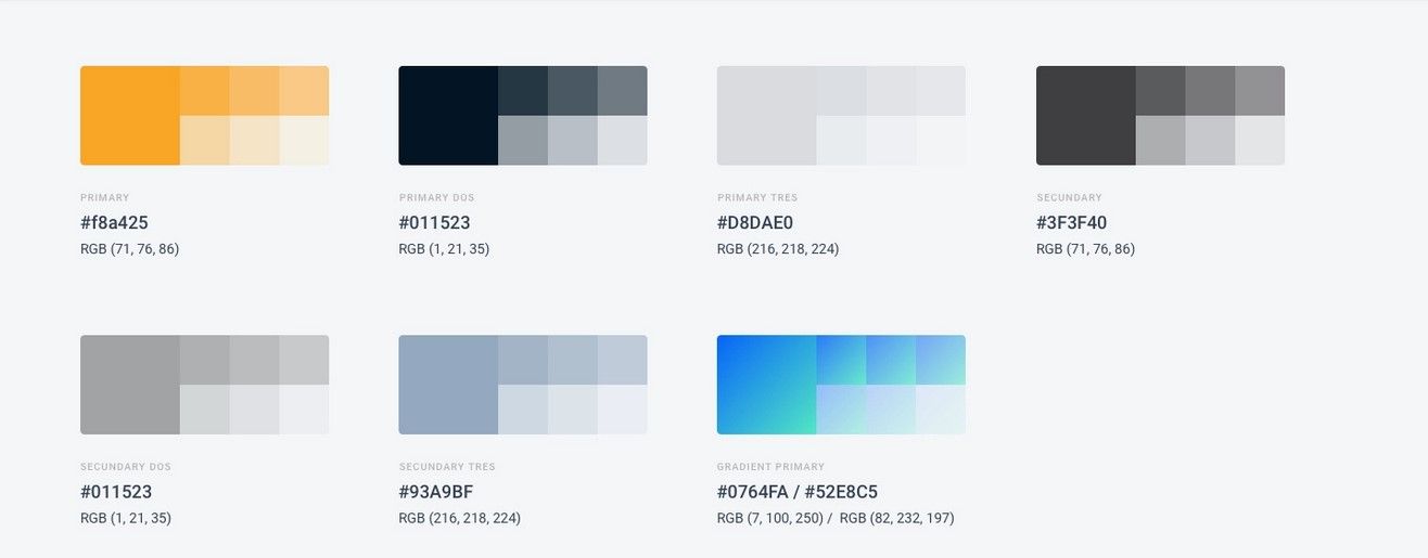
2 – Color Palette
This is the color palette for the design system, including primary, secondary, gradient, alert, greyscale, and background colors.
Primary Color
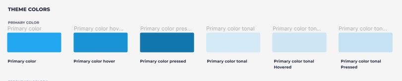
The primary color is a bright blue, with five additional shades to represent different states and variants of components.
Secondary Colors
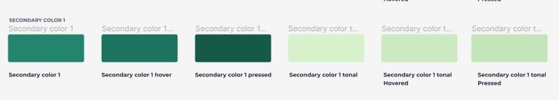
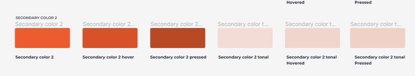
There are two secondary colors: a military green with five shades, and a bright orange with five shades.
Gradients
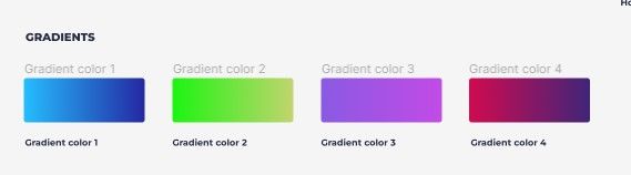
There are four gradient options: blue, green, purple, and red.
Alert Colors
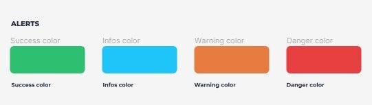
There are four alert colors for success, info, warning, and danger messages and notification bars.
Grayscale
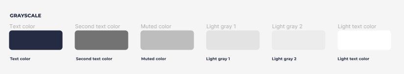
There are six shades of gray for use in text layers, ranging from dark to light.
Background Colors
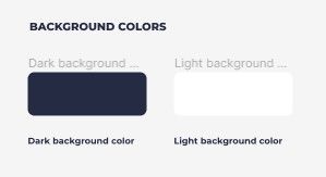
There are light and dark background color options.
Each color has been converted into a Figma color style and added to the library of components. Any color style can be used or modified in the file, and these changes will be automatically applied throughout the design system.
3 – Effects
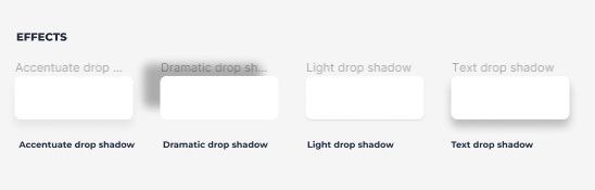
The style guide includes four types of drop shadow: text, light, accentuate, and dramatic. These effects can be found in the effect styles section.
4 – Grid System
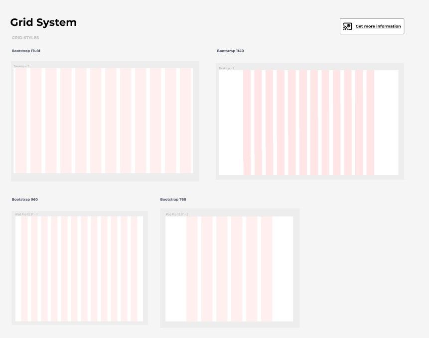
The grid system used in the design system is based on the Bootstrap grid system, which includes six different grid styles:
- Bootstrap-fluid
- Bootstrap desktop (1140px)
- Bootstrap large tablet (960px)
- Bootstrap medium tablet (768px)
- Bootstrap small tablet (600px)
- Bootstrap mobile (375px)
5 – Spacing scale
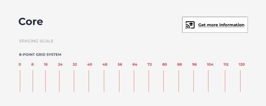
In the Master UI design system, I use the 8-point grid system to define the sizes and spacing of our buttons.
This system is based on the principle of increasing the space between elements by 8 pixels at a time, which allows for a consistent and visually appealing layout. In this system, elements are spaced at multiples of 8 pixels, such as 8, 16, 24, 32, etc.
This can be applied to the size and padding of buttons, as well as other elements in the design. For example, the padding for a small button might be 16 pixels, for a medium button it might be 24 pixels, and for a large button it might be 32 pixels. This allows for a consistent and harmonious layout, as all elements are spaced in relation to each other using the same increments.
That’s all for the style guide. If you found it helpful and want to use it as a reference for your own design system, you can download the Master UI Figma file that includes the style guide and all associated Figma styles. This way, you won’t have to start from scratch in creating your own style guide.
Download here : https://captaindesign.gumroad.com/l/vtbiq
Now that you’ve learned how to create a style guide, return to our Ultimate Guide to Design Systems for further resources on building and optimizing your design system.
Master UI Design System – Streamline Your Design Process
Are you tired of constantly reinventing the wheel with every new project, struggling to maintain consistency in your designs? The Master UI design system may be the solution you’ve been seeking.
Download here : https://captaindesign.gumroad.com/l/vtbiq
The Master UI design system is a powerful tool that helps you create high-quality, consistent user interfaces. With Master UI, you have everything you need to streamline your design process and create stunning interfaces that delight your users.
Here’s what you can expect from Master UI:
- A comprehensive style guide
- Interactive Figma components
- A wide range of components
- Intuitive navigation
- Step-by-step tutorials:
- Comprehensive documentation
With Master UI, you have everything you need to create beautiful, functional interfaces.
Download here : https://captaindesign.gumroad.com/l/vtbiq
If you have any additional resources or links that you think would be helpful to include in this post, please feel free to share them in the comments below. Your contribution would be greatly appreciated.