Designing buttons is an important part of creating a cohesive and user-friendly design system. Buttons serve as the main way for users to interact with and navigate through your interface. Therefore, it’s important to put thought and care into the design and organization of your buttons. In this guide, we will cover how to design and organize buttons for your design system, including tips on choosing the right types and sizes, as well as how to create and organize variants and states. By following these best practices, you can create buttons that are intuitive and effective for your users.
Buttons are essential components of any design system. For a complete guide on how to create, organize, and maintain your design system, check out our Ultimate Guide to Design Systems.
Button Types
When it comes to designing buttons for your design system, it can be helpful to consider a wide range of types. For guidance, I included various button types in my design system Master UI based on those used in Material Design. I found their library to be comprehensive and not overly cluttered, and so I used it as a model to build my buttons. Here are all the button types that I included in my design system:
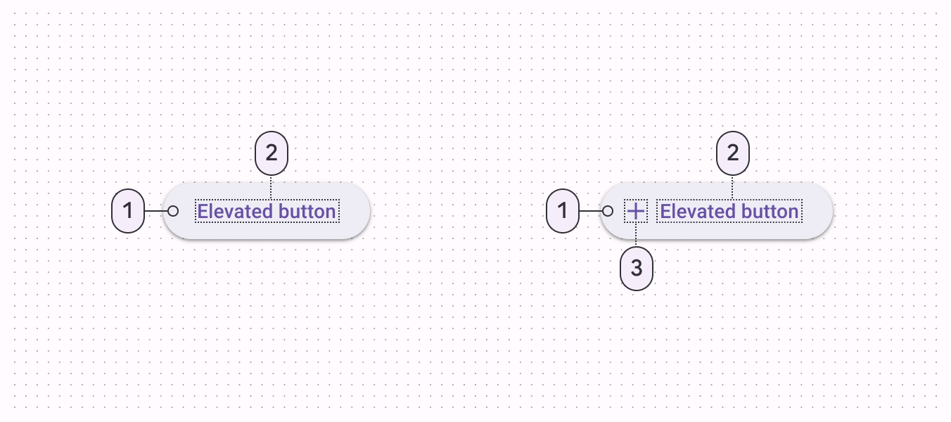
Elevated button: An elevated button is a button with a background color and a shadow. It is used to draw attention to important actions or to create a sense of depth in a layout.
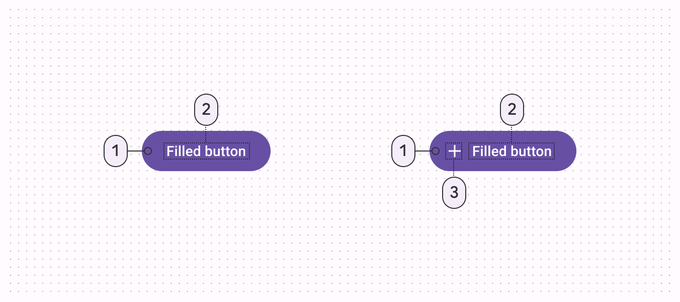
Filled button: A filled button is a button with a solid color background. It is typically used to indicate the primary action of a page or form.
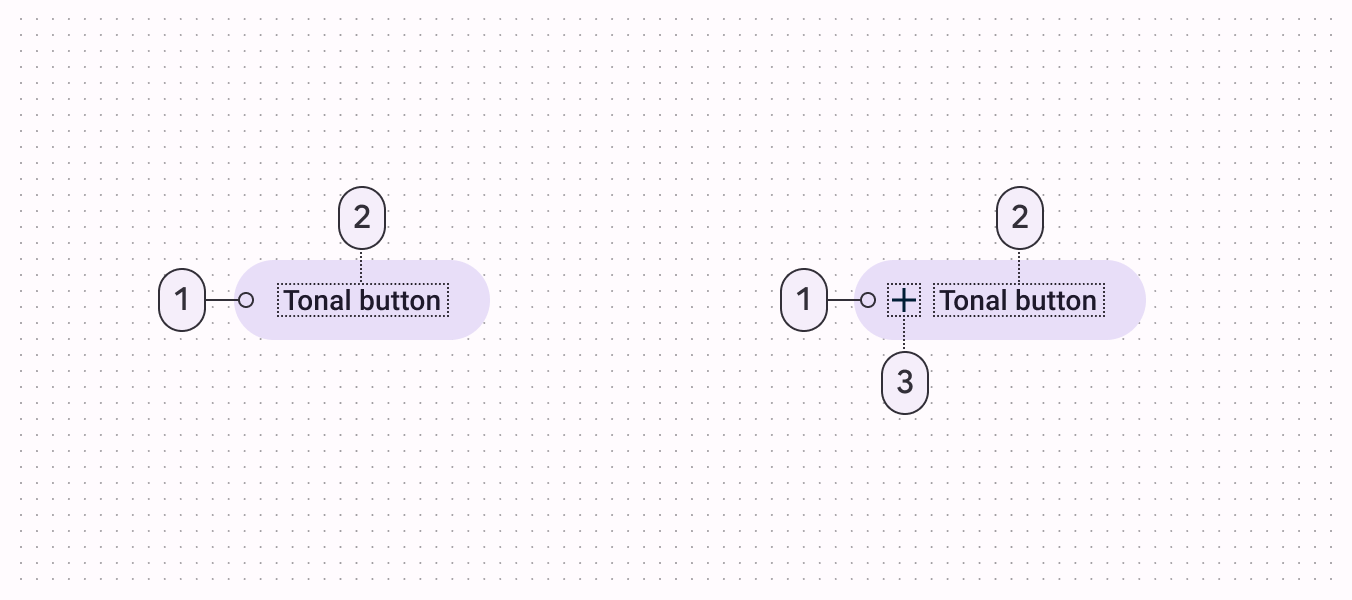
Filled tonal button: A filled tonal button is similar to a filled button, but it uses a tonal color scheme rather than a single color. This means that it uses shades of a single color to create a more subtle and nuanced visual effect. This type of button is often used to indicate secondary actions or as an alternative to filled buttons.
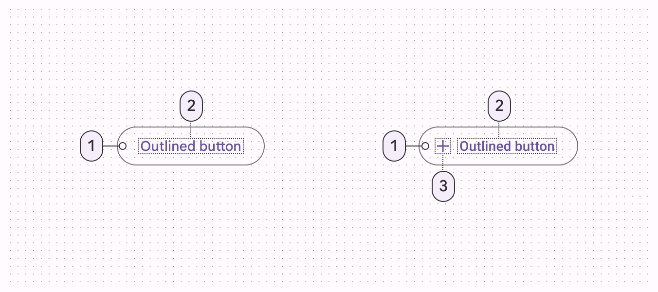
Outlined button: An outlined button is a button with a border but no background color. It is often used in conjunction with raised buttons to provide a secondary action.
FAB (Floating Action Button): A FAB is a circular button that floats over the content of a screen. It is used to represent the primary action of a screen.

Extended FAB: The extended FAB, or floating action button, is a rectangular button that floats over the user interface. It is used for a primary action that is important and should be easily accessible to the user.

Icon button: An icon button is a button that consists of an icon without text. It is often used in toolbars and as a secondary action in dialogs.

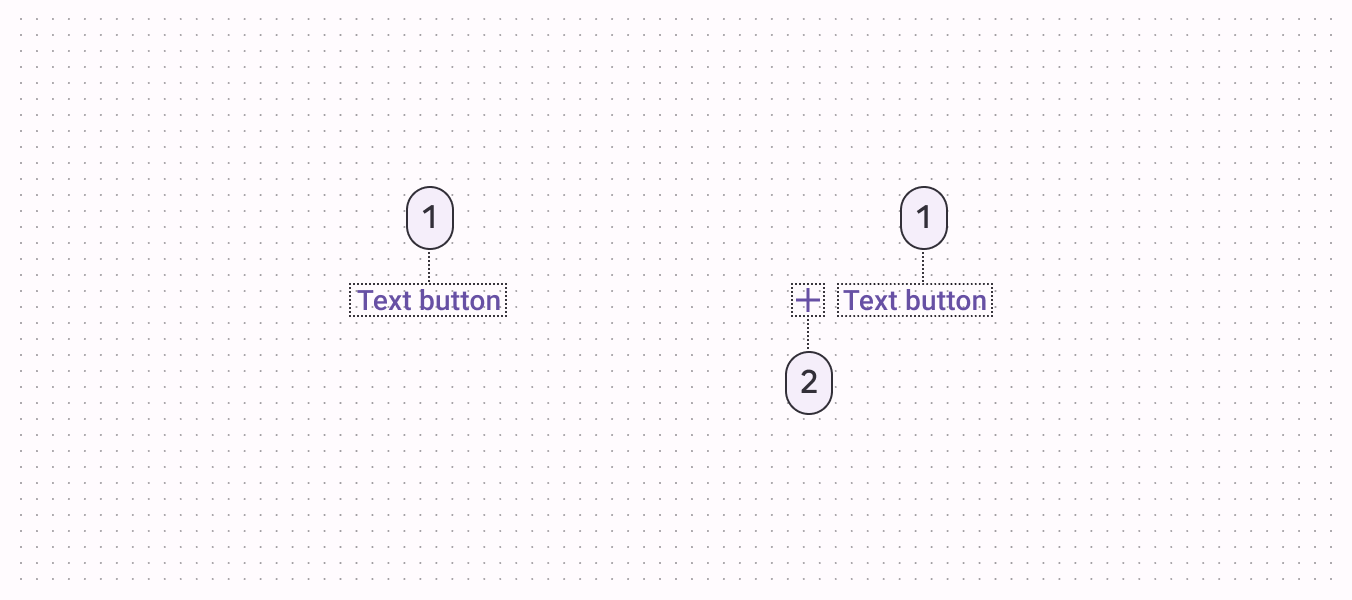
Text button: A text button is a button that consists of text only. It is often used as a secondary action in dialogs or as a link in a text-heavy layout.
Single-select Segmented button: This type of button is used to allow users to select a single option from a list of options. It is typically used for simple choices where only one option can be selected at a time.
Multi-select Segmented button: This type of button is similar to the single-select segmented button, but it allows users to select multiple options from a list of options.

Pagination page buttons: These buttons are used to navigate between pages in a paginated list. They typically include a button for the current page, buttons for the previous and next pages, and buttons for jumping to the first or last page.
Here are some additional components that can be included:
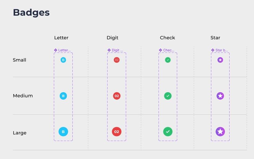
Badge: A badge is a small, rounded component that displays a number or short piece of text, often used to indicate the quantity of items in a list or to draw attention to a new or unread item.
Rating: A rating component allows users to select a numerical rating from a range of options, typically presented as a series of stars or dots. This is often used for product or service reviews.

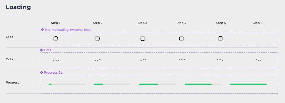
Loading: A loading component is used to indicate that content is being loaded or is in progress. This can be a spinner, progress bar, or other visual indicator.
Button’s variants
There are several variants of buttons that you may want to include in your design system. Here are some examples:
- Button: This is the basic button with a solid background color and text label.
- Button with icon: This button includes an icon in addition to the text label.
- Button with outline: This button has a solid background color with an outline around the button.
- Button with outline and icon: This button has a solid background color with an outline and includes an icon in addition to the text label.
- Button with rounded corners: This button has a solid background color with rounded corners.
- Button with rounded corners and icon: This button has a solid background color with rounded corners and includes an icon in addition to the text label.
These are just a few examples of the types of filled button variants that you may want to include in your design system. You may want to consider adding additional variants depending on the needs of your design system.
I included three basic button variants in the Master UI design system:
- Default button: This is the default variant of a button, which includes a text label and does not have any icons. It is used for basic actions such as submitting a form or clicking to navigate to a different page.
- Button with left icon: This variant includes an icon placed to the left of the text label. It is used to indicate the purpose or action of the button, such as saving, deleting, or adding an item.
- Button with right icon: This variant includes an icon placed to the right of the text label. It is often used for actions that require additional confirmation, such as deleting an item or canceling a process. The right icon can be used to indicate the action or purpose of the button, while the text label provides additional context or information.
Button States
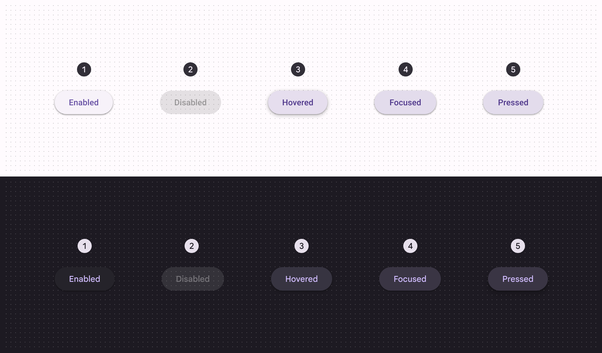
Button variants are different styles or states of a button that can be used to indicate different actions or behaviors. Here are some common button variants:
- Normal or Default: This is the default state of a button. It indicates that the button is ready for interaction and can be clicked on.
- Disabled: This state indicates that the button is not currently available for interaction. It may be grayed out or have a lower opacity.
- Active: This state indicates that the button is currently being clicked or pressed. It may have a different color or visual effect to indicate that it is in the process of being activated.
- Hover: This state indicates that the button is being hovered over by the mouse cursor. It may have a different color or visual effect to indicate that it is being focused on.
- Focus: This state indicates that the button has focus, typically when it is tabbed to using a keyboard. It may have a different color or visual effect to indicate that it is in focus.
- Pressed: This state indicates that the button has been clicked and is in the process of being released. It may have a different color or visual effect to indicate that it is in the process of being released.
Button Sizes
Button sizes are an important aspect of a design system because they allow designers to create visual hierarchy and balance within an interface. Some common button sizes that are frequently used in design systems include:
- Small: This size is typically used for buttons that perform secondary actions or are used in conjunction with other buttons.
- Medium: This is the default size for buttons and is used for primary actions or calls to action.
- Large: Large buttons are used to draw attention and are typically used for important actions or calls to action.
The sizes and padding of small, medium, and large buttons can vary depending on the design system you are using. Here is an example of the sizes and padding for small, medium, and large buttons in a design system:
Small button:
- Size: 24px height
- Horizontal Padding: 16
- Vertical Padding: 4
Medium button:
- Size: 40px height
- Horizontal Padding: 24
- Vertical Padding: 6
Large button:
- Size: 48px height
- Horizontal Padding: 32
- Vertical Padding: 10
Keep in mind that these are just examples and the sizes and padding for small, medium, and large buttons in your design system may be different. It is important to establish and document the sizes and padding for your buttons in your design system to ensure consistent design and usability.
How to organize your buttons
There are a few ways you can consider organizing your buttons in your design system:
- By purpose: Group your buttons based on their intended use or function, such as primary action buttons, secondary action buttons, tertiary action buttons, etc.
- By size: Group your buttons based on their size, such as small buttons, medium buttons, large buttons, etc.
- By type: Group your buttons based on their type, such as filled buttons, outline buttons, ghost buttons, etc.
- By user flow: Group your buttons based on the user flow they are used in, such as on-boarding buttons, account settings buttons, etc.
- By product or service: Group your buttons based on the product or service they are used in, such as website buttons, mobile app buttons, etc.
The way that I picked to organize buttons in the Master UI design system is by type and size. For example, elevated buttons in small, medium, and large sizes, and similarly for filled buttons in small, medium, and large sizes.
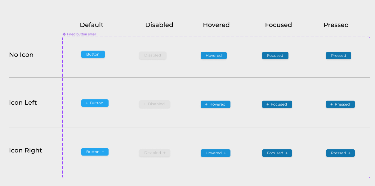
To organize my design system’s buttons, I created a table with the button variants listed vertically and the different states listed horizontally. This allowed me to easily keep track of all the various types, sizes, and states of my buttons and made it easier to navigate through the many options available.
It’s important to choose an organization method that makes sense for your design system and helps you and your team find the buttons you need quickly and easily.
To see how buttons fit into the bigger picture of your design system, visit our Ultimate Guide to Design Systems for a deeper understanding of the overall process.
Master UI Design System – Streamline Your Design Process
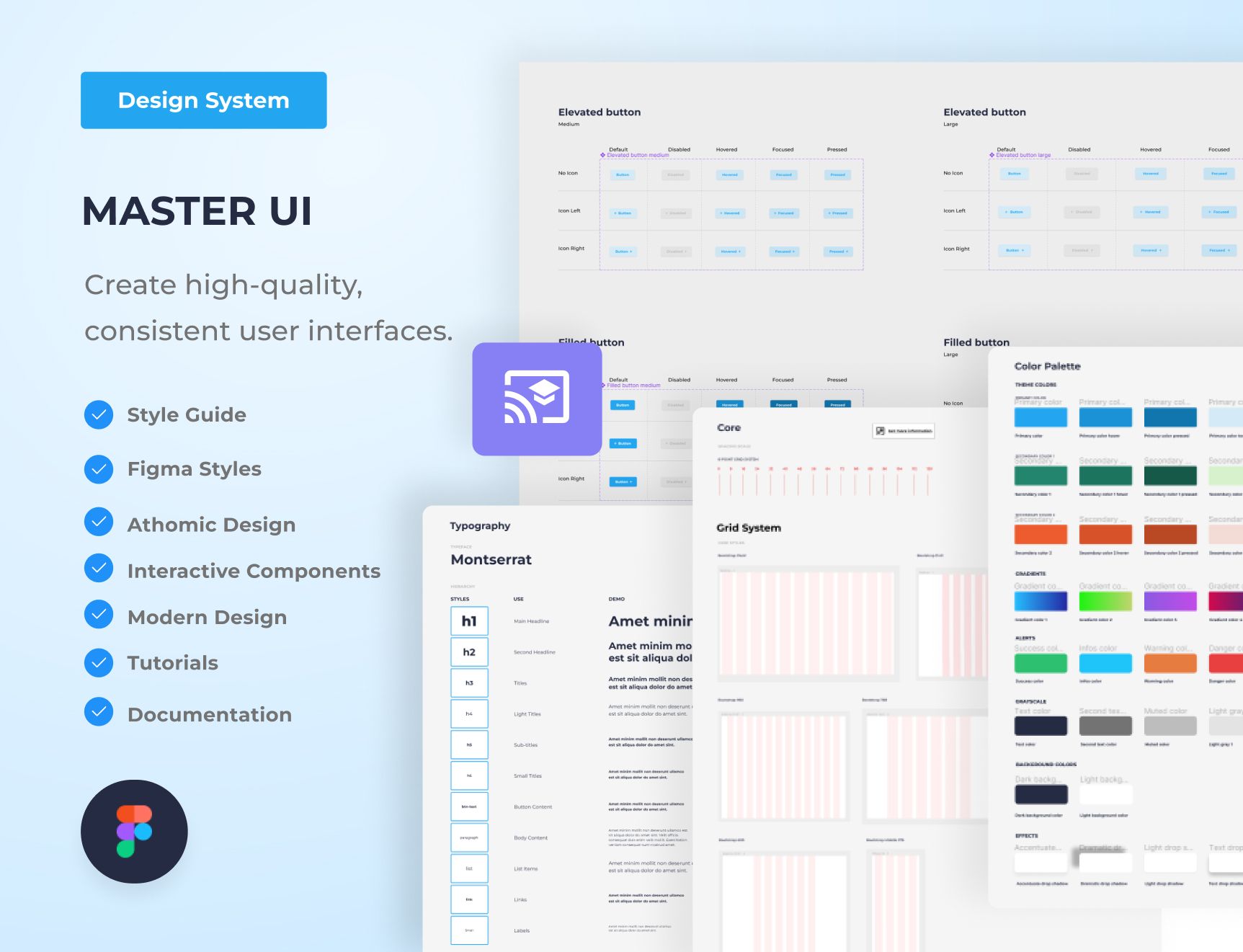
Are you tired of constantly reinventing the wheel with every new project, struggling to maintain consistency in your designs? The Master UI design system may be the solution you’ve been seeking.
Download here : https://captaindesign.gumroad.com/l/vtbiq
The Master UI design system is a powerful tool that helps you create high-quality, consistent user interfaces. With Master UI, you have everything you need to streamline your design process and create stunning interfaces that delight your users.
Here’s what you can expect from Master UI:
- A comprehensive style guide
- Interactive Figma components
- A wide range of components
- Intuitive navigation
- Step-by-step tutorials:
- Comprehensive documentation
With Master UI, you have everything you need to create beautiful, functional interfaces.
Download here : https://captaindesign.gumroad.com/l/vtbiq
If you have any additional resources or links that you think would be helpful to include in this post, please feel free to share them in the comments below. Your contribution would be greatly appreciated.
