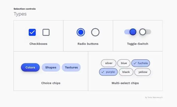
Selection controls are UI elements that allow users to select options from a list or a range of options. They include elements such as check-boxes, radio buttons, and switches.
Selection controls play a critical role in any design system. Learn how to incorporate them by reading our Ultimate Guide to Design Systems.
Effective Design Strategies for Selection Controls
When designing selection controls for your design system, it’s important to consider the following:
- Context: Consider the context in which the selection control will be used. Is it for a form, a list of options, or a toggle switch? This will help you determine the appropriate type of selection control to use.
- Usability: Make sure the selection control is easy to use and understand. Use clear and concise labels, and provide enough space around the element to make it easy to click or tap.
- Accessibility: Consider the needs of users with disabilities and ensure that your selection controls are accessible. This includes providing clear and descriptive labels, using appropriate color contrast, and ensuring that the controls are keyboard accessible.
- Consistency: Use consistent styles and behaviors for your selection controls across all parts of your design system. This will help users understand how to use the controls and improve the overall usability of your system.
- Flexibility: Design your selection controls to be flexible and adaptable to different contexts and use cases. This may involve creating different variations of the same control for different contexts, or providing options for customization.
By considering these factors, you can design effective and user-friendly selection controls for your design system.
Types of selection controls
There are several types of selection controls that you may want to consider including in your design system. These include:
- Radio buttons: These are used to allow the user to select one option from a list of mutually exclusive options.
- Checkboxes: These are used to allow the user to select multiple options from a list of options.
- Toggle switches: These are used to allow the user to switch between two states (e.g. on/off).
- Dropdown menus: These are used to allow the user to select an option from a list of options that is presented in a dropdown menu.
- Sliders: These are used to allow the user to select a value within a range by sliding a handle along a track.
- Range sliders: These are similar to sliders, but allow the user to select a range of values within a range.
- Date pickers: These are used to allow the user to select a date or date range.
- Time pickers: These are used to allow the user to select a time or time range.
States of selection controls
There are several different states that you may want to consider when designing selection controls for your design system:
- Checked: This state indicates that the selection control is selected.
- Unchecked: This state indicates that the selection control is not selected.
- Indeterminate: This state is used for checkboxes that have children items that are partially selected.
- Disabled: This state indicates that the selection control is not available for selection.
- Focused: This state indicates that the selection control has focus and is ready to be selected.
- Invalid: This state indicates that the selection control is in an invalid state, usually because the value entered does not meet certain criteria.
- Hover: This state indicates that the selection control is being hovered over by the mouse cursor.
It’s important to consider these different states when designing selection controls for your design system, as they will help to communicate the status and availability of the control to the user.
Selection controls Usage
Here are some best practices and examples for designing selection controls for your design system:
Radio
Radio buttons are used for selecting a single option from a list of options. They are commonly used in forms to allow users to choose from a list of options, such as selecting a payment method or choosing their preferred shipping method.
Here are some examples of radio buttons in use:
- A form asking users to select their gender
- A form asking users to select their preferred payment method
- A survey asking users to select their favorite type of music
Checkboxes
- Use checkboxes for options that are not mutually exclusive
- Group related checkboxes together
- Use clear and concise labels
- Consider providing a select all or deselect all option for large groups of checkboxes
Toggle switches
- Use toggle switches for options that are mutually exclusive
- Use clear and concise labels
- Consider providing a default or preselected option
Dropdown menus
- Use dropdown menus for options that have a clear hierarchy or when space is limited
- Use clear and concise labels for options
- Consider using a search function for large lists of options
Sliders
- Use sliders for continuous or discrete values within a range
- Clearly label the minimum and maximum values
- Consider providing a reset or default value option
Range sliders
- Use range sliders for selecting a range of continuous or discrete values
- Clearly label the minimum and maximum values
- Consider providing a reset or default value option
Date pickers
- Use date pickers for selecting a specific date or range of dates
- Consider providing options for selecting different date formats
- Consider providing a clear and easy to use calendar view
Time pickers
- Use time pickers for selecting a specific time or range of times
- Consider providing options for selecting different time formats
- Consider providing clear and easy to use clock view.
Interested in learning how to bring all the components of your design system together? Return to our Ultimate Guide to Design Systems for a comprehensive approach.
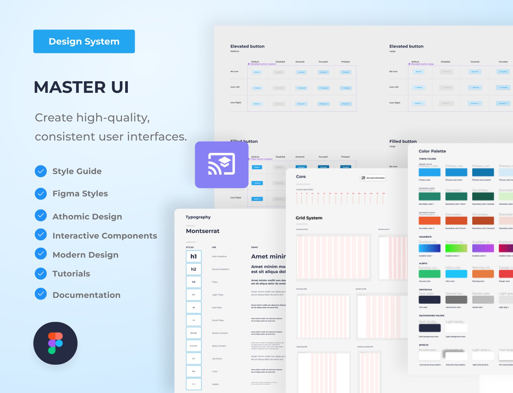
Master UI Design System – Streamline Your Design Process

Are you tired of constantly reinventing the wheel with every new project, struggling to maintain consistency in your designs? The Master UI design system may be the solution you’ve been seeking.
Download here : https://captaindesign.gumroad.com/l/vtbiq
The Master UI design system is a powerful tool that helps you create high-quality, consistent user interfaces. With Master UI, you have everything you need to streamline your design process and create stunning interfaces that delight your users.
Here’s what you can expect from Master UI:
- A comprehensive style guide
- Interactive Figma components
- A wide range of components
- Intuitive navigation
- Step-by-step tutorials:
- Comprehensive documentation
With Master UI, you have everything you need to create beautiful, functional interfaces.
Download here : https://captaindesign.gumroad.com/l/vtbiq
If you have any additional resources or links that you think would be helpful to include in this post, please feel free to share them in the comments below. Your contribution would be greatly appreciated.


