Text fields and forms are essential components of your design system. Before diving into this guide, take a look at our Ultimate Guide to Design Systems to understand the foundational principles of design systems.
Designing text fields and forms for your design system involves considering the different types and states of these components.
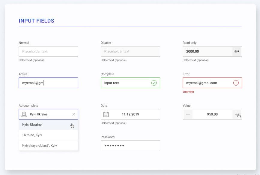
Forms can include a variety of text fields. It’s important to consider the layout and organization of these components within the form, as well as the different states (such as focused, hover, active, and disabled) that they may need to support.
In addition, you may want to consider including validation and error handling in your design system. This can involve designing error messages and visual indicators to help users understand any issues with their form inputs.
Overall, designing text fields and forms for your design system requires a balance between usability and aesthetics. It’s important to create components that are easy for users to interact with and understand, while also fitting in with the overall look and feel of your design system.
Types of text fields
Here are the details for each type of text field that you can include in your design system:
- Filled: This type of text field has a solid background color and is typically used for input fields that are focused on the user entering a single line of text.
- Filled Icon Left: This type of text field is similar to the Filled text field, but it includes an icon to the left of the input field. This can be used to give a visual indication of the type of information being entered, such as a password or email address.
- Filled Icon Right: This type of text field is similar to the Filled Icon Left text field, but the icon is placed to the right of the input field instead.
- Outlined: This type of text field has an outline instead of a solid background color, and is typically used for input fields that are focused on the user entering a single line of text.
- Outlined Icon Left: This type of text field is similar to the Outlined text field, but it includes an icon to the left of the input field.
- Outlined Icon Right: This type of text field is similar to the Outlined Icon Left text field, but the icon is placed to the right of the input field instead.
- URL: This type of text field is specifically designed for entering a URL. It may include validation to ensure that the user is entering a valid URL.
- Digits: This type of text field is specifically designed for entering numerical values. It may include validation to ensure that the user is only entering digits.
- Text Area: This type of text field is designed for the user to enter multiple lines of text. It may include a resize handle to allow the user to adjust the size of the text area as needed.
Text fields states
There are several states that you may want to consider when designing text fields for your design system:
- Normal: This is the default state of a text field, and it simply indicates that the field is ready for user input.
- Focused: When a user clicks on a text field, it becomes focused, which means that the cursor is placed inside the field and the field is ready for input.
- Disabled: A disabled text field is one that is not editable by the user. It may appear greyed out or have a different visual appearance to indicate that it is not available for input.
- Error: An error state is used to indicate that there is an issue with the input in the text field. This could be due to an incorrect format, missing required information, or any other issue.
- Success: A success state is used to indicate that the input in the text field is valid and has been accepted.
To explore how text fields and forms contribute to your design system, check out our Ultimate Guide to Design Systems for more insights.
Master UI Design System – Streamline Your Design Process
Are you tired of constantly reinventing the wheel with every new project, struggling to maintain consistency in your designs? The Master UI design system may be the solution you’ve been seeking.
Download here : https://captaindesign.gumroad.com/l/vtbiq
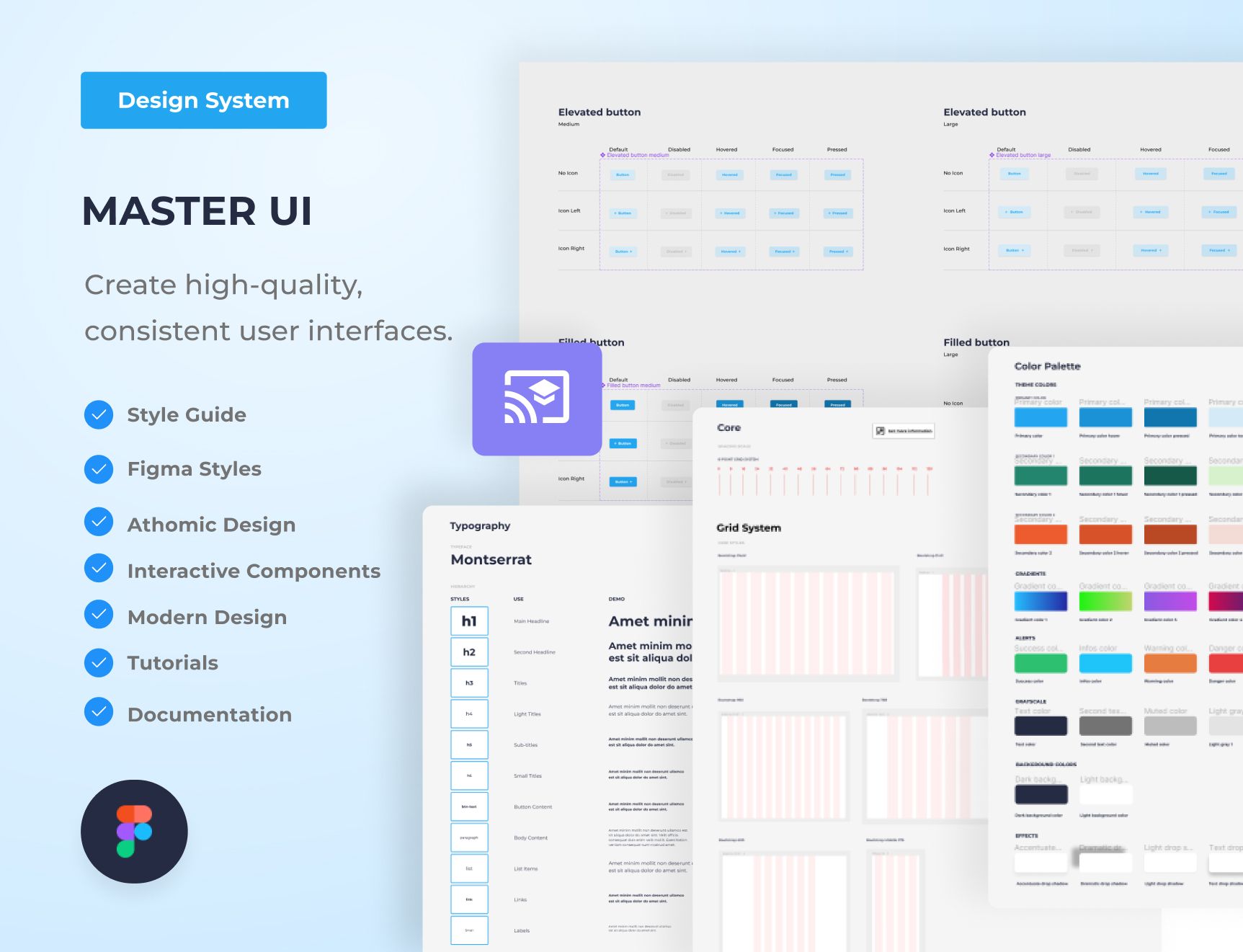
The Master UI design system is a powerful tool that helps you create high-quality, consistent user interfaces. With Master UI, you have everything you need to streamline your design process and create stunning interfaces that delight your users.
Here’s what you can expect from Master UI:
- A comprehensive style guide
- Interactive Figma components
- A wide range of components
- Intuitive navigation
- Step-by-step tutorials:
- Comprehensive documentation
With Master UI, you have everything you need to create beautiful, functional interfaces.
Download here : https://captaindesign.gumroad.com/l/vtbiq
If you have any additional resources or links that you think would be helpful to include in this post, please feel free to share them in the comments below. Your contribution would be greatly appreciated.
