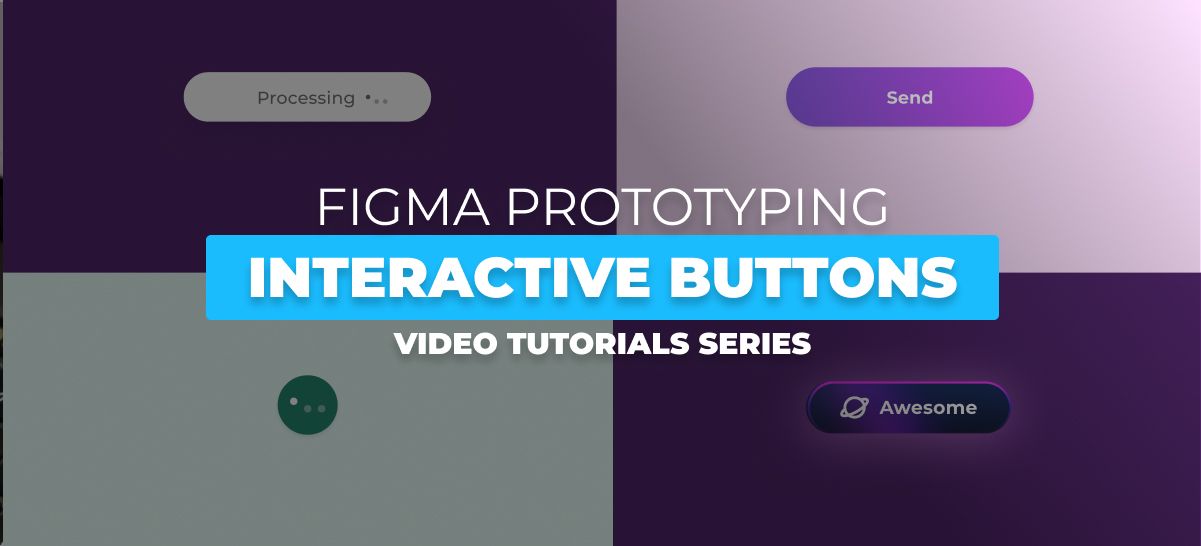
In the world of digital design, interactivity is the key to engaging user experiences. Buttons play a pivotal role in user interface design, and animations can bring them to life, adding both flair and functionality. Welcome to our creative tutorial series, where we explore the art of Figma button animations. From loading buttons that communicate progress to send buttons with a touch of excitement and gradient buttons that add depth, we’ve got it all covered.
In this series, you’ll discover how to craft innovative button animations using Figma, a versatile design tool. Whether you’re a budding designer looking to expand your skill set or a seasoned pro seeking fresh inspiration, these tutorials are your guide to creating captivating and interactive buttons. Let’s dive into the world of Figma button animations and elevate your design game!
1- Figma Tutorial: How to create a loading button interaction
This Figma tutorial guides you through the process of creating a loading button interaction. Learn how to design and implement a button that visually communicates loading or processing, enhancing the user experience in your designs.
2- Figma Button Tutorial – Creative Loading Button Animation
Dive into creative button animations with this Figma tutorial. Explore innovative loading button animation designs and get inspired to add flair to your user interfaces.
3- Figma Tutorial: Create a progress Button animation component
In this Figma tutorial, you’ll learn to create a progress button animation component, adding a dynamic and engaging element to your user interfaces. The animation will visually communicate progress, enhancing user experience and interactivity.
4- Figma Tutorial: Create a Processing interactive Button animation component
This Figma tutorial delves into creating an interactive button animation component that conveys processing and user feedback. Learn to design and implement a button that engages users while processes occur in the background.
5- Step-by-Step Figma Tutorial: Crafting send Button animation component
Follow a step-by-step Figma tutorial to craft a “send” button animation component. Learn how to create an animated button that adds excitement to actions like sending messages or submitting forms.
6- Figma Tutorial: How to create a Gradient Button animation
Explore the use of gradients in button animations with this Figma tutorial. Learn to design and implement a gradient button animation that adds depth and visual appeal to your designs, creating a striking and engaging effect.
Conclusion
As we conclude our creative tutorial series on Figma button animations, we hope you’re feeling inspired and empowered to create engaging and interactive buttons in your designs. Buttons are more than just clickable elements; they are the gateways to actions, feedback, and user engagement.
Throughout this series, you’ve learned to design loading buttons, send buttons, and gradient buttons, each with its unique flair and functionality. With Figma as your canvas, your creativity knows no bounds.
Design is a journey of continuous improvement, and as you move forward, don’t hesitate to experiment, iterate, and keep pushing the boundaries of interactivity. The digital world is ever-evolving, and your designs should evolve with it.
We’re excited to see the remarkable button animations you’ll create. Your creativity, combined with these newfound skills, has the power to make your designs memorable and user-friendly. So go forth, design boldly, and continue to inspire and interact with your audience through the magic of Figma button animations. Happy designing!


