Navigation is a key aspect of user experience in any design system. To see how it fits into the bigger picture, start by reviewing our Ultimate Guide to Design Systems.
Designing navigation for a design system can be a challenging task, as it requires considering the needs and goals of the users, as well as the overall look and feel of the product. Effective navigation should be intuitive, consistent, and easy to use, allowing users to easily find and access the content and features they need.
There are several key factors to consider when designing navigation for a design system. These include the hierarchy and organization of content, the layout and placement of navigation elements, and the use of visual cues and other design elements to guide users through the product.
In addition to these considerations, it is important to ensure that navigation is responsive and adapts to different screen sizes and devices. This may involve designing separate navigation patterns for different screen sizes, or using responsive design techniques to ensure that the navigation remains effective across different devices.
Overall, designing navigation for a design system requires careful planning and attention to detail, as it plays a critical role in the user experience and the overall success of the product.
Types of navigations
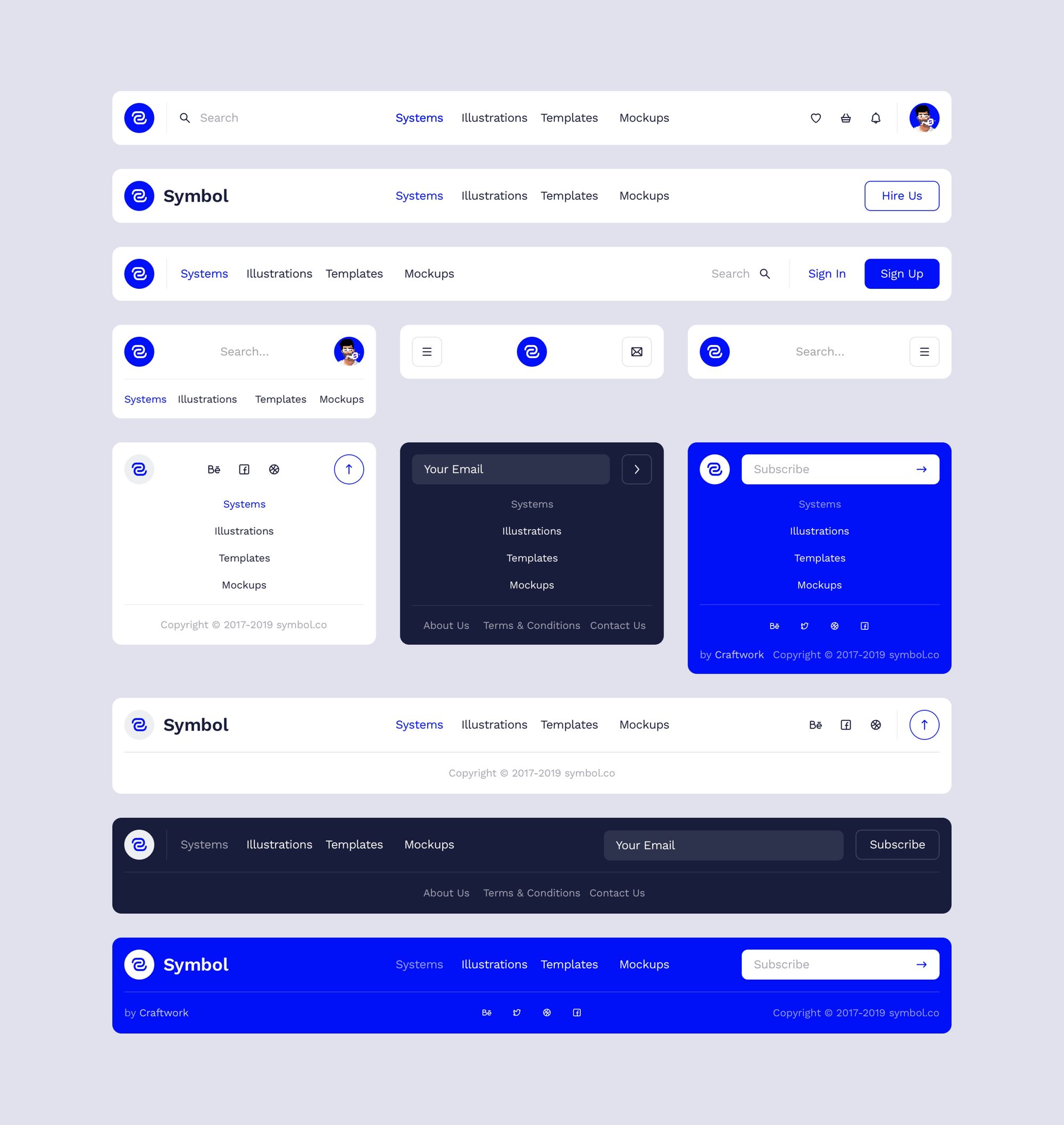
There are several types of navigations that you may want to consider including in your design system. These include:
- Top navigation bar: A horizontal bar at the top of the page that allows users to easily navigate to different sections of the website or app.
- Side navigation menu: A vertical menu that appears on the left or right side of the page, allowing users to easily access different sections of the website or app.
- Footer navigation: A horizontal bar at the bottom of the page that provides links to important pages or sections of the website or app.
- Tabbed navigation: A group of tabs that allow users to navigate between different sections of content within a single page.
- Breadcrumb navigation: A list of links that shows the user’s current location within the website or app and allows them to easily navigate back to previous pages.
- Pagination: A navigation system that allows users to move between different pages of content, typically used for long lists or search results.
- Dropdown menus: A menu that appears when a user clicks on a button or link, allowing them to access additional options or pages.
There are many other types of navigations as well, and the best choice for your design system will depend on your specific needs and goals.
Navigation states
There are several states that navigation elements, such as menus and links, can be in. Here are some examples:
- Active: This state indicates that the navigation element is currently being used or selected.
- Disabled: This state indicates that the navigation element is not currently available for use.
- Hover: This state indicates that the user’s mouse or cursor is hovering over the navigation element.
- Focus: This state indicates that the navigation element is currently in focus, for example, if it is the element that the user is interacting with using the keyboard.
- Visited: This state indicates that the user has previously interacted with the navigation element, such as by clicking on a link.
Continue building your knowledge of design systems by revisiting our Ultimate Guide to Design Systems for more best practices and tips.
Master UI Design System – Streamline Your Design Process
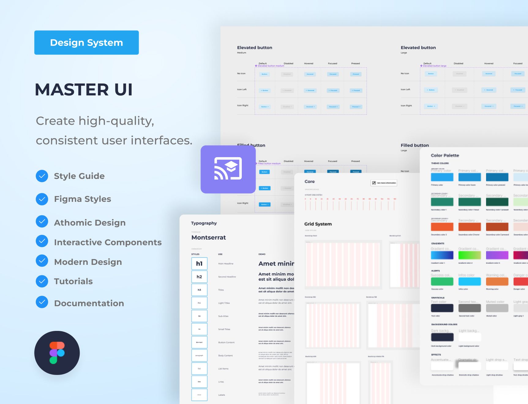
Are you tired of constantly reinventing the wheel with every new project, struggling to maintain consistency in your designs? The Master UI design system may be the solution you’ve been seeking.
Download here : https://captaindesign.gumroad.com/l/vtbiq
The Master UI design system is a powerful tool that helps you create high-quality, consistent user interfaces. With Master UI, you have everything you need to streamline your design process and create stunning interfaces that delight your users.
Here’s what you can expect from Master UI:
- A comprehensive style guide
- Interactive Figma components
- A wide range of components
- Intuitive navigation
- Step-by-step tutorials:
- Comprehensive documentation
With Master UI, you have everything you need to create beautiful, functional interfaces.
Download here : https://captaindesign.gumroad.com/l/vtbiq
If you have any additional resources or links that you think would be helpful to include in this post, please feel free to share them in the comments below. Your contribution would be greatly appreciated.