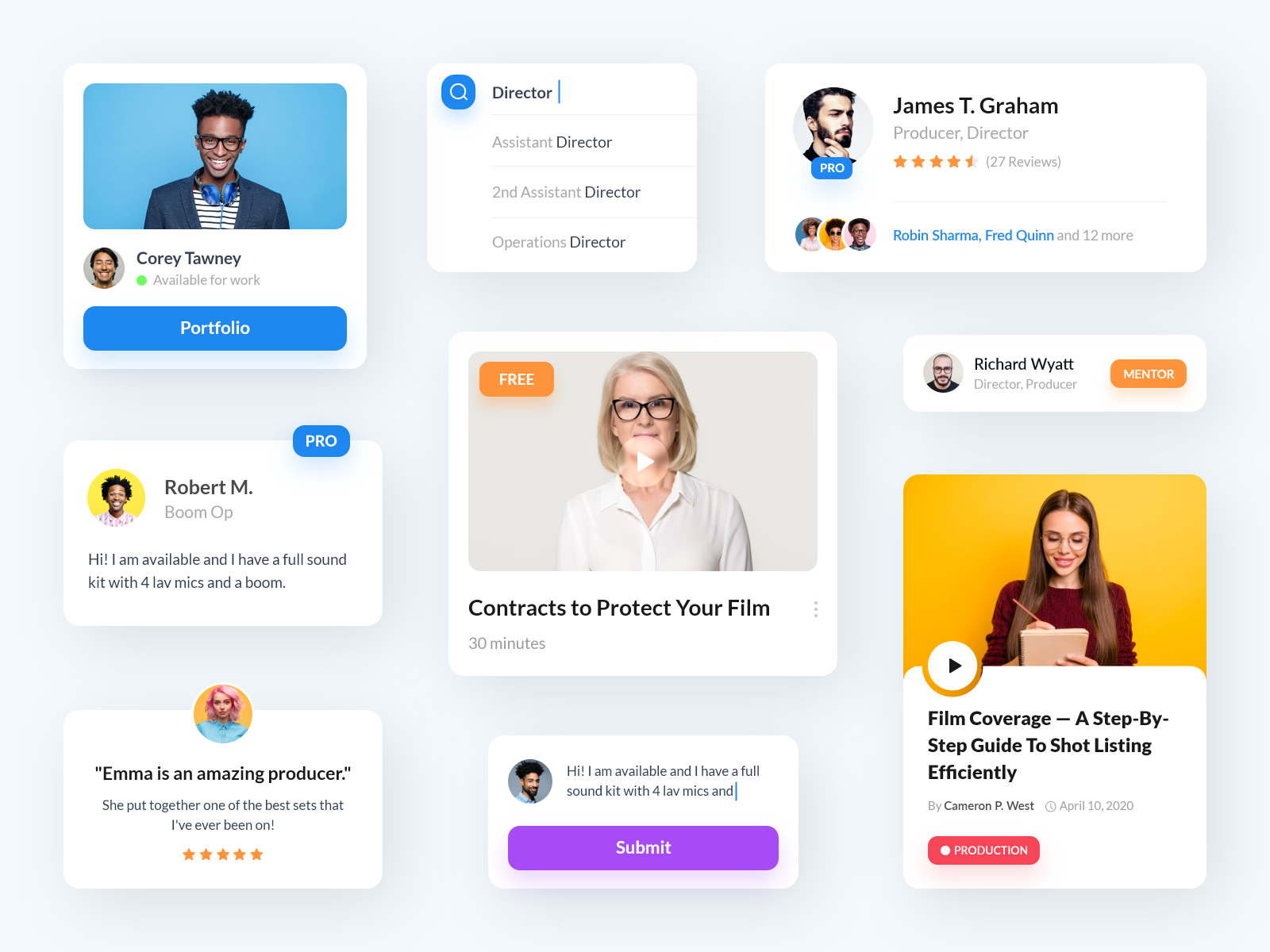
UI cards are a common design element used in user interfaces to visually group related content and provide easy access to more detailed information. They are typically used to display a summary of information, such as an image, title, and brief description, with the option to expand for more details.
UI cards are an important component in any design system. To get a complete understanding of how to build and manage your design system, make sure to check out our Ultimate Guide to Design Systems.
Effective Techniques for Designing UI Cards
When designing UI cards for your design system, it’s important to consider the following:
- Purpose: What information do you want to convey through the card?
- Layout: How will the content be organized within the card?
- Interaction: How will the user interact with the card, such as expanding for more details or accessing additional content?
- Visual design: How will the card look visually, including colors, typography, and imagery?
Types of cards
There are several types of UI cards that you can include in your design system, including:
- Standard cards: These are the most basic type of card, typically used to display information about a single item or concept.
- Image cards: These cards feature a large image, often accompanied by text or other information.
- Data cards: These cards are used to display data or statistics, often in the form of charts or graphs.
- Action cards: These cards include buttons or other interactive elements, allowing users to take some sort of action, such as making a purchase or signing up for a newsletter.
- Profile cards: These cards are used to display information about a person or entity, often including an image and contact information.
- Product cards: These cards are used to display information about a product, including an image, price, and description.
- Media cards: These cards are used to display media such as videos or audio clips, often accompanied by text or other information.
Cards variants
Here’s a the different variants of cards:
Elevated: The Elevated card variant has a subtle shadow that gives it a slightly raised appearance, which can be used to give it a sense of depth and hierarchy within the design. This variant is often used for content cards or cards that contain important information.
Filled: The Filled card variant has a solid background color, which can be used to highlight the content within the card or to create contrast with the surrounding elements. This variant is often used for product cards or cards that contain actionable elements such as buttons.
Outlined : The Outlined card variant has a thin border around the edge of the card, which can be used to differentiate it from other elements on the page or to create a more subtle visual effect. This variant is often used for pricing cards or cards that contain less important information.
Cards states
The different states of cards in a design system can be used to indicate the current status or interaction of the card. For example:
Default: the default state is the normal appearance of the card when it is not being interacted with.
Hovered: The hovered state is the appearance of the card when the user’s cursor is hovering over it.
Focused: The focused state is the appearance of the card when it is selected or has focus.
Pressed: The pressed state is the appearance of the card when it is being clicked on or activated.
Dragged: The dragged state is the appearance of the card when it is being dragged and moved around.
Disabled: The disabled state is the appearance of the card when it is not able to be interacted with. These different states can be used to give visual feedback to the user and make the UI more interactive and user-friendly.
To see how UI cards fit into a comprehensive design system, don’t forget to visit our Ultimate Guide to Design Systems.
Master UI Design System – Streamline Your Design Process
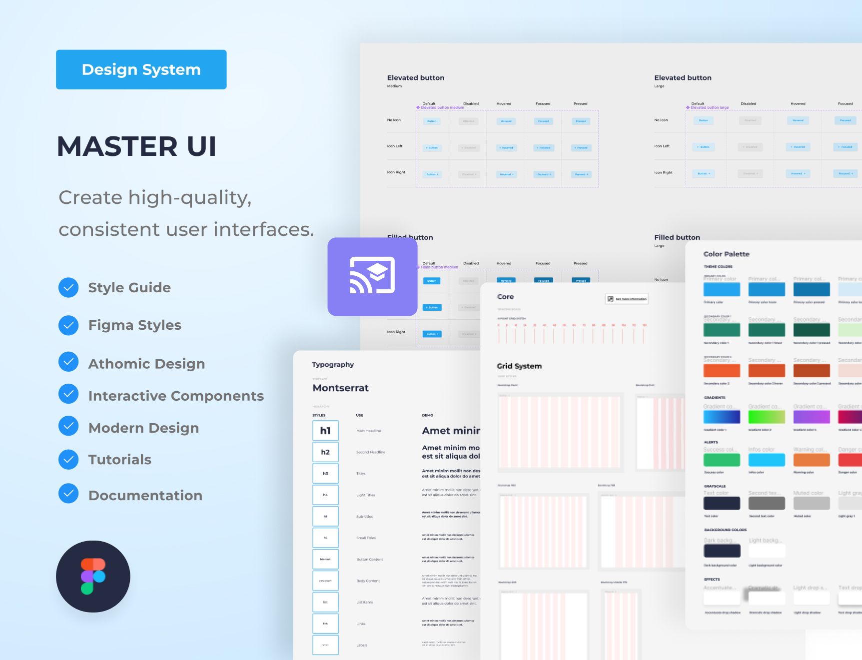
Are you tired of constantly reinventing the wheel with every new project, struggling to maintain consistency in your designs? The Master UI design system may be the solution you’ve been seeking.
Download here : https://captaindesign.gumroad.com/l/vtbiq
The Master UI design system is a powerful tool that helps you create high-quality, consistent user interfaces. With Master UI, you have everything you need to streamline your design process and create stunning interfaces that delight your users.
Here’s what you can expect from Master UI:
- A comprehensive style guide
- Interactive Figma components
- A wide range of components
- Intuitive navigation
- Step-by-step tutorials:
- Comprehensive documentation
With Master UI, you have everything you need to create beautiful, functional interfaces.
Download here : https://captaindesign.gumroad.com/l/vtbiq
If you have any additional resources or links that you think would be helpful to include in this post, please feel free to share them in the comments below. Your contribution would be greatly appreciated.
