If you’re seeking the optimal way to master crafting buttons with Penpot, you’ve landed in the perfect spot! In this tutorial, we’re going to explore the basics of creating button layouts using Penpot, specifically its Flex Layout feature. No worries if you’re new to all this – we’ll take it step by step, so you can easily grasp how to design buttons that not only look good but also work well in your designs. Let’s dive in and make your first button layout together!that not only look nice but also make your designs work better for users.
If you’re new to Penpot, it’s best to start by checking out our Ultimate Guide to Mastering Design with Penpot, which covers everything you need to know to get started with this powerful tool.
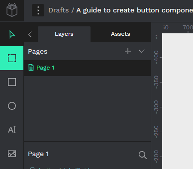
1 – Creating a Button Layout with Penpot’s Flex Layout
Here’s how to create a button in Penpot using the flex layout feature.
- Access the Board tool from the side toolbar or use the shortcut “B.”
- Draw a board with dimensions 180px (W) x 48px (H) on the canvas.
- Set its fill color to #1388d7.
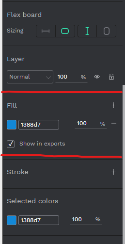
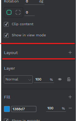
- Navigate to the layout section, click the + button above Fill, and transform the board into a Flex Layout.
Adding Text to the Button:
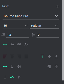
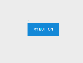
- Use the text tool to input “My button” as a placeholder text.
- Edit text settings to Source Sans Pro, 16px, regular.
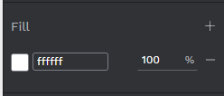
- Change the text fill color to #ffffff.
Adjusting Flex Layout Options:
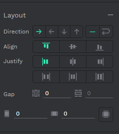
- Select the button frame.
- Configure the Flex Layout options: Align: Align items center. Justify: Justify content center. Gap: 8px. Padding: Vertical padding 16px, horizontal padding 24px.
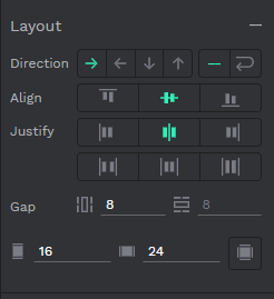
3. Set Sizing to X Fit content and Y Fit content.
Importing and Placing an Icon:
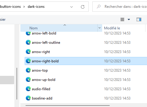
Then let’s import an icon to add beside the text in our button.
- Import an icon using the image button in the side toolbar.
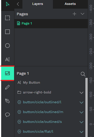
- Choose an icon from your system folders (e.g., an arrow SVG icon).
- Now select the icon and go the Size section on the right hand sidebar
- Adjust icon size and color:
– Lock proportions.
– Set width (W) to 16.
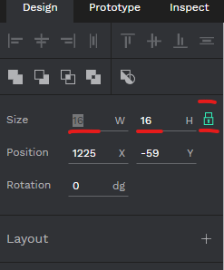
– Change fill color to #ffffff.
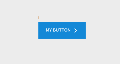
- Drop the icon to the right side of the text within the button’s layout.
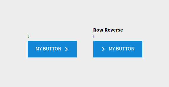
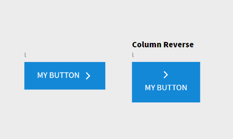
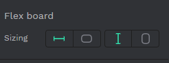
Exploring Button Layout Directions
Changing Button Direction with Penpot Flex Layout:
With Penpot Flex Layout you can change the the direction of the button layout from Horizontal to vertical and also from left to right and top to button, let’s see how it work
- Duplicate the original button (Ctrl+C to copy, Ctrl+V to paste).
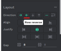
- Select the duplicated button layout and go to the Layout section.
- For horizontal direction, hit “Row reverse” to change the icon direction from right to left.
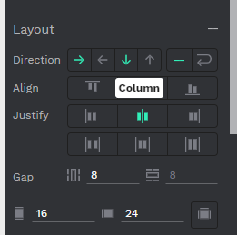
- To switch from horizontal to vertical:
– For vertical down, hit the bottom arrow or select ‘Column.’
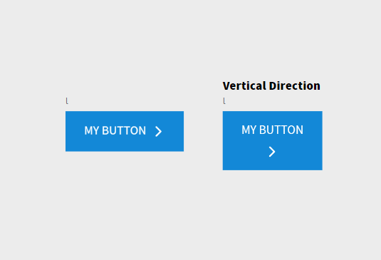
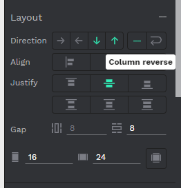
- For vertical up, hit “Column reverse” or the top arrow.
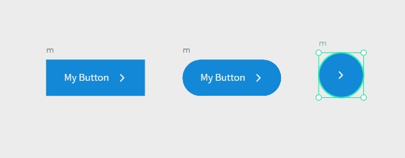
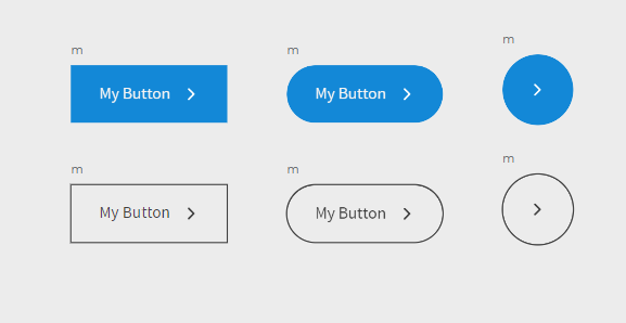
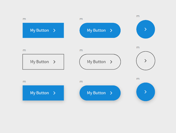
2 – Create different styles of buttons
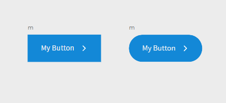
Create a rounded button
Let’s kick things off by making a rounded button:
- Duplicate the original button.
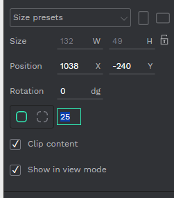
- Select the duplicated button, and on the right-hand sidebar, change the radius value to 25.
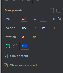
Create a Circle button
Now, let’s turn our button into a circle:
- Duplicate our rounded button and remove the text layer.
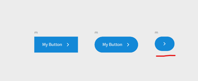
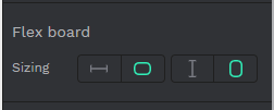
- Select the duplicated button, go to the Flex Board section on the right-hand sidebar, and set sizing to fixed width for both Horizontal and Vertical.
- Adjust the button’s width and height to 60px, and the radius value to 250.
Create an Outlined button
For an outlined look, we’ll play with strokes:
- Select all three buttons and duplicate them.
- In the Fill section, remove the Fill color.
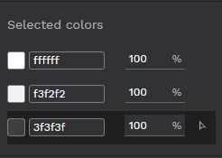
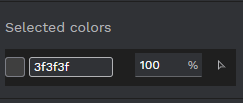
- Add a Selection Stroke and set its color to #3f3f3f.
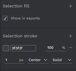
- Move to the Selected color section and set each color to #3f3f3f
Create an Elevated button
Let’s add a drop shadow effect for an elevated button:
- Duplicate the original blue button.
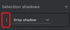
- In the right-hand sidebar, go to Selection Shadows and add a shadow effect using the + button.
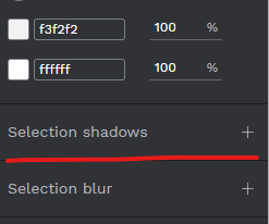
- To ajust the shadow setting, hit the three dots icon in the left
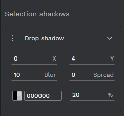
- Change the shadow settings to:
X: 0, Y: 4, Blur: 10, Spred:0
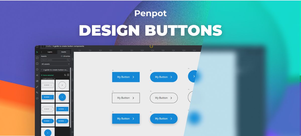
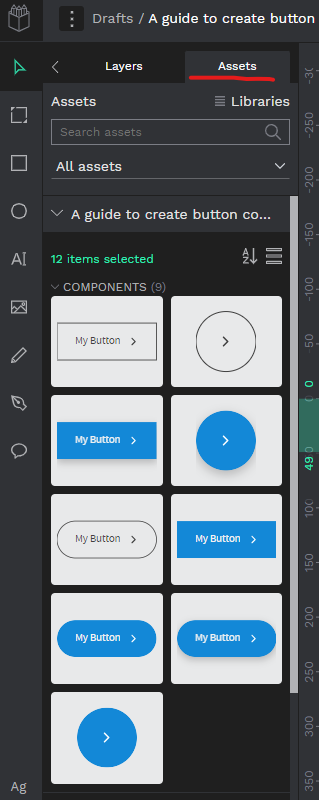
3 – Transform buttons to components
To make our buttons reusable components:
- Select all our buttons.
- Right-click and choose “Create Multiple Components” from the context menu.
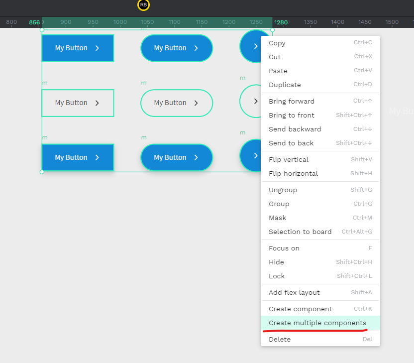
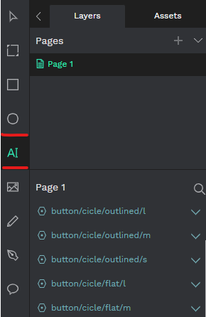
You can now find your components in the Assets tab under components. Keep up the good work, and let’s make those buttons shine!
Conclusion
And there you have it – a journey from the basics to adding flair to your buttons in Penpot! We’ve transformed a regular button into various styles: rounded, circular, outlined, and even elevated. Playing with features like radius, strokes, and shadows has given our buttons that extra oomph.
Don’t forget to save your creations as components in the Assets tab for easy access. Now armed with these skills, go ahead and craft buttons that steal the spotlight in your designs. Stay tuned for more Penpot adventures, and keep on designing!
Now that you’ve learned how to design buttons, continue expanding your Penpot skills by visiting our comprehensive Penpot Tutorials: The Ultimate Guide to Mastering Design with Penpot.