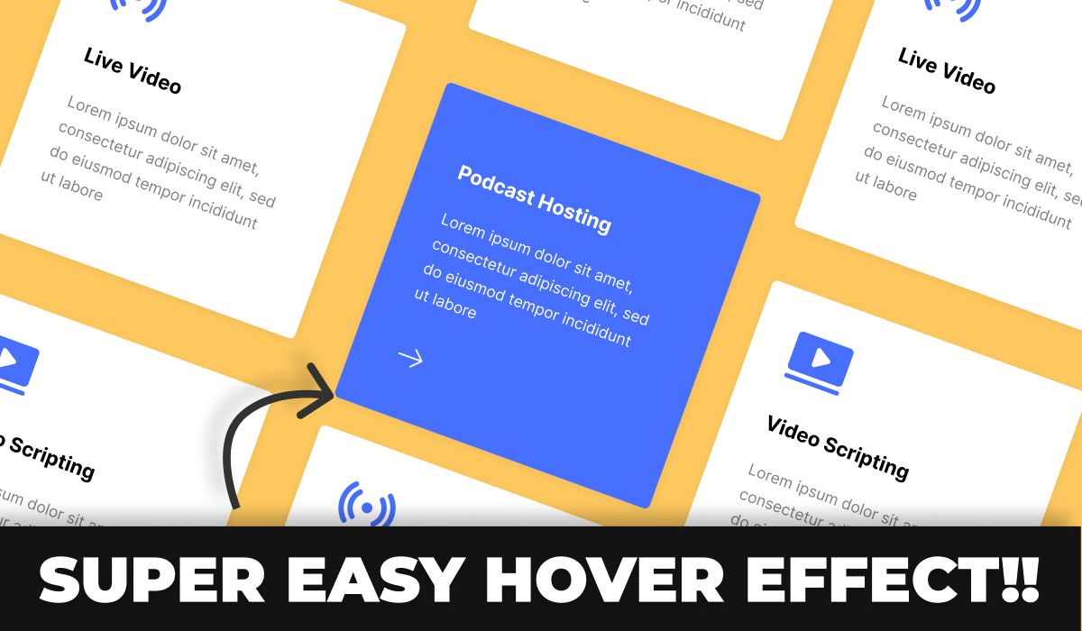
Step into the dynamic world of UI design, where interactive Features Card Hover Effects take center stage. These versatile elements don’t just capture user attention; they seamlessly blend aesthetics and functionality. Eager to create these captivating features using Figma? You’ve landed in the right place.
In this blog post, we dive deep into crafting interactive Features Card Hover Effects. Whether you’re an experienced designer or a newcomer, our comprehensive guide caters to all levels. From concept to realization, we’ll guide you through the process of breathing life into your designs and making them truly interactive.
Join us as we explore the art of creating visually stunning Features Card Hover Effects that perform seamlessly. You’ll gain insights into enhancing user experiences and refining your design skills within the dynamic Figma ecosystem.
Hover effects can make your UI more interactive. If you’re new to prototyping, make sure to first explore our Prototyping for Beginners: Mastering Figma Prototypes for an introduction.
📥 Resources featured in this tutorial 📥
📥 Explore 1000+ UI Components: https://masterui.co/
📥 Download the template file: https://www.figma.com/community/file/1286215540208793687/interactive-features-card-hover-effects
Conclusion
We trust this tutorial has ignited your curiosity to explore the limitless possibilities of Figma and equipped you with the skills to craft exceptional Features Card Hover Effects that will leave a lasting impression on your audience.
Thank you for embarking on this creative journey with us. Don’t forget to apply your newfound skills and keep venturing into the dynamic world of UI design.
Remember to share this tutorial with a fellow designer, and stay tuned for our upcoming Figma tutorials and updates!
Once you’ve created hover effect cards, enhance your Figma skills by returning to our Prototyping for Beginners: Mastering Figma Prototypes for more tutorials.


