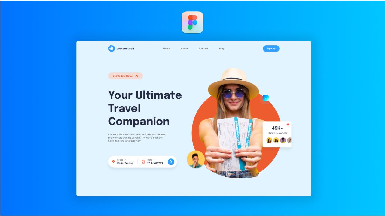
Crafting an unforgettable Travel Header is not just essential; it’s an art that captures hearts and ignites wanderlust. Throughout this tutorial, we’ll empower you with the essential knowledge and techniques to create mesmerizing user experiences that leave a lasting imprint.
So, fasten your seatbelts and brace yourself for an exhilarating journey through the realm of Figma and “Master UI,” as we uncover the secrets to crafting captivating travel landing pages that awaken wanderlust in your audience!
🚀 Discover How To: 🚀
- Create breathtaking and user-friendly Travel Header layouts using Figma.
- Harness the true power of the “Master UI” design system for seamless and coherent designs.
Let’s set sail on this creative odyssey together!
📥 Resources we need for this tutorial 📥
Before we embark on this Figma Tutorial on Designing a Travel Landing Page with “Master UI” Design System, ensure you are equipped with all the essential tools!
Download the Master UI Design System File
To fully unleash the power of “Master UI,” you’ll need to download the design system file. Simply click on the link below to access and download the file:
📥 Download Master UI Design System File
Conclusion
We hope this tutorial has ignited a spark of wanderlust in your design journey and empowered you to create awe-inspiring travel landing pages.
Thank you for joining us on this thrilling odyssey. Put your newfound skills into action and continue exploring the enchanting world of UI design. Don’t forget to subscribe to our blog for a constant source of inspiration with exciting tutorials and updates.


