Step into the exciting world of UI design, where interactive component buttons take center stage. These adaptable elements capture user attention, seamlessly blending aesthetics and functionality. Interested in creating eye-catching cards with Figma? You’re in the perfect place.
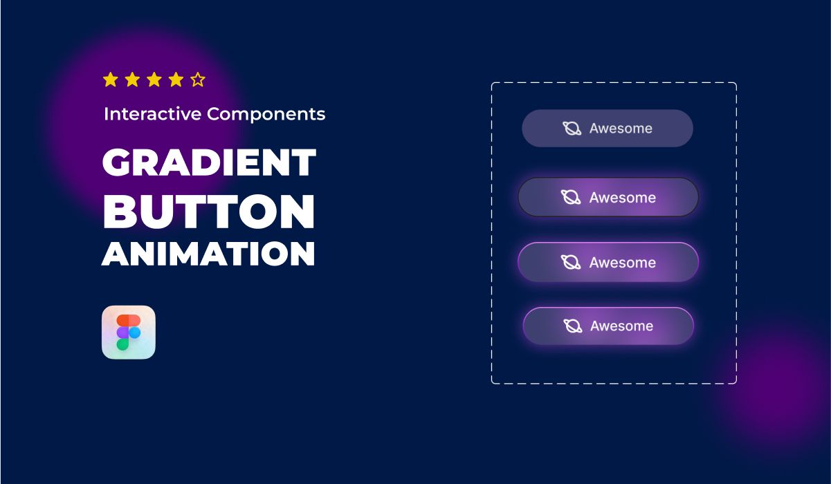
In this blog, we delve into crafting Gradient Button animations. Whether you’re an experienced designer or just starting, our guide covers it all. From concepts to reality, we’ll demonstrate how to infuse life into your designs, making them truly interactive.
Join us as we explore the art of creating visually appealing cards that not only look fantastic but also perform exceptionally. You’ll learn how to enhance user experiences and refine your design skills using Figma’s interactive features.
Gradient button animations can add a unique touch to your design. For an introduction to prototyping, first explore our Prototyping for Beginners: Mastering Figma Prototypes.
📥 Resources mentioned in this tutorial 📥
📥 Explore 1000+ UI Components: https://masterui.co/
📥 Get the template file: https://www.figma.com/community/file/1293828945540887738/figma-interactive-gradient-button-animation-ui-design
Conclusion
We trust that this tutorial has ignited your curiosity to explore the limitless possibilities of Figma and empowered you to create outstanding Gradient Button animations that will have a lasting impact on your audience.
Thank you for embarking on this creative journey with us. Be sure to put your newly acquired skills into practice and continue your exploration of the fascinating world of UI design. Don’t forget to share this tutorial with a friend, and stay tuned for our upcoming Figma tutorials and updates!
Now that you’ve designed a gradient button animation, enhance your Figma prototyping knowledge with the Prototyping for Beginners: Mastering Figma Prototypes guide.


