Before you create your FAB buttons, take a look at our Mastering Interactive Buttons in Figma: Design Engaging UI Components guide to learn how to add interactive features.
There are nine types of common buttons: elevated, filled, filled tonal, outlined, text, icon, FAB, Extended FAB, and Segmented.
In this tutorial, we’ll show you how to use Figma to design a FAB button in all of its different states and types.
1 – How to design a FAB button
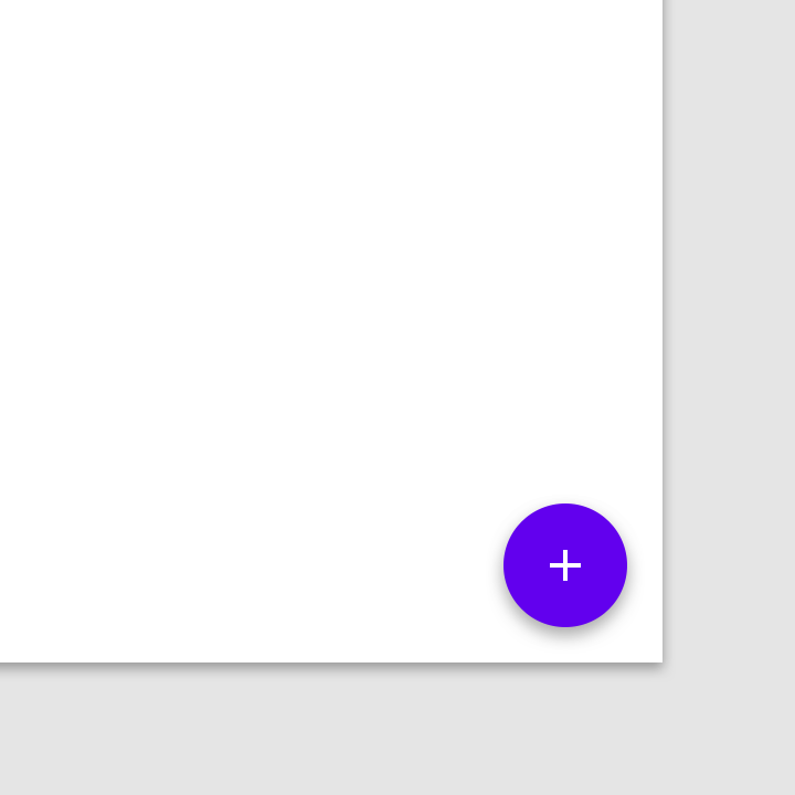
A floating action button (FAB) represents the main action of a screen.
A floating action button (FAB) does the primary, or most common, action on a screen. It appears in front of everything else on the screen, usually as a circle with an icon in the middle. FABs come in three styles: regular, mini, and extended.
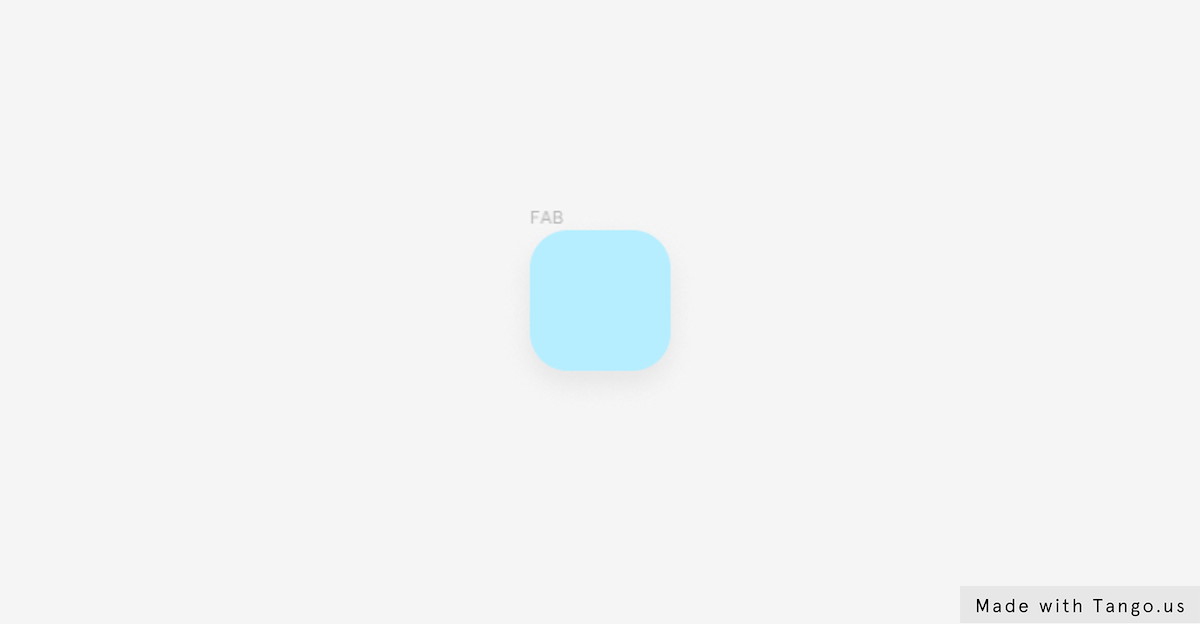
Create the button frame
- Pick the frame tool or use the keyboard shortcut F.
- Click and drag to draw a rectangular frame.
- Go to the Frame section in the right-hand sidebar and make the following changes: W 44, H 44, and corner radius 12.
- In the Fill section change the color code to B7EEFF.
Add a drop shadow effect.
- To create a drop shadow, go to Effects section and hit the plus icon to add a new Effect.
- Select the Effect icon to open the Effect’s settings modal.
- Then, add the Drop shadow settings: X: 0, Y: 4, Blur: 10, Spread: 0, Opacity: 7%.
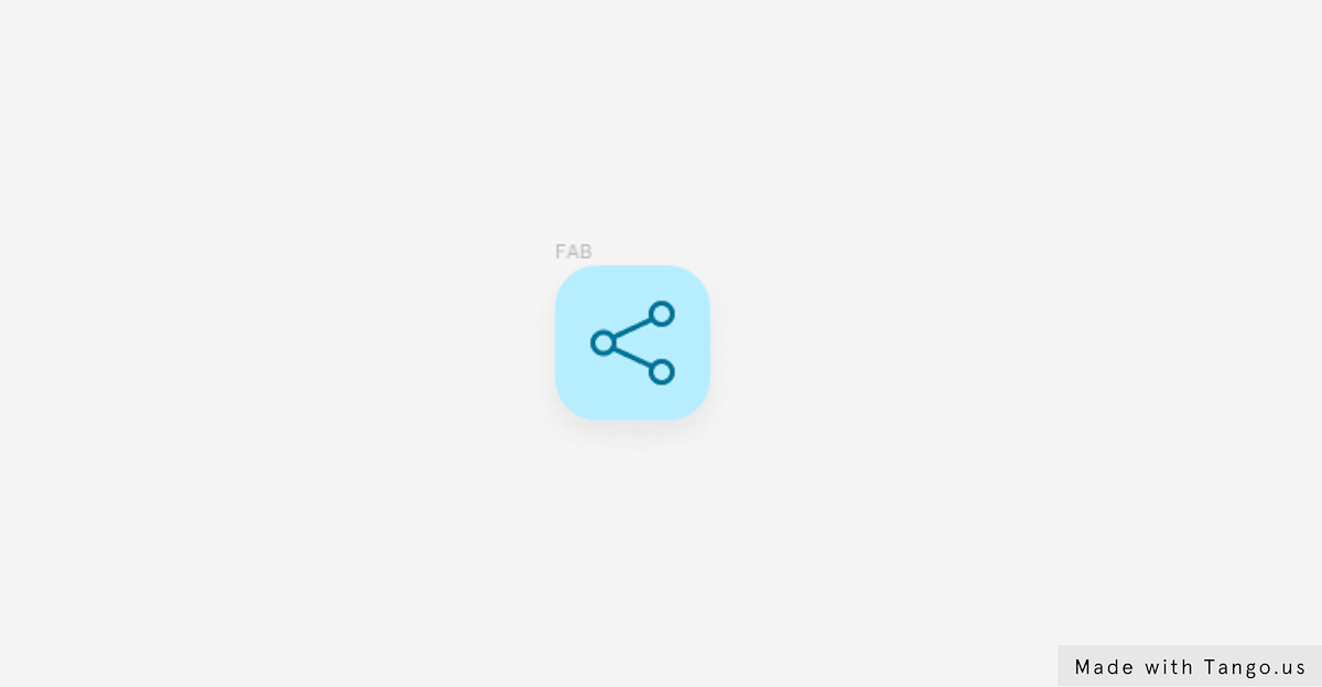
Add an icon
- To add an icon to our button, we’ll use the Iconify plugin.
- Select the Resources button in the toolbar and hit Plugins.
- Type “Iconify” in the search field.
- Hit Run next to the plugin name to trigger the Iconify plugin.
- You can look for any icon you want by using the search field in the plugin window. Let’s look for the “add” icon for our example.
- Select the icon among the verities of icons proposed by the plugin.
- To import the icon, just hit the Import Icon Button.
- Move the icon to the left side of the duplicated button frame.
- Select the icon frame and change it’s size to W24 and H24.
- Go to the layers panel and select the vector layers of the icon.
- Move to the Fill section in the right-hand sidebar add change the default Fill code to “00779C“.
Transform the button frame to Auto layout
- Select the button frame and go to the Auto layout section.
- Hit the plus icon in the right corner to add an auto layout.
- Change the horizontal padding value to “10”.
- Also change the vertical padding to “10”.
Here’s what our raised button should look like when it’s done.
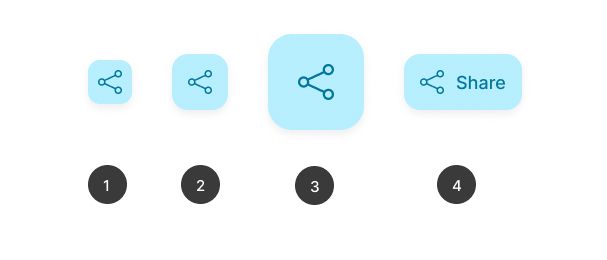
2 – How to design FAB button Variants
As you create components and build out your design system, you’ll find the need for components that are similar to each other, with only slight differences. For example: you might have multiple components for buttons, with separate components for various states and sizes, as well as light and dark modes. https://help.figma.com/hc/en-us/articles/360056440594-Create-and-use-variants
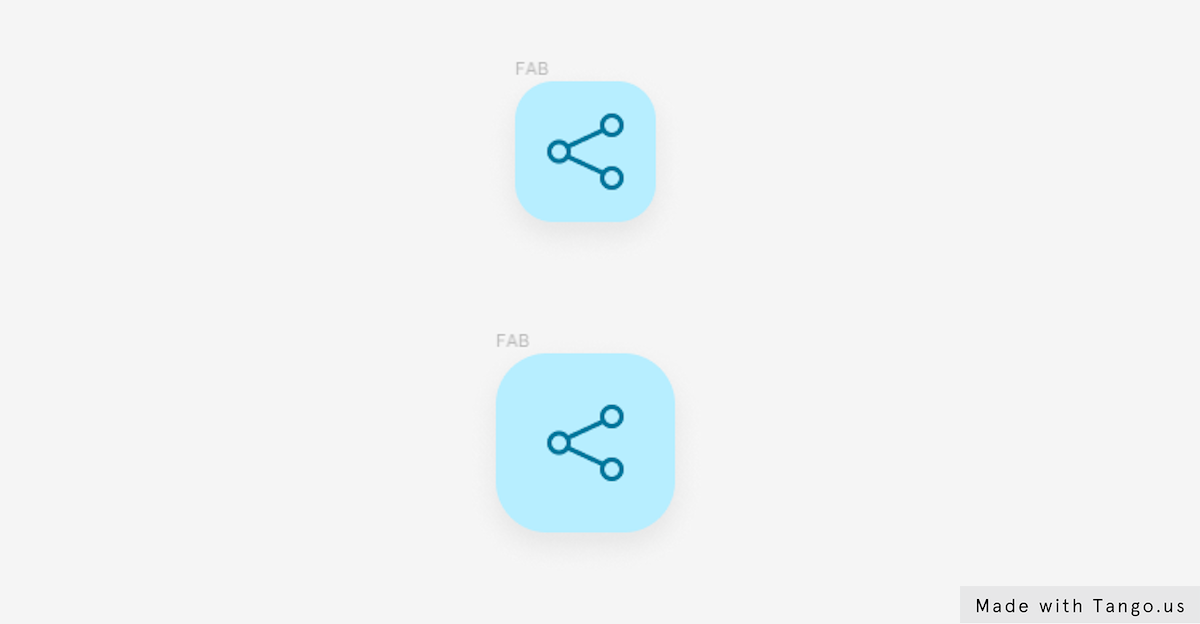
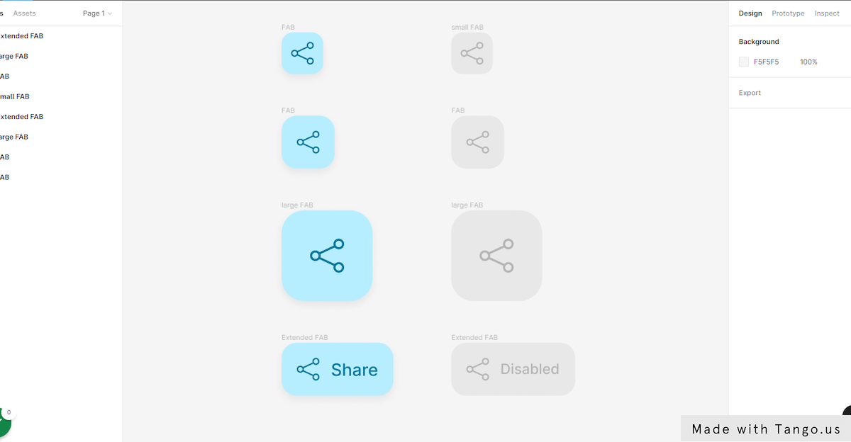
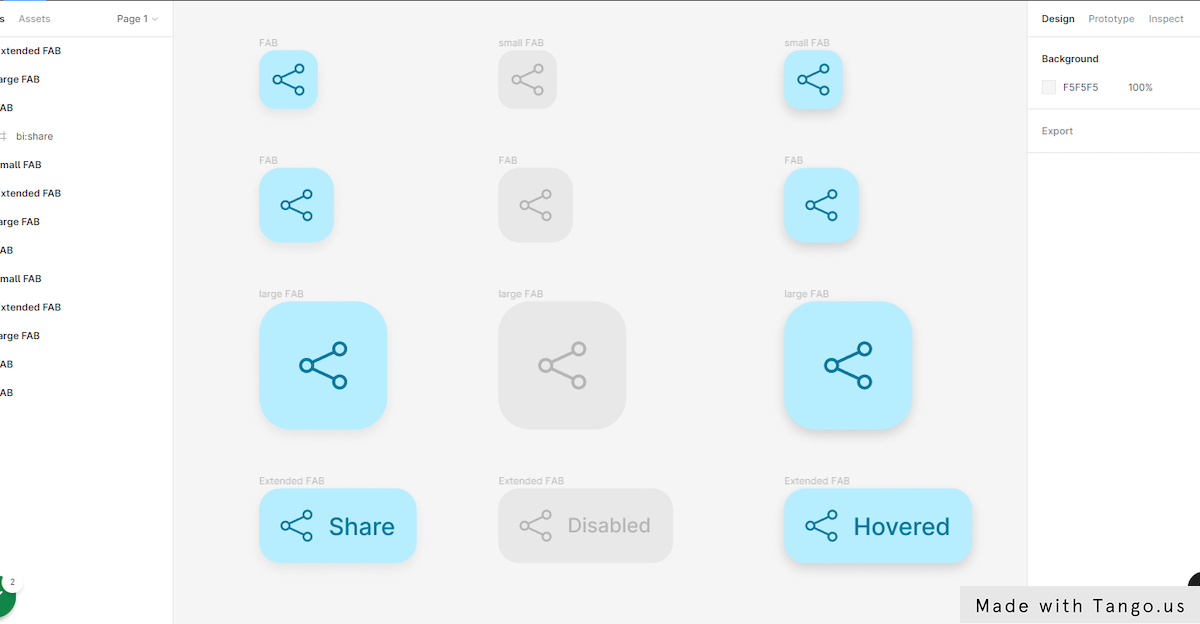
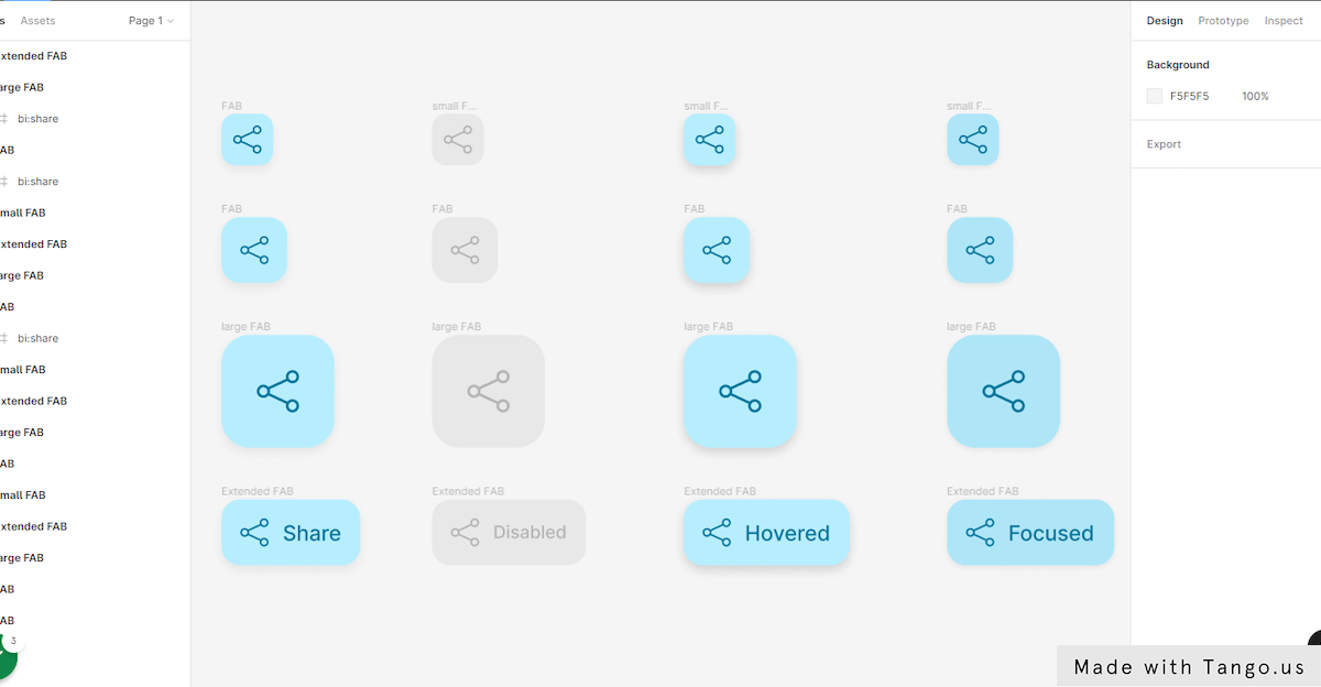
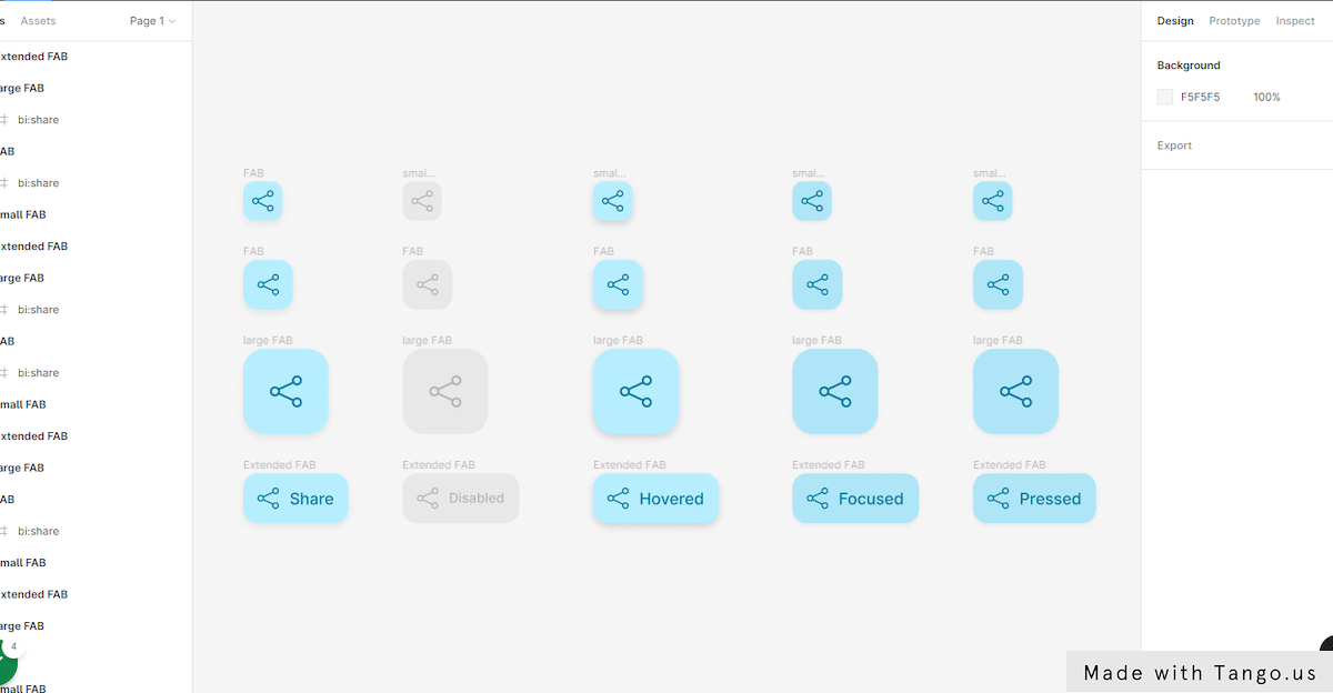
FAB button variants: FAB, small FAB, large FAB, and Extended FAB.
1 – Create a medium size FAB button
- First, let’s select our FAB button.
- Right click and select Copy or use the keyboard shortcut command or Ctrl + C.
- Right click on a blank spot next to the button and hit Past here.
- Go to the Frame section in the right-hand sidebar and change the corner radius value to “16“.
- Go to the Auto layout section.
- Change the horizontal padding value to “16”.
- Also change the vertical padding to “16”.
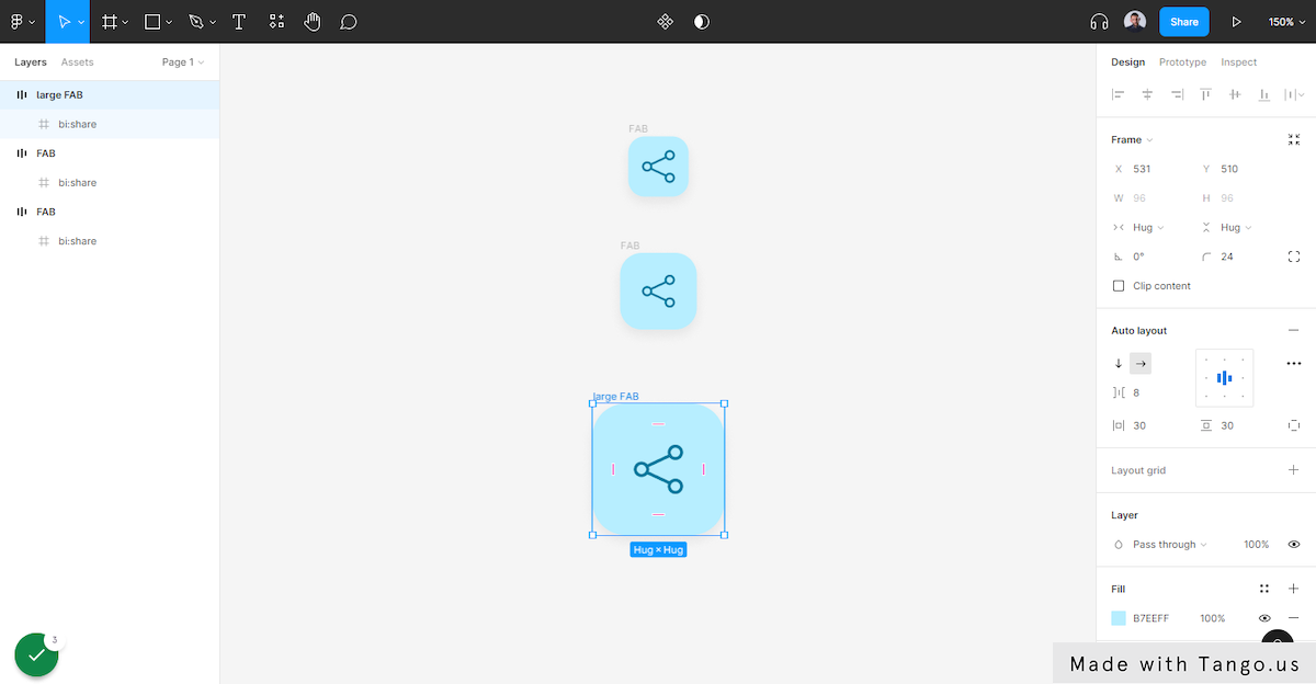
2- Create a large size FAB button
- Select the medium size FAB frame.
- Right click and select Copy.
- Right click in a blank spot under the last button and hit Past here.
- Go to the Auto layout section.
- Change the horizontal padding value to “30”.
- Also change the vertical padding to “30”.
- Go to the Frame section in the right-hand sidebar and change the corner radius value to “24“.
- Select the icon frame and change it’s size to W36 and H36.
That’s all we need to do for this variants.
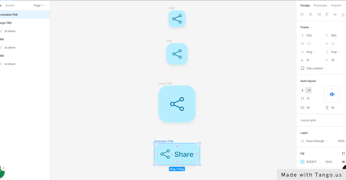
3 – Create an extended FAB button
An extended FAB is a FAB with a text layer.
- Select the medium size FAB frame.
- Right click and select Copy.
- Right click in a blank spot under the last button and hit Past here.
Create our button’s text
- Pick the text tool in the toolbar or use the shortcut T.
- Click on the right side of the icon in the button’s frame and type “Enabled“.
- Go to the text section in the right-hand sidebar and change the font size to 18.
- Click on Text align center to center the text.
- In the Fill section, change the text color to “00779C“
- Next, select the button frame and go to the Auto layout section.
- Change the spacing between value to “12“.
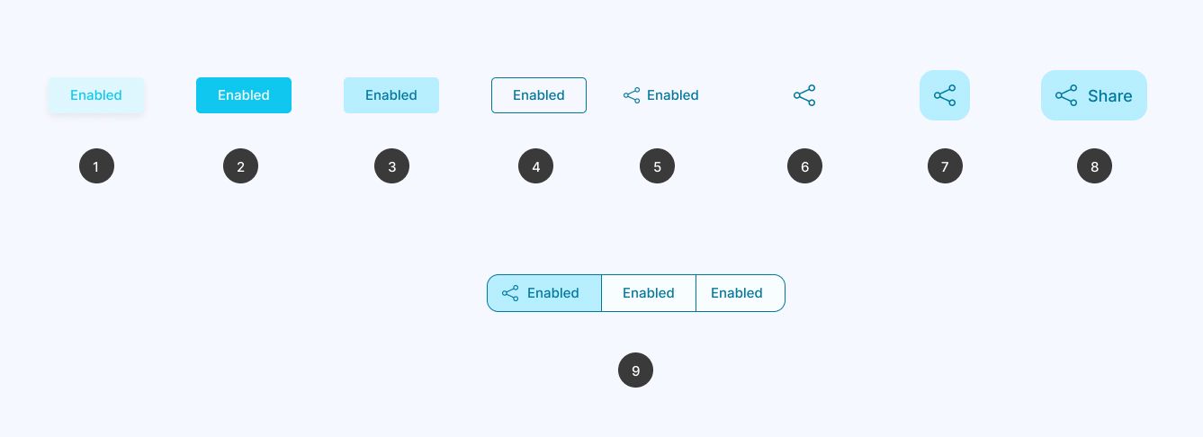
3 – How to design FAB button states
States are visual representations used to communicate the status of a component or interactive element.
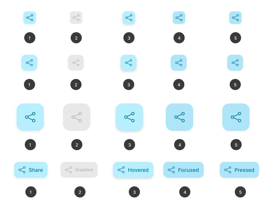
1- FAB button disabled state
- First, Select all four button variants.
- Right click and select Copy or use the keyboard shortcut command or Ctrl + C.
- Right click in a blank spot beside the variants and hit Past here.
- Keep the duplicated variants selected and go to the Fill section and change the color code to “E8E8E8“.
- Next, go to the Selection colors section and change the text color to “B5B5B5“.
- After changing the color, go to the Effects section and remove the drop shadow effect using the – icon.
- Now, move to the layers panel and rename the duplicated variants to “Disabled Button“.
Here’s the final result of the disabled state of the variants.
2- FAB button hovered state
- Let’s select the four default button variants.
- Right click and hit Copy.
- Right click next to the disabled variants and select Past here to duplicate.
- Go to the Selection color section and replace the button background color to “B7EEFF”.
- Also change the icon color to “00779C”.
- Then, change the Drop shadow settings to: X: 0, Y: 4, Blur: 10, Spread: 0, Opacity: 15%.
- Now, go to the layers panel and rename the duplicated variants to “Hovered Button“
Here’s the final result of our hovered state.
3- FAB button Focused state
- First, select the four hovered state buttons, just like we did with the other states.
- Right click and select Copy or use the keyboard shortcut command or Ctrl + C.
- Right click in a blank spot next to the hovered variants and hit Past here.
- Go to the Fill section and change the Fill color code of the variants to “AEE6F8“.
- Go to the Effects section and select the drop shadow effect icon to trigger the effect modal.
- Change the drop shadow setting to: X 0, Y 2, Blur 6, and opacity to 7%.
- Now, move to the layers panel and rename the duplicated variants to “Focused Button”.
4- FAB button Pressed state
Last but not least, we need to make our selected states. This time, we’ll keep the settings the same as for the focused state.
- Select the Focused state buttons.
- Right click and select Copy.
- Right click again next to the Focused state variants and select Paste here.
- Now, rename the duplicated variants to “Pressed Button”.
And here is a view of all the states of our variants.
4 – Add the FAB Buttons frames to Figma Components
In this part, we’ll give our variants some Figma magic. We’ll combine all of our buttons into a single component. This will let us access all of our buttons’ states and options from a single component.
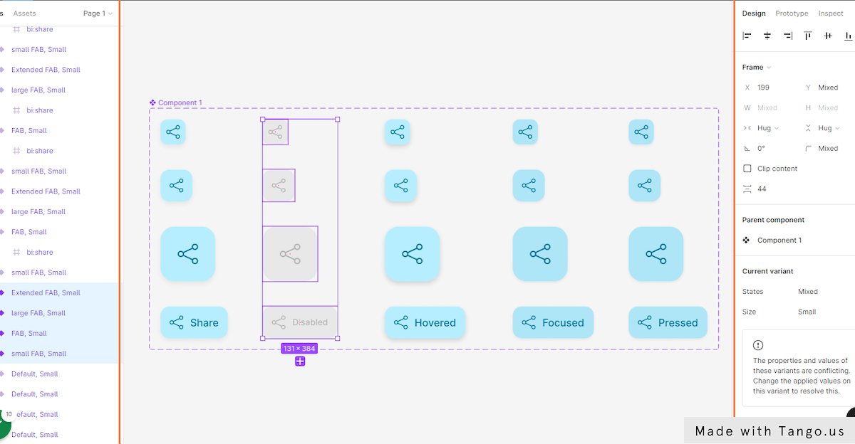
- First, let’s select all our buttons.
Create component set
- Go to the center top bar and hit the arrow beside the component button.
- Click on Create component set.
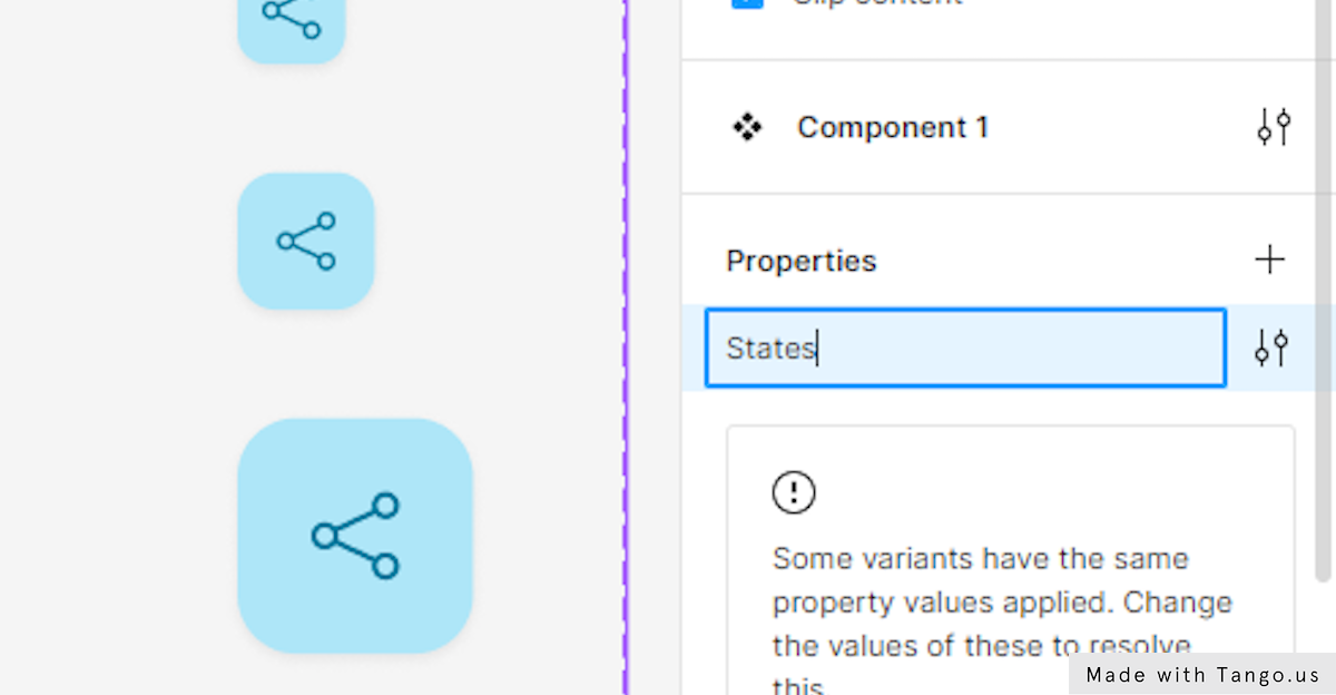
- Move to the Properties section and double click on Property 1.
- Rename the Property 1 to “States”
- Next, click again on the + icon besides Properties to create a second component property.
- Choose Variant from the property menu.
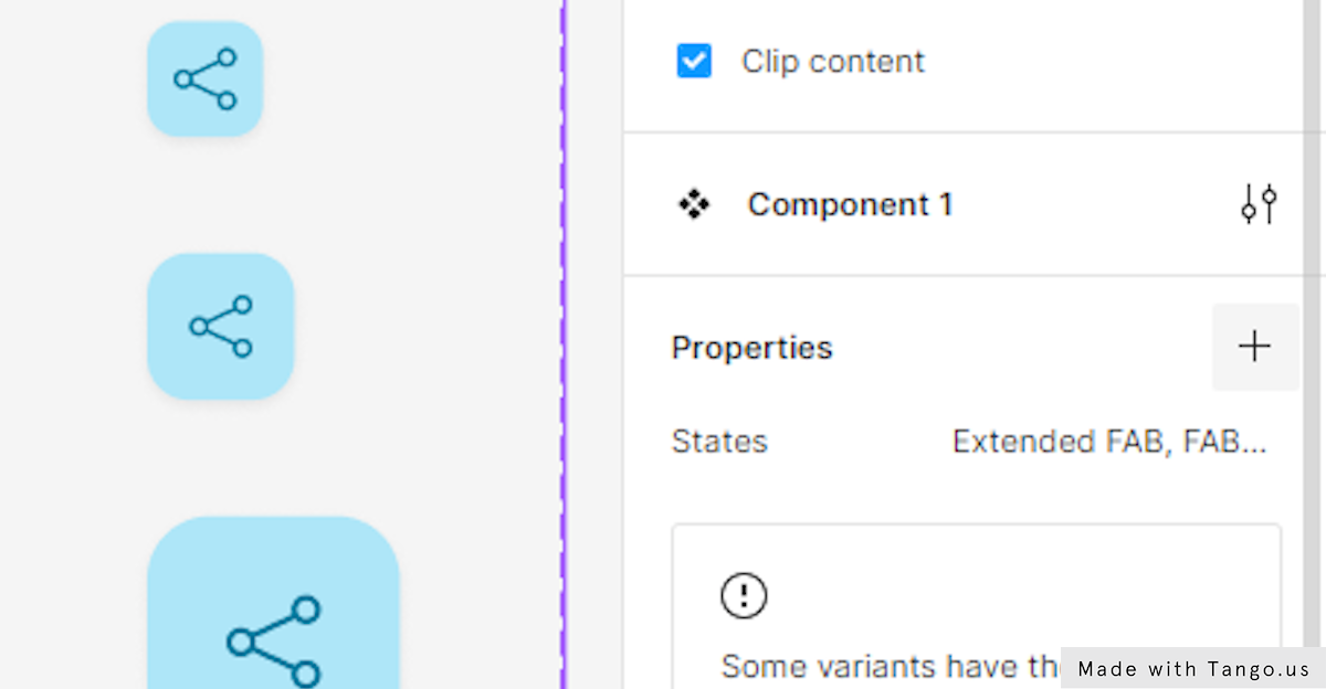
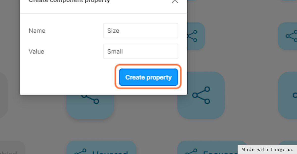
- The name of our new property will be “size”.
- Type “small” in the Value input.
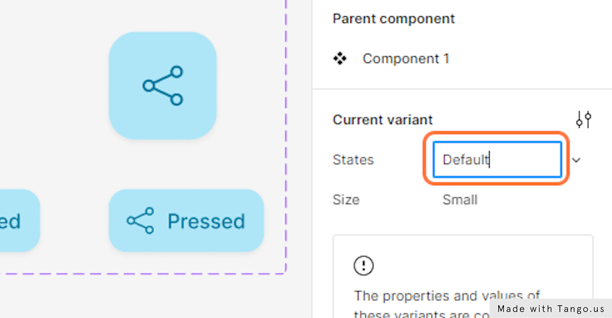
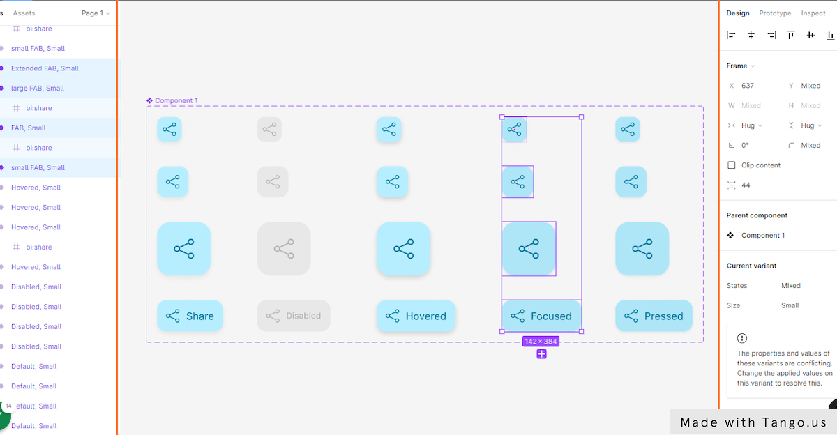
- Now, select the default button states.
- Move to the Current variant section in the right-hand sidebar and Type “Default” beside States.
With this, we have given our default variants the property Default.
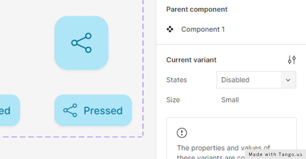
- Next, select the disabled variants’ states.
- Go to the Current variant and Type “Disabled” exactly like we did with the default variants.
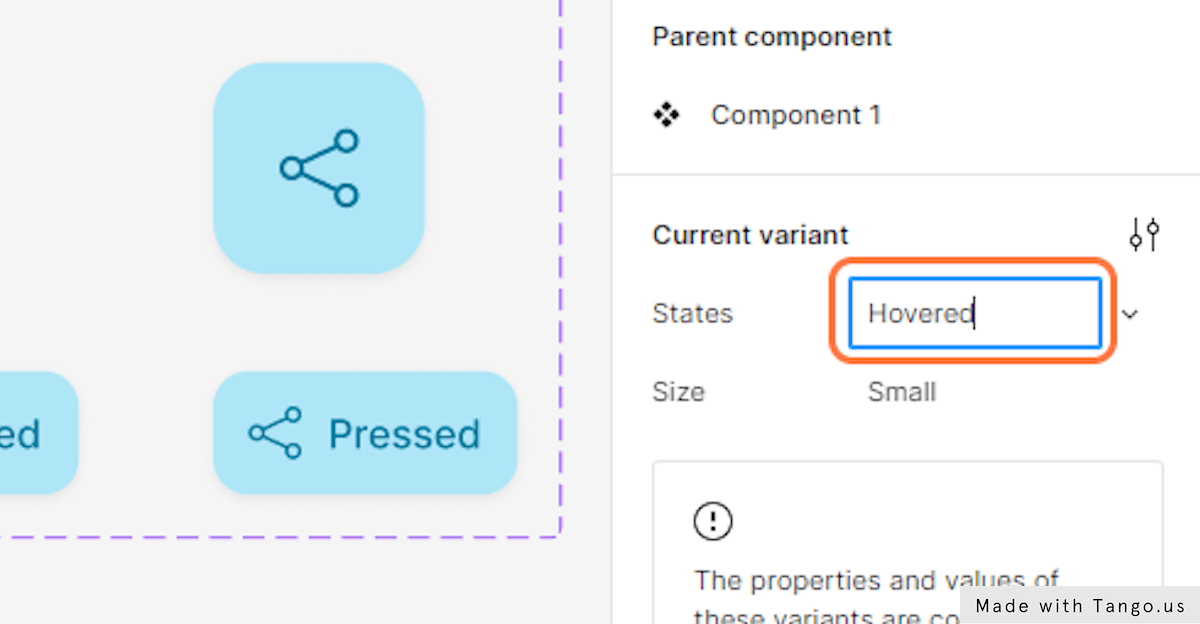
- Go back once more to your variants and select the Hovered state variants.
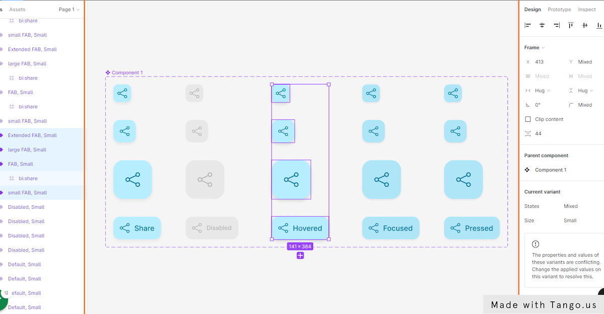
- In the Current variant section Type “Hovered”.
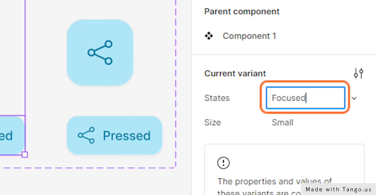
- Now, select the focused state variants.
- And type in Focused to the Current variant States.
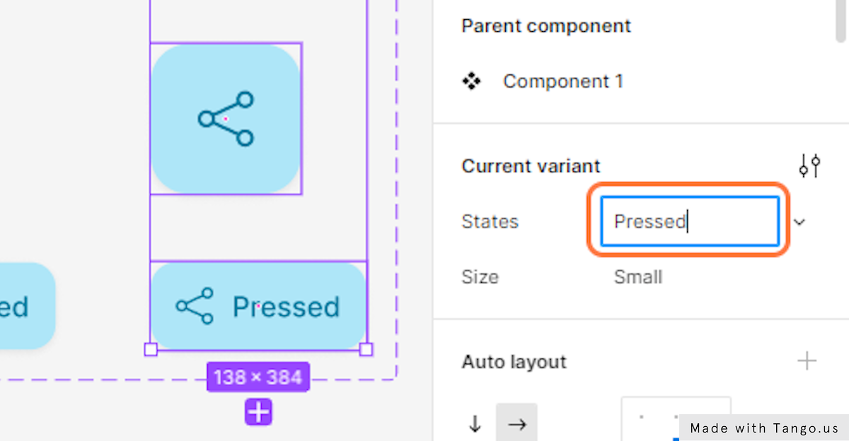
- Next, Select the Pressed state variants.
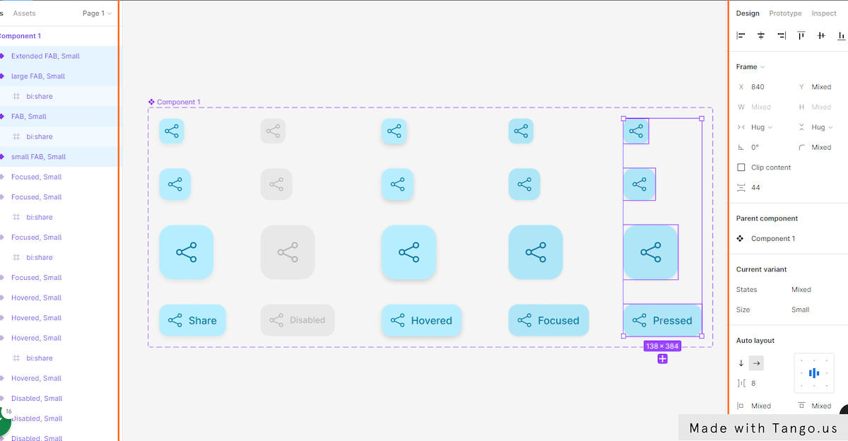
- And type “Pressed” in the Current variant States.
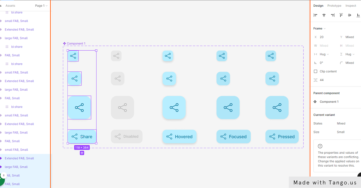
- Now, select the first five variants that have icons.
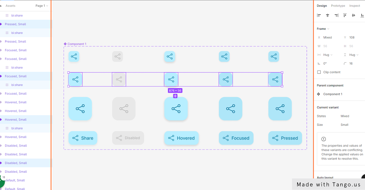
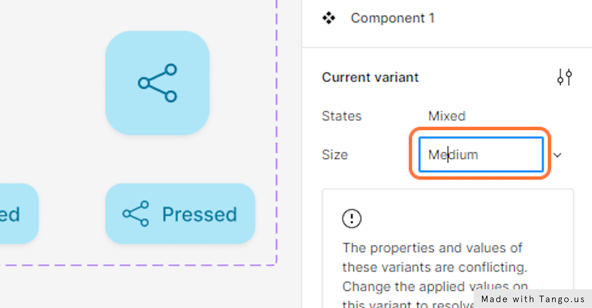
- Go to the Current variant and Type “Medium” beside the size property to confirm that those variants are the mid sized FABs.
- Next, select the large FAB variants.
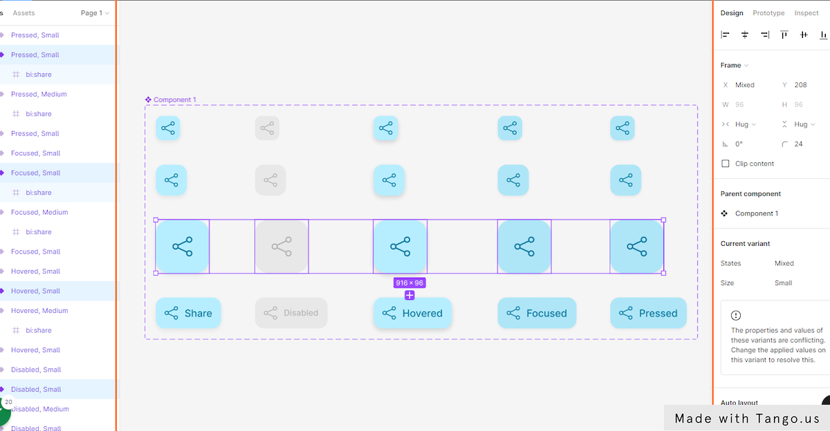
- Go to the Current variant section and type “Large” beside the size property.
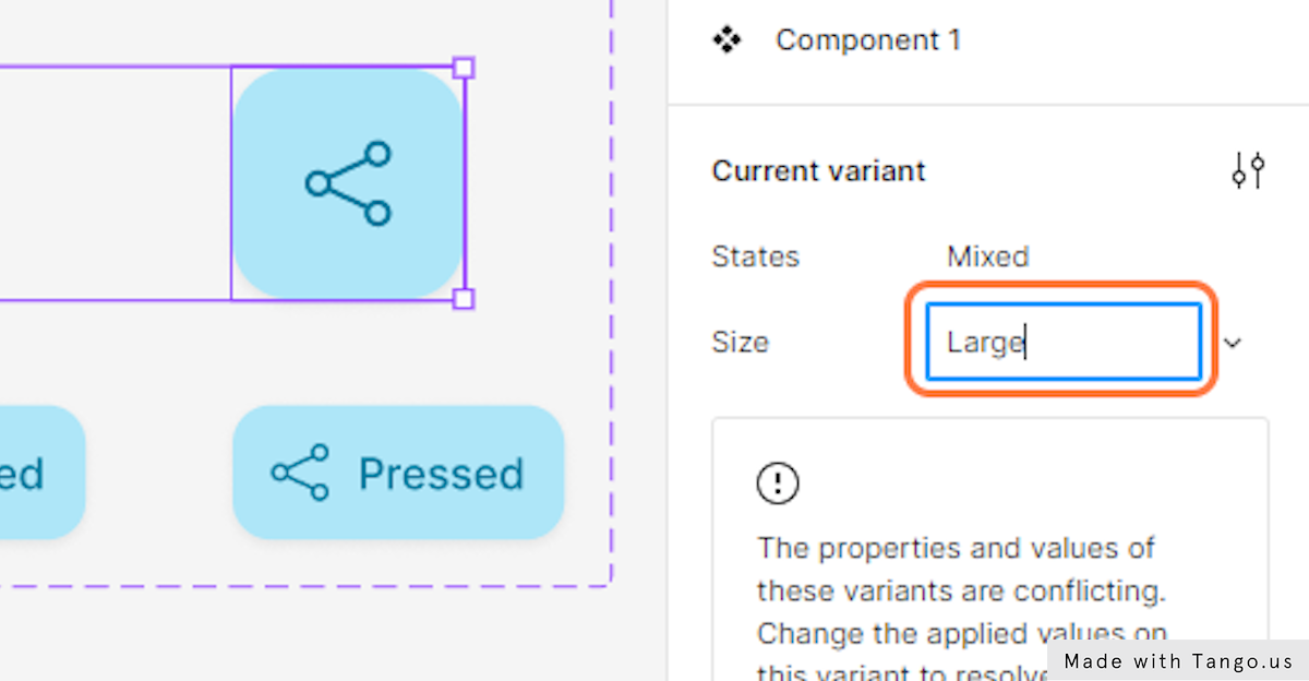
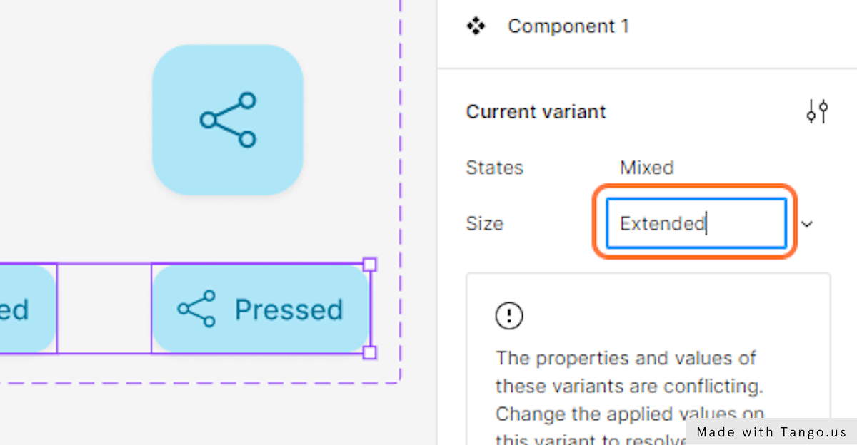
- Last, select the extended FAB variants.
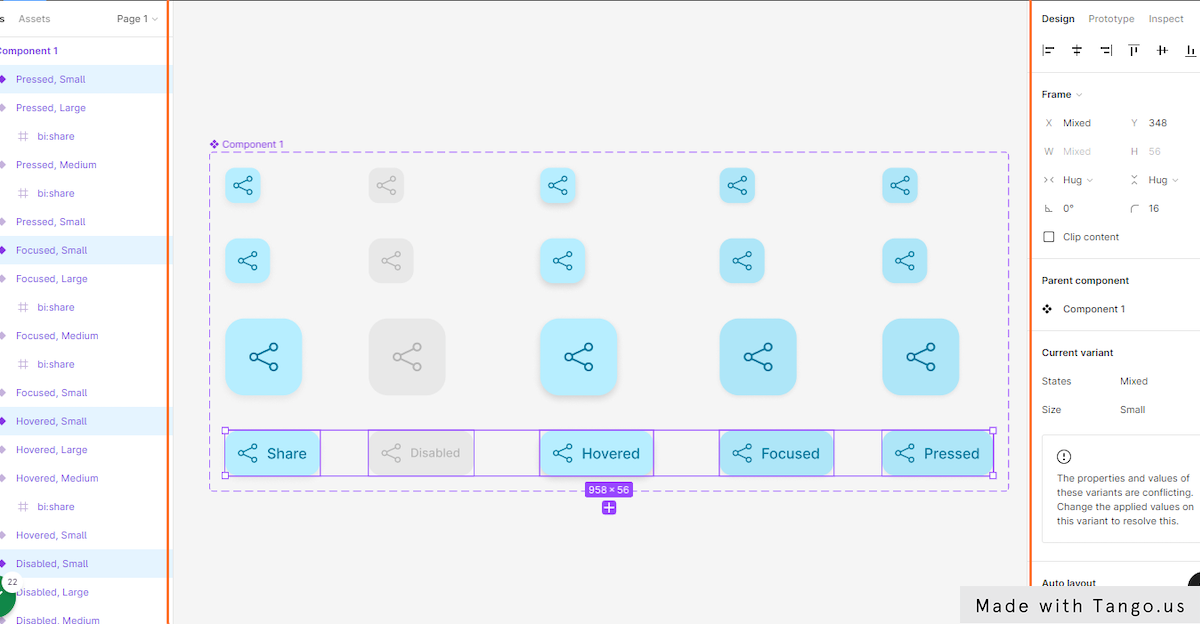
- Add the Extended value to the size property.
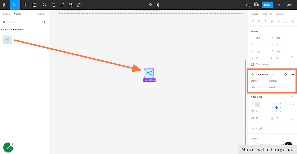
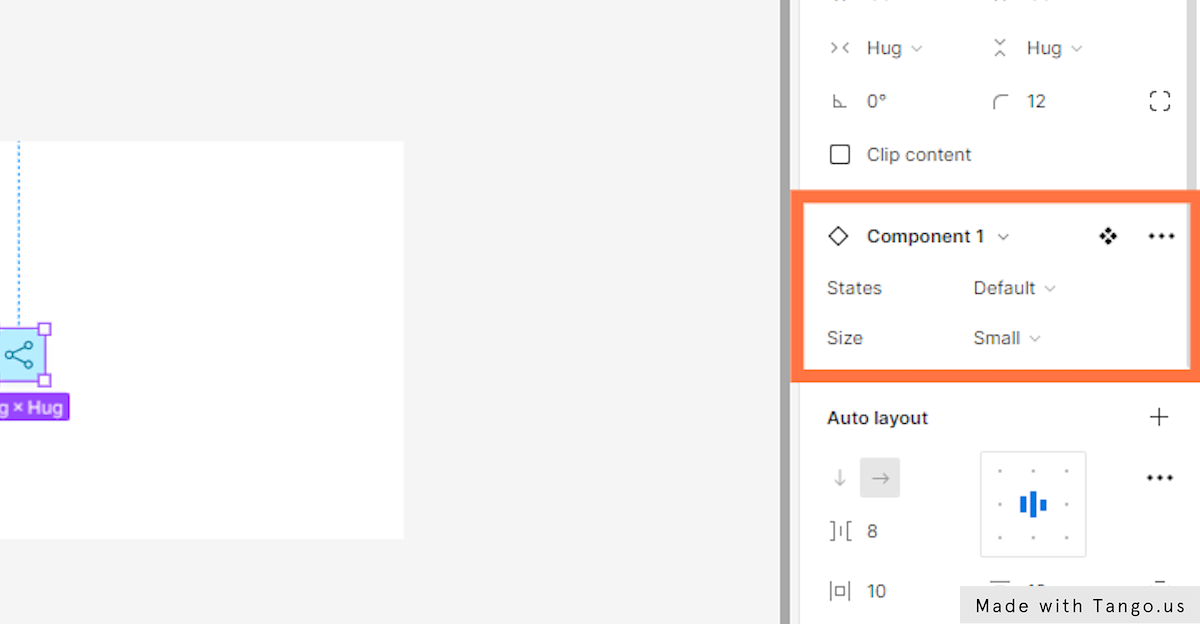
- Now, go to the Assets tab in the layers panel and drag and drop our button component to the canvas.
- In the right-hand sidebar, under “Components,” you should have the same settings as in the screenshot.
- Use the properties panel to switch between different variants’ stats and sizes.
If you want to see a variant’s states, just click the arrow next to “Default value,” and a menu will pop up with all the states. By clicking on the size menu, you can switch between button’s sizes.
5 – Create Interactive FAB buttons – Interactive components
In this last part, we’ll use Figma’s prototyping features to make the states of our components interactive.
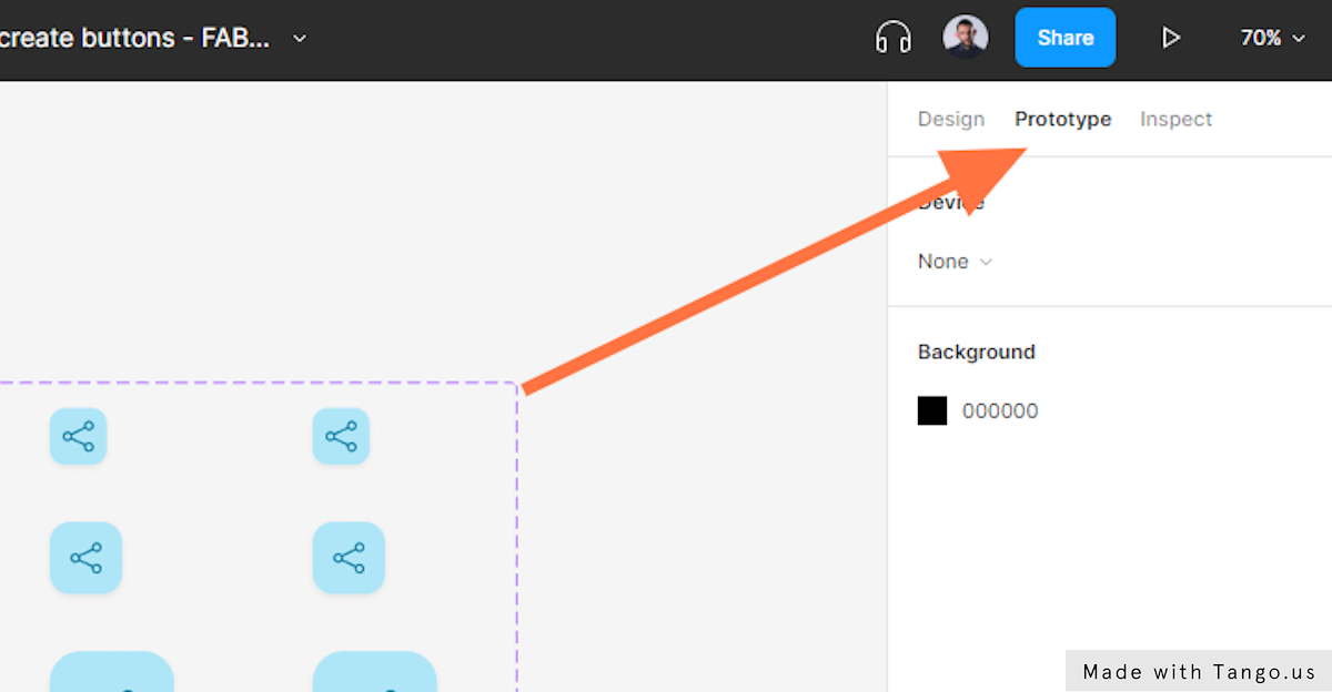
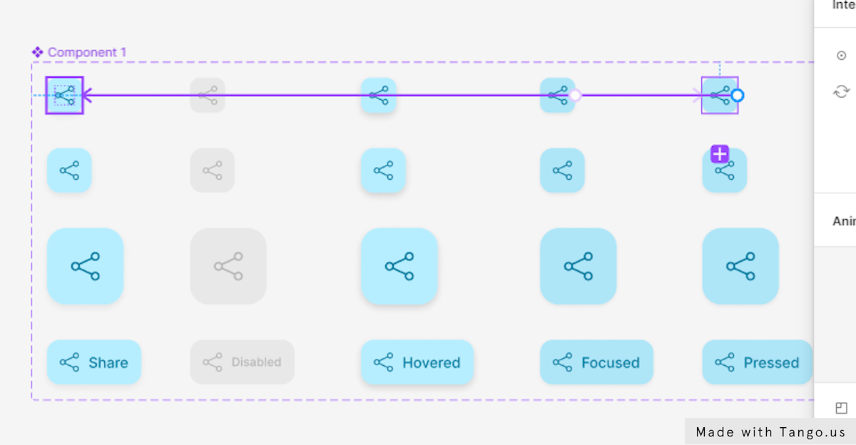
- First, select the top left variant.
- Go to the top menu of the right-hand sidebar and select Prototype.
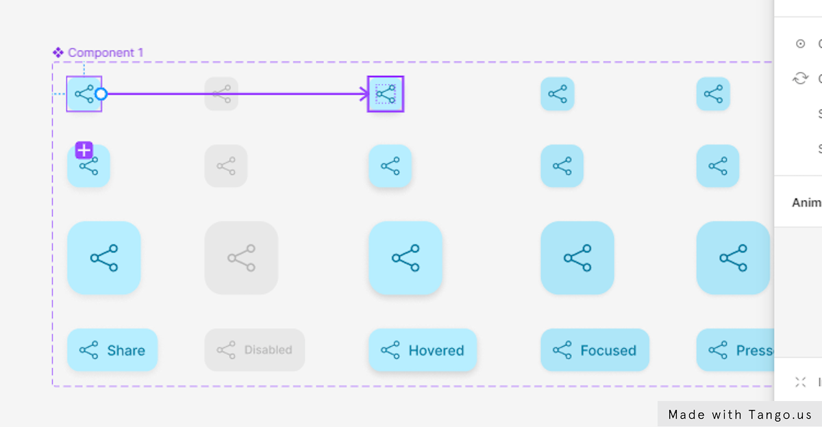
Create a link between variants.
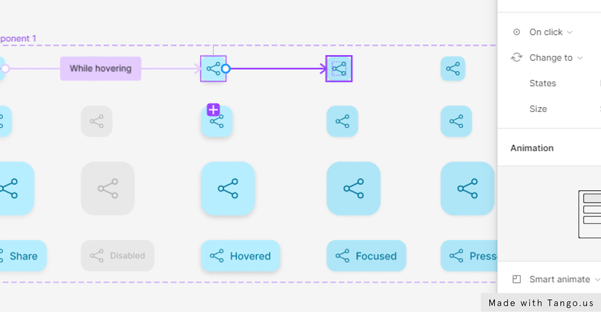
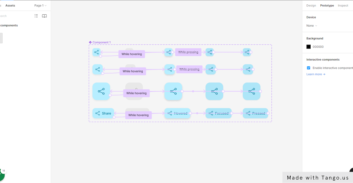
When you move your mouse over the frame of the variant, a small circle shows up on the right side of the button. Click on that circle and drag it straight to the Hovered state version. This will link the two different variants.
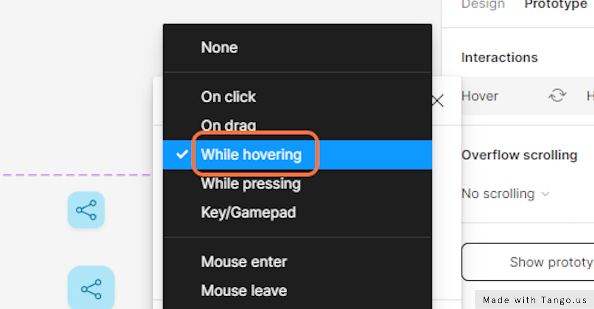
- On the right side of your canvas, you’ll see a menu. Choose While hovering.
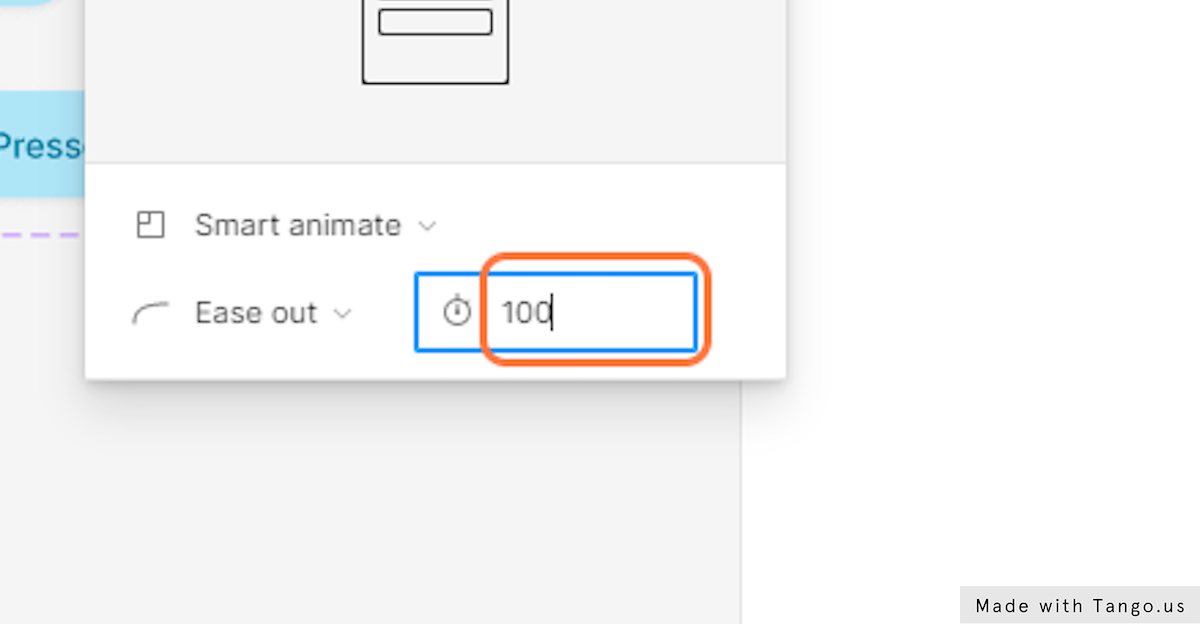
- Then, at the bottom of the prototyping settings panel. Select the animation setting menu and choose Smart animate.
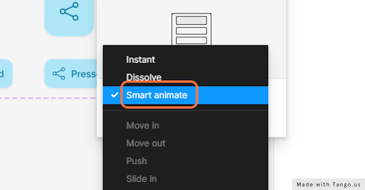
- Set the animation speed to “100”.
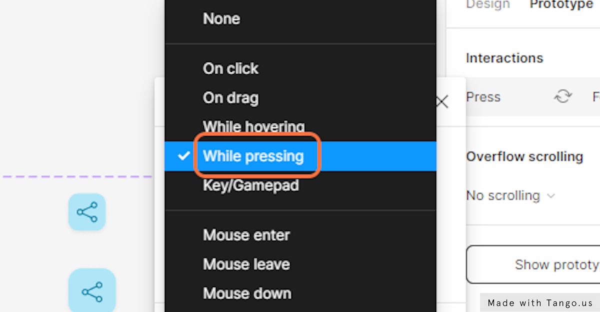
- Next, select the hovered state button and draw a link to the Focused state.
- In the menu select While pressing.
- Again, select the Focused state and draw a link to Pressed state.
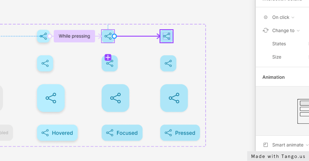
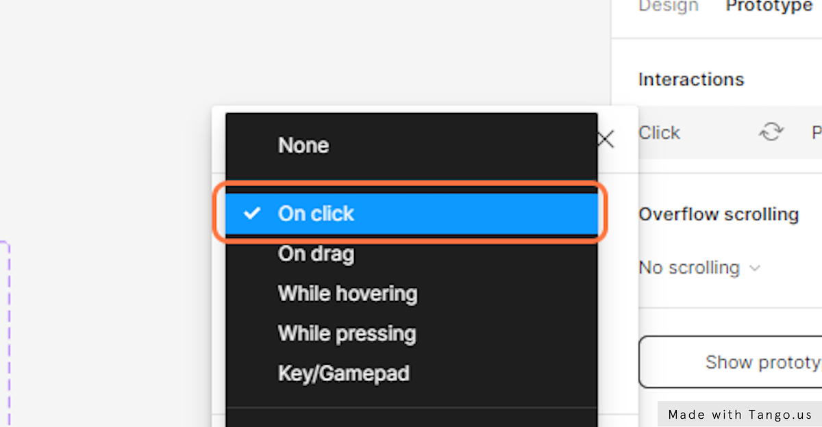
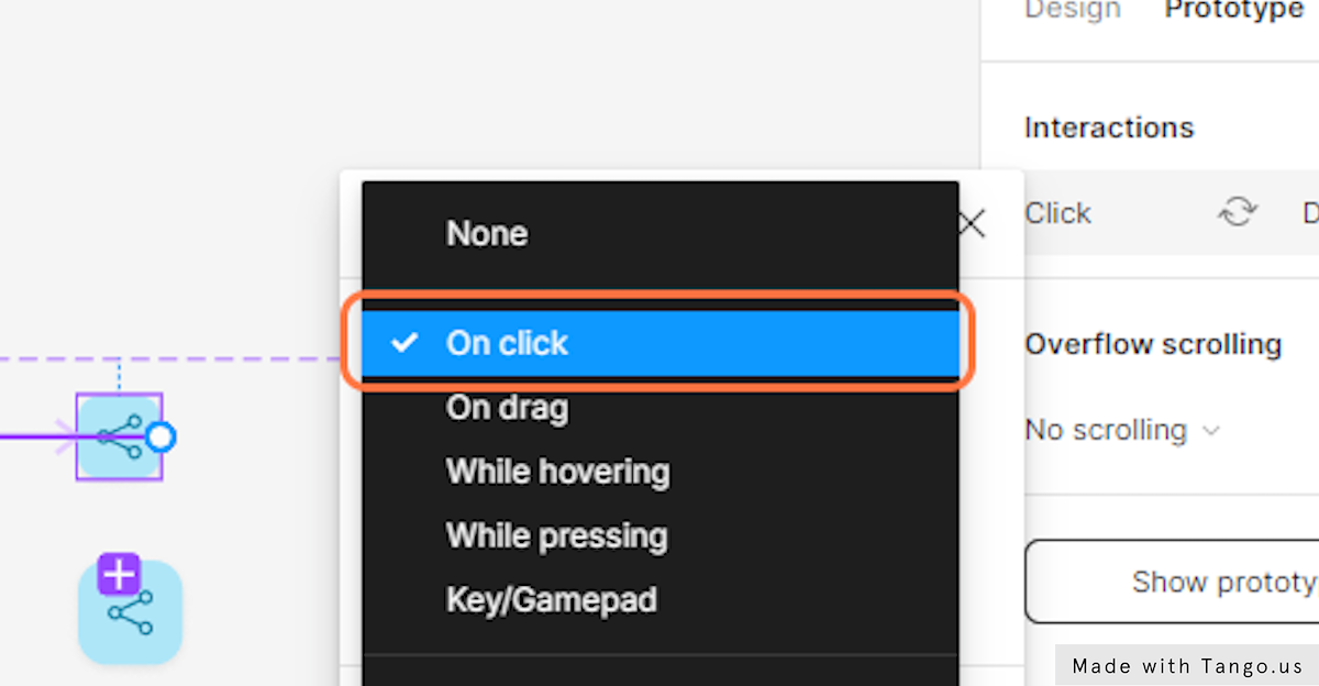
- This time choose On click in the Interaction menu.
- And last, select and draw a link between the selected state and the Default state.
This will make it easy to click back from the selected state to the default state.
- Choose On click in the interaction menu.
I did the same thing for the other variants to get through this part faster.
Interactive component in action
Now to see the button interactive component in action:
- Let’s pick the frame tool or use the shortcut F.
- Create a frame on your canvas.
- Go to the Assets section and drag and drop the button component to the center of the frame.
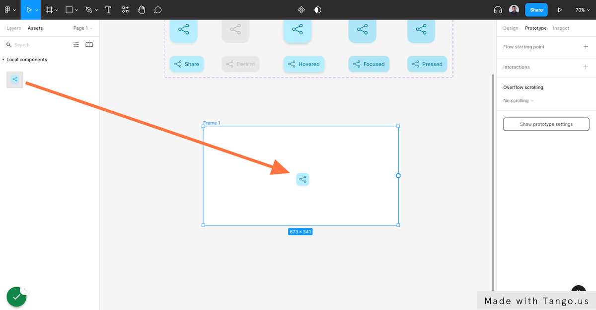
- Next, go to the top right corner of the editor and hit the play icon.
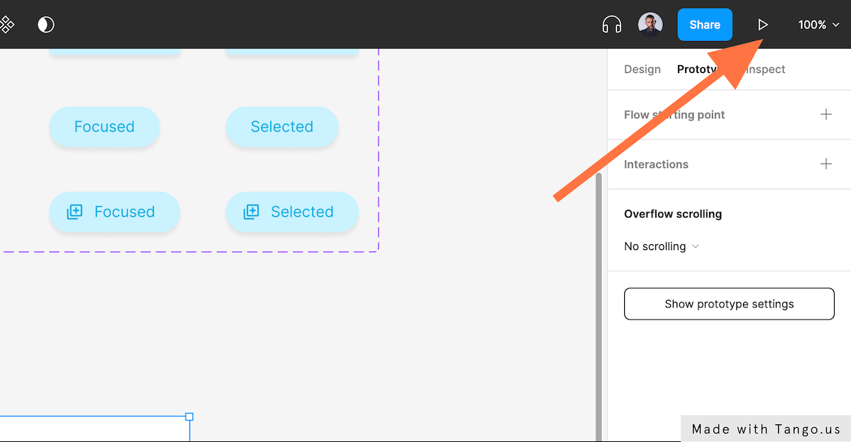
- Figma will open the prototyping player in a new angle. Hover or press or click on the button to see the button’s states changing.
- You can also change the button sizes in the variants section to see how it works in the prototype player.
Conclusion
You now know how to design a full-featured, dynamic button with variants that you can use in your design files and share with your team.
I hope you found this tutorial helpful; if so, you’ll appreciate our other Figma tutorials.
If you want to continue your Figma learning experience, we’ve got you covered with everything from creating a new file to organizing your files to collaborating with your team.
Please share this tutorial with your friends who want to learn Figma; it would mean a lot to us. We’ll see you in the next Figma tutorials.