Did you ever find yourself drowning in all the Components you’d built for your design’s project? In this regard, I’d like to share with you how I keep the components of my design well ordered.
From buttons to complex navbars. The number of components you’ll have to create to design a full project can exceed 100 + components easily. So, if you don’t take the time to properly arrange the components, your design space can become saturated, making it difficult for you to work through the components you’ve built and also confusing your team members as they try to find their way through all the components.
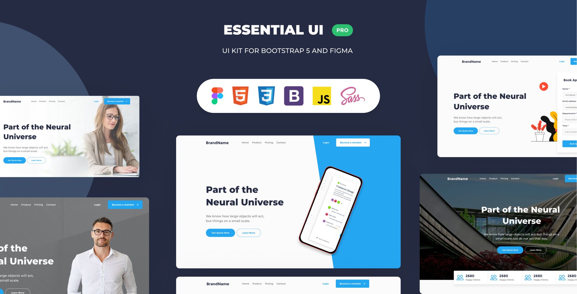
In this post, I’ll show you how I arrange my components using the Essential UI Kit file as an example.
Essential UI pro Components
Essential UI Pro holds a library of basic Ui Component, like Buttons, Forms, Tables, navbars, cards, and filters. Every UI component is reliable, effective, and easily customizable.
The library contains six groups of components: Buttons, Forms, Tabs and Lists, navbars, Cards, and Filters.
How to organized the 100+ components
1- Group all the Components in one page
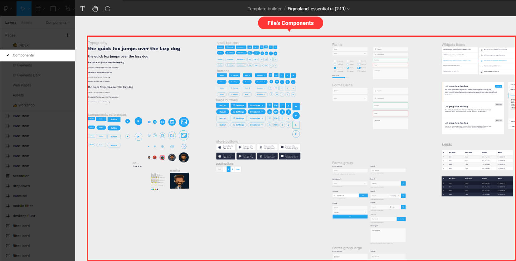
I started by creating a page where I can hold all my components in a single place.
2 – Groups of similar components inside a frame
I created a reference for each component, then merged them into a single frame and labelled it “components reference.” For example: small button, medium button, big button, and so on.
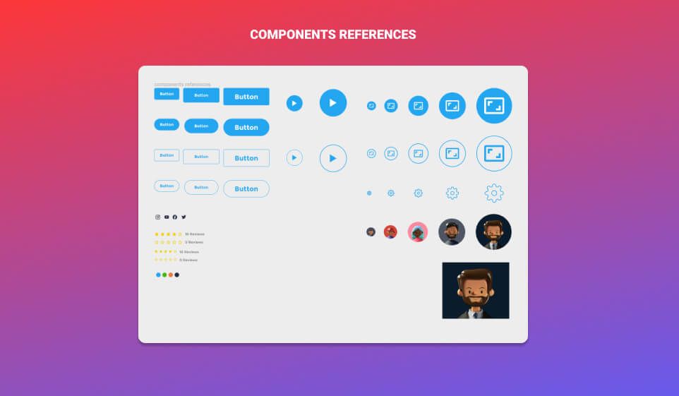
Then I built variants of each reference to enlarge the library. In my canvas area, I arranged my components horizontally. I begin with the buttons on the left side of the canvas, creating combinations of all the buttons I need for my project and grouping them within a single frame. I then built the forms, followed by tables and widgets, navigation bars, and finally combinations of UI cards for the product and blog posts items. all the components I create are determined by the project I am working on.
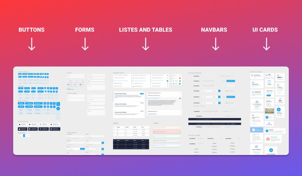
Now, let’s see in more details each components group in the essential UI pro file and how it is Structured.
Now, let’s take a closer look at each components group that I’ve created for the essential UI pro file.
1 – Buttons
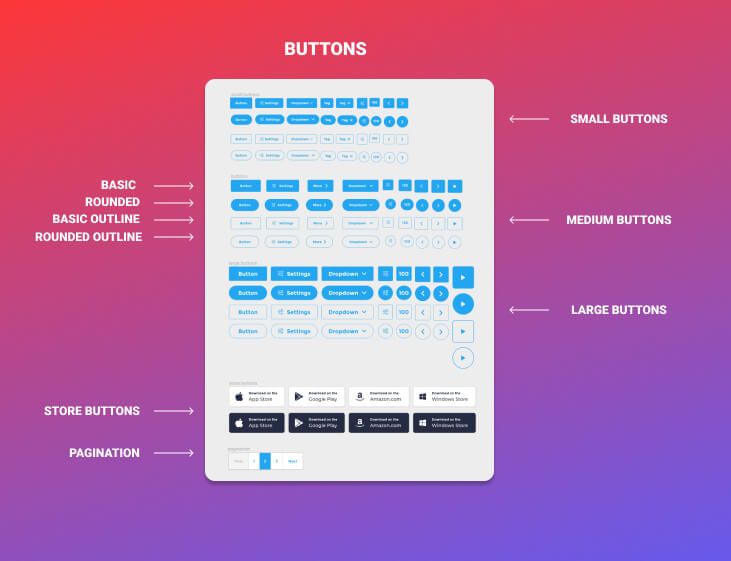
Buttons are divided into four types, each with three standard sizes: small, medium, and large. The scale and style variations of the buttons are based on what is actually found on the majority of common web interfaces. Each button is on auto-layout mode. Essentially, the button’s total size would resize dynamically in relation to its content.
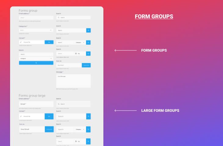
2 – Forms
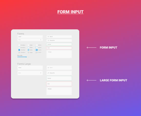
Forms are divided into two categories. Each type category is available in two sizes: regular and large.
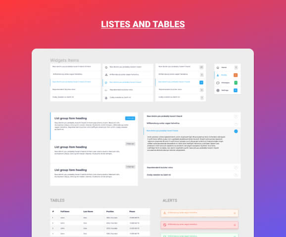
3 – Tables and lists
I made a series of tables and various lists to facilitate the creation of sidebars and dashboard features.
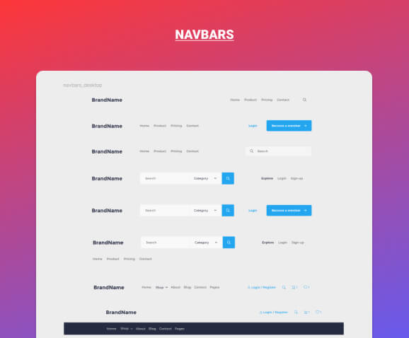
4 – Navbars
The most interesting elements in this file are the navbars. I designed a number of navbars for both mobile and desktop use. navbars are designed to fit with a variety of designs, from a simple landing page to an eCommerce website.
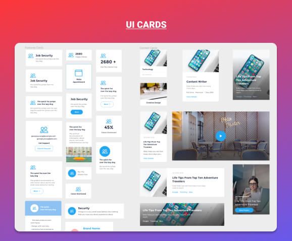
5 – Cards
Cards components are designed to produce blog post items, feature elements, testimonials, and pricing.
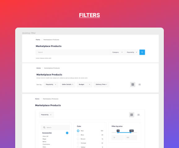
6 – Filters
Filters are complex components made up of simpler components such as buttons and forms. Filters was created to aid in the creation of dashboard interfaces and eCommerce websites.
Now you have a clear idea of how you can organize your components however the amount of components you create.
I hope you found this short tip helpful. Thank you so much for your time and soon I will be back with a few short tips.
