For a complete breakdown of organizing and managing Figma files, check out our Figma File Management for Beginners: A Comprehensive Guide.
When it comes to design in Figma, you have the option to create your design on a single page and stack all your UI elements in a single area, or you can use pages to divide items to make your design clear and less saturated.
Frequently, our files grow in size as a result of the components and iterations of the projects we make. It is important to maintain order. Otherwise, we risk being disoriented inside our file and make collaboration with our teammates difficult.
One thing that helps avoid this situation is the Figma’s page feature. To keep your stuff organized, you can build pages within your file. You might, for example, create a page dedicated to your components, another for the design screens, and a separate page for each design iteration.
Here in this short post, I will use the Essential UI Pro Figma file as an example to show you how I use pages to organize my design.
Essential UI Pro

The Essential UI Pro is an Ui Kit, with 500+ Figma and HTML components, Ui Elements, pre-built layouts and more. Consequently, when I created the Essential UI kit, I knew it would be a massive file with hundreds of UI elements. Since I was creating this file not just for myself, but also to make it available to other designers and creatives, I had to consider the file’s organization carefully.
The Essential UI Pro File Structure
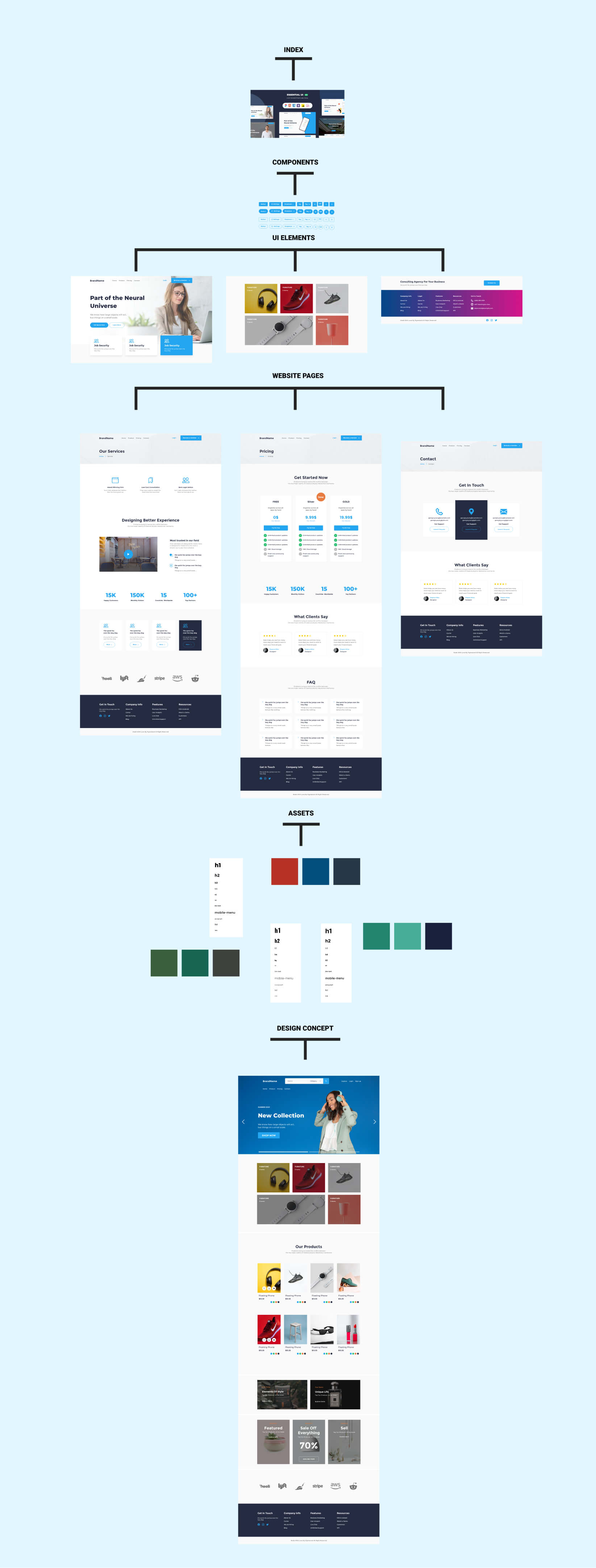
The Essential UI Pro file is divided into six main pages: the index page, the components page, the elements page, the web/app screens page, the assets page, and the workshop page.
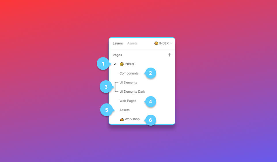
1 – The index page
When my clients and team members open the file, this is the first thing they see. I only make this page for the preview thumbnail in order to make a good first impression on my clients. I also included a list of all the external resources that were used in this file. For example, all of the icons, font faces, and stock images used in this file.
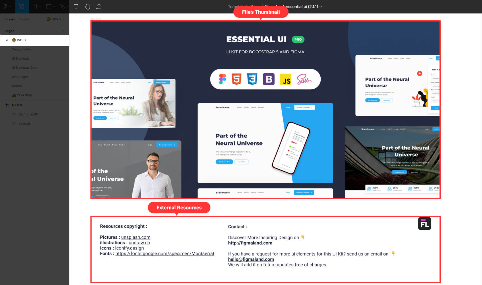
I strongly advise you to include an index page in your design’s files where you can provide a preview look and quick information about your design.
2 – The components page
This is where I design and organize all of my components, from simple buttons to complex nav bars. It enables me to easily access any components I require.
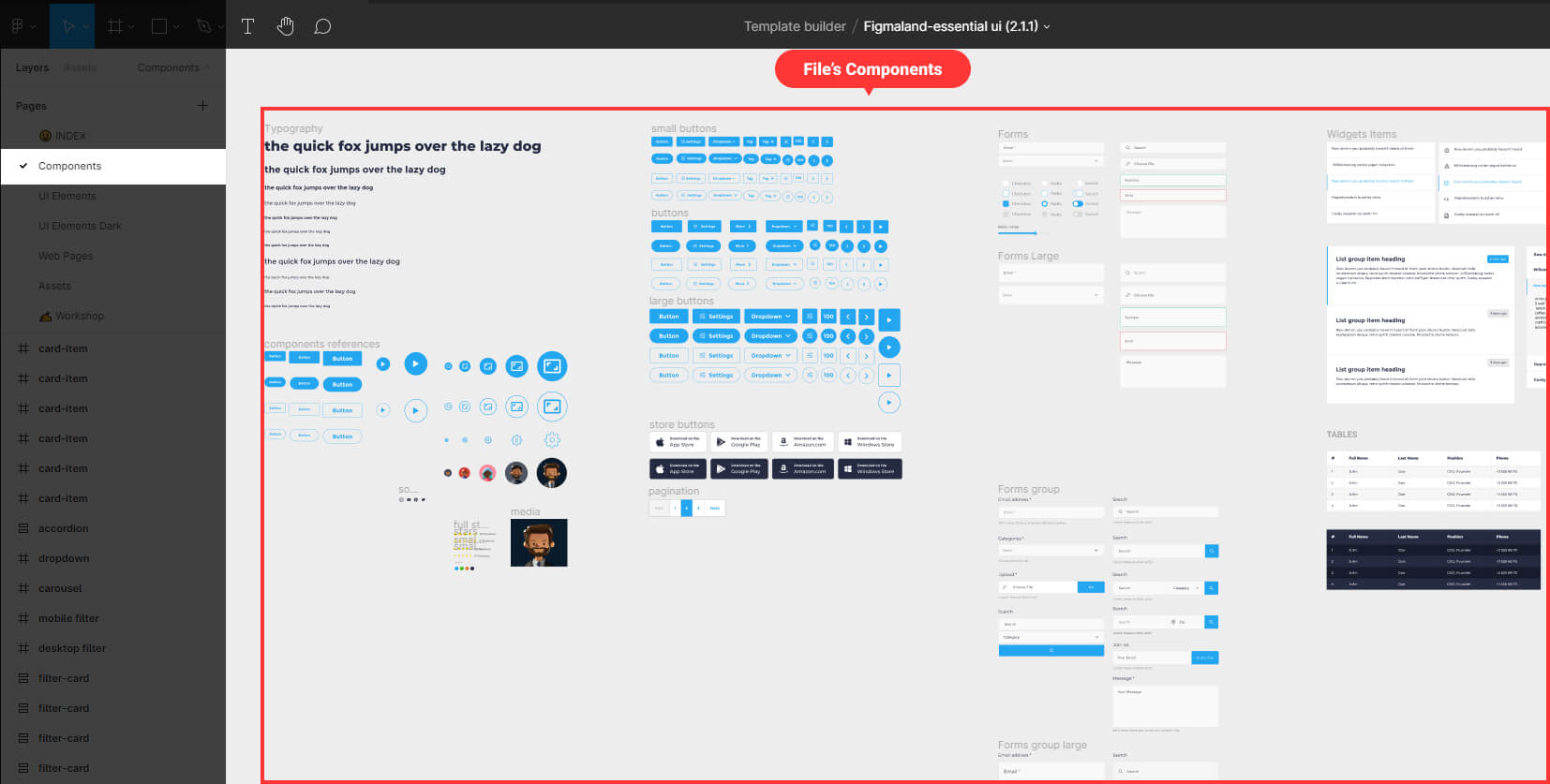
You will create many components in any design project, so consider devoting a special space for your Components inside your file.
3 – The elements page
This page is dedicated to more complex UI elements such as headers, call to actions, and footers. I make multiple versions of each UI element so that when I begin composing the pages of my website, I will have more options.
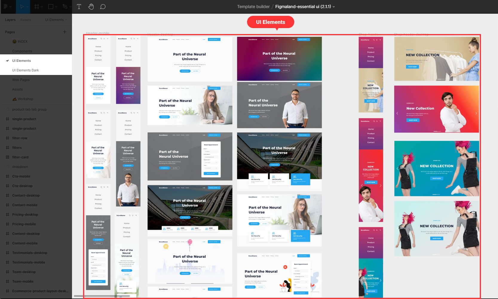
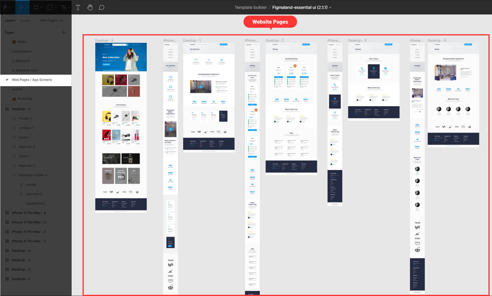
4 – The web pages/ app screens page
On this page, I create all of my app screens and web pages.
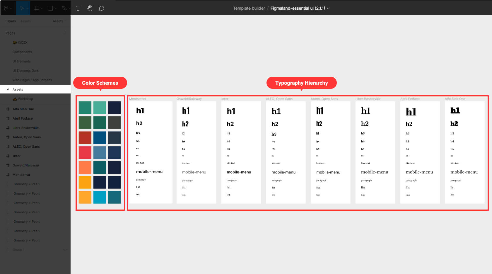
5 – The Assets page
This page contains a collection of color palettes and typography styles that I have used or will likely use in the design.
6 – The workshop page
This is where the design magic takes place. In this page, I design and prototype the entire app or website.
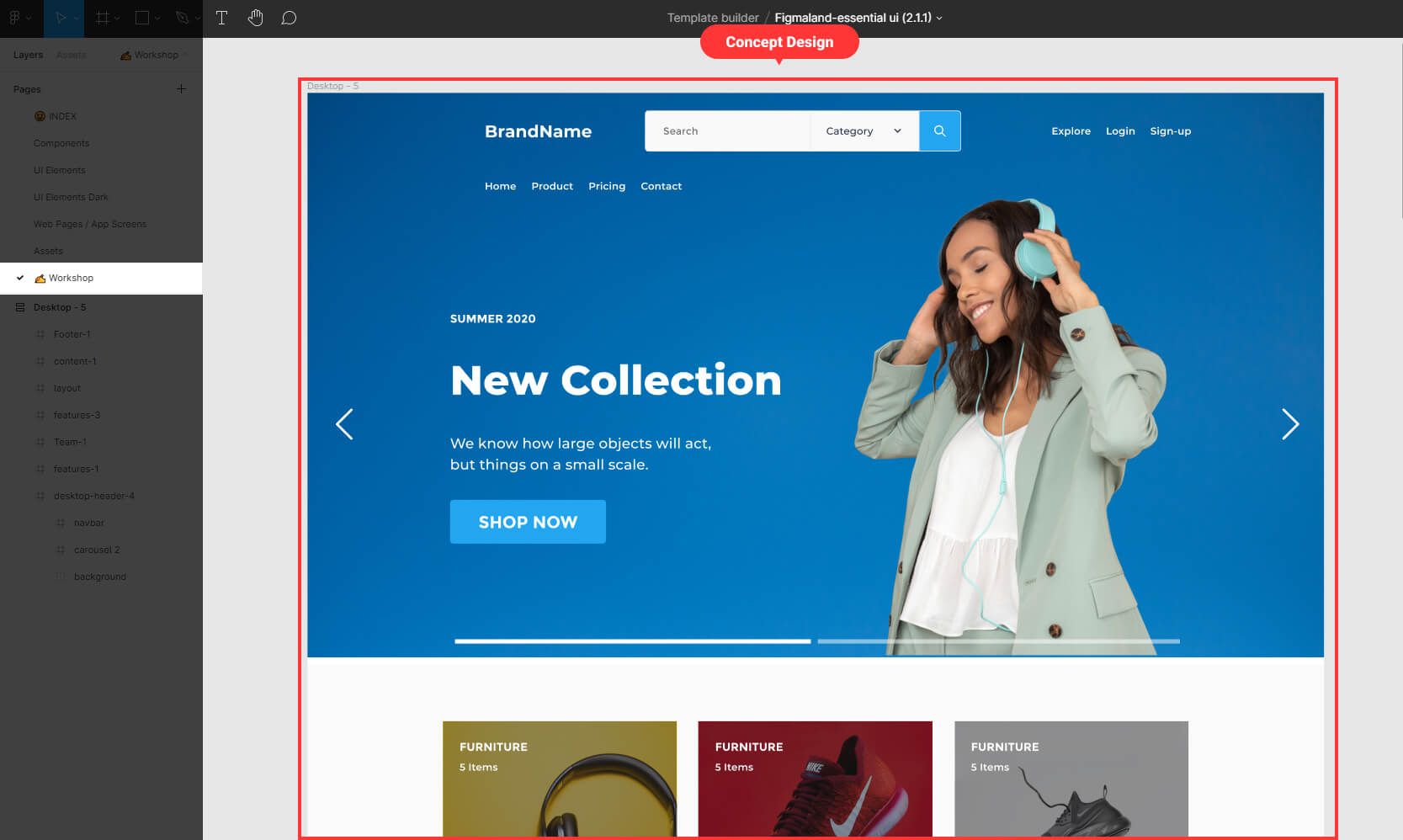
By using these six basic pages, I will have a strong structure across my design’s file. This makes it easier for me and my team to navigate the file. Maintain clarity even if the file grows significantly in size.
That’s all about Figma’s file structure, we’ve covered how to use pages for better file organization.
I hope you found this short tip helpful. Thank you so much for your time and soon I will be back with a few short tips.
