Auto Layout is one of the most powerful features in Figma. If you’re new to Figma, start with our Learn Figma Basics: Your Complete Guide to Mastering Figma to get familiar with the basics.
With the auto layout, Buttons can resize with their text. Lists can rearrange themselves when items are moved around. And elements can be nested to create complex interfaces that respond to their content.
When you add Auto Layout to a frame, the items inside are stacked next to each other (either vertically or horizontally). The frame’s size is then determined by the total size of the items within it.
Auto Layout frames can have their own padding, fill, stroke, and corner radius, so you can create buttons without adding additional layers.
Apply Auto Layout to a frame:
The Auto Layout feature is accessible in the properties panel under the constraints section.
Let’s create a new frame and transform it into an auto layout and see how it works.
Create a new frame:
- Select the artboard frame
- Pick the frame tool in the toolbar.
- Draw a frame of 60px by 60px
- Add a fill color: #11ACDD to the new frame.
- Click + icon beside Auto layout.
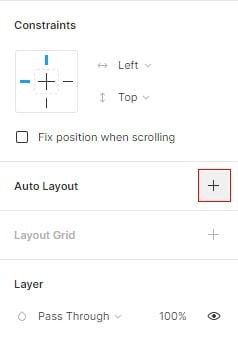
To see the difference between a regular frame and an auto layout, we need to add layers to it.
- Select the text tool

- Click inside the auto layout frame
- Add the text: Sign up for free.
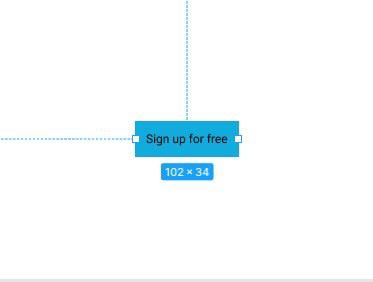
Now our frame is automatically resizable.
Auto layout properties:
The auto layout frame has four main settings: direction, padding, spacing between, and resizing.
1 — spacing :
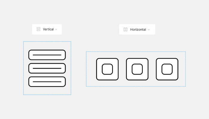
The direction allows you to choose which way the Auto Layout Frame will flow. You can choose between Vertical and Horizontal.
- Vertical allows you to add, remove, and reorder objects along the y-axis. example: objects within a list, or posts within a newsfeed or timeline.
- Horizontal allows you to add, remove, and reorder objects along the x-axis. example: a row of buttons, or icons in a mobile navigation menu.
2. Padding
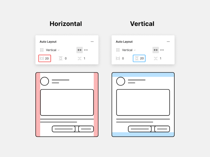
Padding controls the whitespace or “breathing room” around objects in your Auto Layout.
You can set Horizontal or Vertical padding.
3. Spacing Between
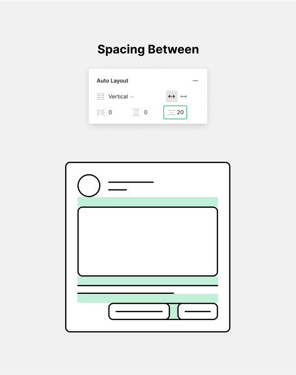
You can control the Spacing between objects in an Auto Layout.
4. Resizing
You can allow your frame to auto-resize or to be fixed.
Exercise file :
I created a file with practical examples of auto layout applications. it contains various UI elements like navbar, list of items, cards, and layout, to experiment and learn more about auto layout.
File link: Practice Auto Layout
In the next post, we will see the text tool and how to create links inside your project’s file.
This post is a part of a series that cover the basics of designing with Figma. See you in the next post 😉


