Fill mode
Before exploring fill modes, strokes, and effects in detail, refer to Learn Figma Basics: Your Complete Guide to Mastering Figma for foundational insights on Figma’s core functionalities.
The fill mode allows you to apply a solid color, a gradient, or an image to an object. It is accessible through the properties panel of the object. You are allowed to apply multiple fill layers.
Let me show you how it works using our previous shape.
Add a fill:
- Select the shape layer
- Go to fill section in the sidebar.
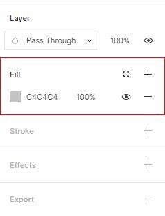
- Inside the fill section, click on the gray square to reveal the color picker.
- Move the circle point of the color picker to choose a color, or add a color code in the Hex input field.
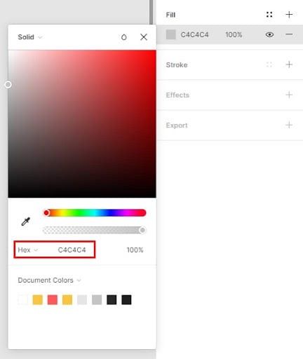
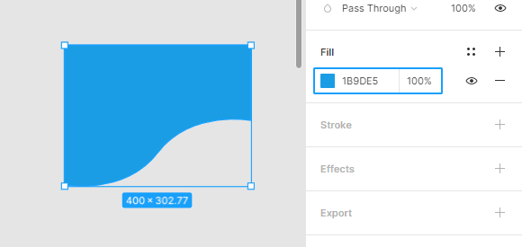
- In my case, I will change my shape color to a bright blue. (add this HEX code: #1B9DE5 to match the color I used)
Add a Gradient :
There are two ways to add a gradient effect to a layer. The first one is to change a solid color to a gradient. the second is to add a new fill layer on top of the solid color.
Change a solid to a gradient:
- Select your shape layer
- Click on the color square to trigger the color picker
- Click on solid On the top left of the color picker modal.
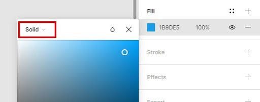
A dropdown menu appears with different gradient effects: linear, radial, angular, and diamond.
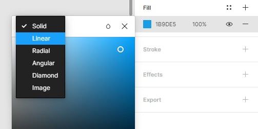
- Select Linear
- Every gradient has a minimum of two colors. To modify a color, select one of the two colors square in the gradient controller.
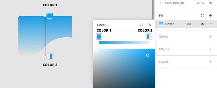
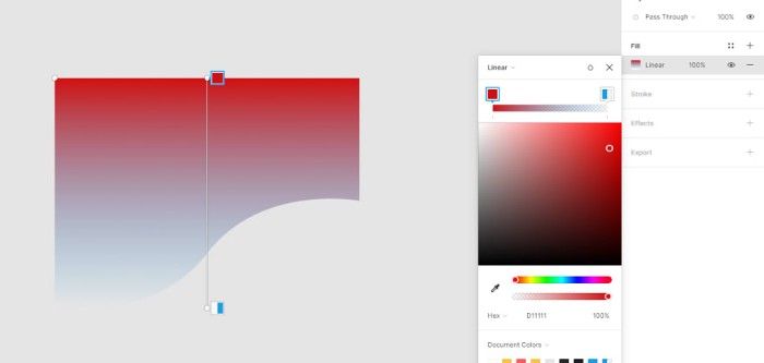
Add a new gradient layer :
If you want to preserve your previous solid color, you create a new fill layer with a gradient.
- After selecting your shape layer, click on the + icon on the right side of the fill section.

A new linear gradient will be created on top of your first fill.
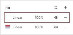
- Select the Linear fill layer to edit it.
- Or adjust the fill opacity with the opacity field.
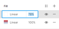
Image as a Fill:
Images in Figma are a type of Fill. You can access them in the Fill section with the gradient effects.
New fill layer
- Select the shape layer
- Click on the + icon on the right side of the fill section.
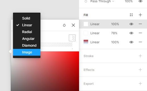
- Select the fill layer
- Click on linear in the top left of the color picker
- Select Image in the dropdown menu
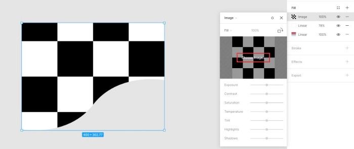
A placeholder image of black and white checks will be applied to the shape.
- Click the Choose image button in the preview
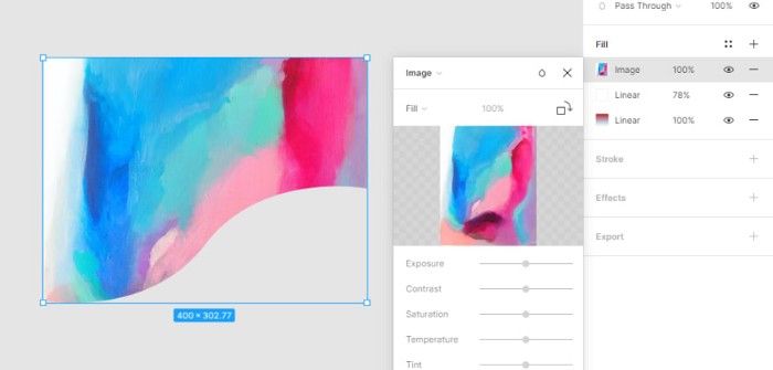
Import an image from your computer and click Open to apply.
The Image will be added to your shape as a Fill.
Stroke:
Adding a stroke is the same as adding a color fill. it is accessible through the properties panel.
Stokes has three main options, the color the size, and the direction.
Let’s see how to add a stroke to a shape layer, edit its color, size, and direction.
1- Create a stroke :
the stroke section is under the fill area.
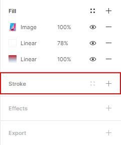
- Select your shape layer.
- Click the + button on the right side of the stroke section to add a stroke layer.
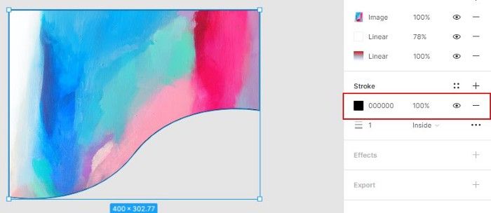
2- Change the color of the stroke:
- Select the color rectangle to trigger the color picker.
- Add the color code #ededed in the Hex field.
3- Increase the size of the stroke:
- The size field is under the color section. its default value is 1px.
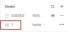
- Click on the size field and increase it to 8px.
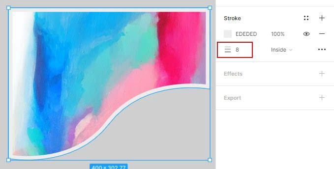
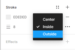
4- change the direction of the stroke:
- Besides the stroke size, click on inside.
- In the drop-down menu, select Outside.
Effects:
Effects are also a properties panel section, applicable the same way as a stroke or a fill.
Add drop shadow :
- Select the shape layer
- Click on the + icon on the right side of the effect section

- A drop shadow effect will be applied to the layer.
- Click on drop shadow to trigger the effects menu
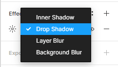
You a have a choice between a drop shadow or a blur effect
- Select the drop shadow you can adjust the effect settings by clicking the effect icon on the left.
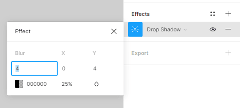
In the effect modal, you have various options like effect size, color, opacity, blur, and blend mode. You can change some of the default settings to see how it works.
In the next post, we will discuss how to make smart objects with the components and styles features.
This post is a part of a series that cover the basics of designing with Figma. See you in the next post 😉


