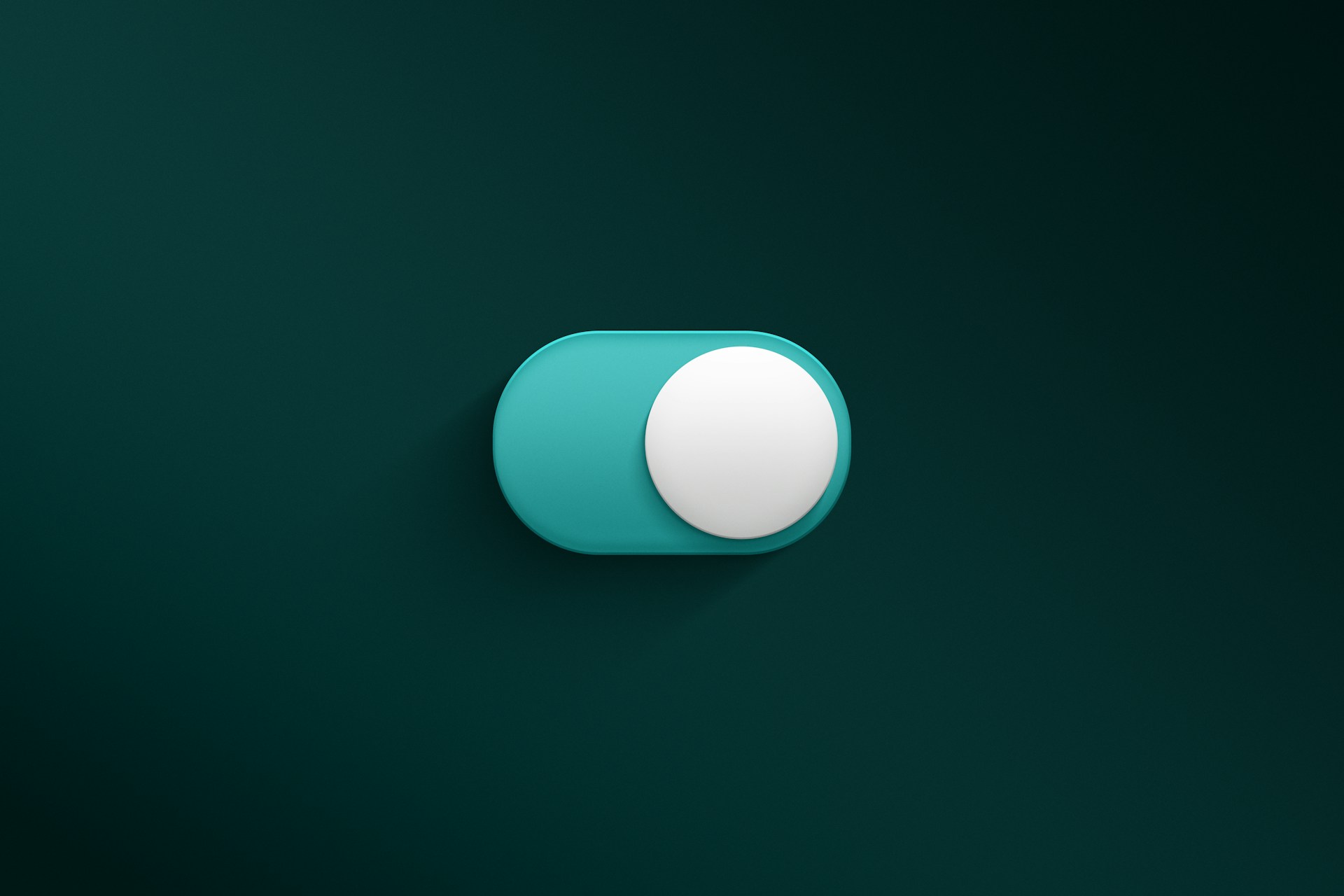
Interactive buttons are essential components of any user interface, guiding users through interactions and driving engagement with digital products. In Figma, creating well-designed, interactive buttons can significantly enhance the user experience (UX) by making interfaces more intuitive and responsive. Whether you’re designing for websites, apps, or any other digital platform, mastering the art of button design can set your product apart.
This pillar article will dive into everything you need to know about creating interactive buttons in Figma, covering different button types, styles, and how to implement them into your designs. We’ll also link to specific tutorials that explain how to craft elevated, filled, icon, outlined, text, and segmented buttons step-by-step.
Key Features of Interactive Buttons in Figma
Prototype-Ready Components: Figma allows you to create buttons with multiple states (default, hover, active, disabled), which can be prototyped to show real-time interactions.
Component Variants: Designers can create different button styles (filled, outlined, text) as variants within a single component set, making it easy to switch between styles in your designs.
Interactive States: With Figma’s prototyping feature, you can assign interactions like hover effects, click animations, and button transitions to give users real-time feedback.
Design System Integration: Interactive buttons in Figma can be part of a broader design system, ensuring consistency across multiple projects and platforms.
Benefits of Using Interactive Buttons in Figma
Interactive buttons come with numerous advantages that enhance both the design process and user experience:
- Improved Usability: Buttons that change state upon interaction make it clear to users what actions are available, reducing confusion and improving the overall UX.
- Consistency Across Platforms: By creating reusable components, interactive buttons can be applied across different projects while maintaining a consistent design language.
- Time-Saving: Once you’ve created a set of interactive buttons in Figma, you can easily reuse and adapt them, saving time when working on new projects.
- Enhanced Visual Feedback: Buttons that respond to clicks, taps, and hovers provide immediate feedback to the user, making the interface feel more responsive and polished.
How to Create Interactive Buttons: Step-by-Step Guide
Designing interactive buttons in Figma is straightforward once you understand the key components. Here’s a simple guide:
- Start with a Frame: Use a frame to define the button’s size and shape.
- Add Text or Icon: Insert text or an icon to indicate the button’s function.
- Create Component: Turn the button design into a component to reuse across your design.
- Add Variants: Create different interaction states (default, hover, pressed, disabled) as component variants.
- Prototype: Link the variants using Figma’s prototyping tools to define the interactions (e.g., hover, click).
- Test: Preview the prototype to see the button’s interactivity in action.
For specific types of buttons, explore our tutorials:
- Learn how to create Elevated Buttons in Figma, which feature raised designs with subtle shadows to enhance visual prominence.
- Discover how to design Filled Tonal Buttons for vibrant, modern interfaces.
- Follow the guide on creating Icon Buttons that enhance functionality without text labels.
Advanced Button Design Concepts
For designers looking to push the boundaries of interactivity in Figma, advanced techniques can offer more polished, refined buttons:
- Auto Layout: Use Auto Layout to create buttons that dynamically adjust based on content, such as text length or icon placement.
- Smart Animation: Apply Figma’s smart animate feature to create smooth transitions between button states.
- Responsive Buttons: Design buttons that scale based on screen size, ensuring they remain functional and visually appealing on both desktop and mobile.
To dive deeper into advanced concepts, check out how to design Outlined Buttons and Segmented Buttons.
Best Practices for Designing Interactive Buttons
To ensure that your buttons are both visually appealing and functionally effective, follow these best practices:
- Consistency is Key: Maintain consistent padding, font size, and border radius across all button variants to create a unified design language.
- Clear Call-to-Action: Ensure the button’s purpose is immediately clear through concise labeling or iconography.
- Use Color Wisely: Choose contrasting colors for interactive states like hover and disabled to improve accessibility and user feedback.
- Prototype Early: Test interactive buttons within prototypes early in the design process to identify potential usability issues.
For practical examples, see how to design Text Buttons and FAB Buttons.
Related Tutorials and Resources
Looking to expand your knowledge on button design in Figma? Check out our detailed tutorials that cover different button types:
- How to Create Buttons in Figma – Elevated Buttons
- How to Design Filled Tonal Buttons
- How to Create Icon Buttons
- How to Design Outlined Buttons
- How to Design Text Buttons
- How to Create FAB Buttons
- How to Design Filled Buttons
- How to Create Segmented Buttons
These resources provide step-by-step guidance on designing various types of buttons in Figma, each tailored for specific use cases and design systems.
Conclusion and Next Steps
Mastering interactive buttons in Figma can dramatically improve your UI designs by adding dynamic, responsive elements that engage users. Whether you’re creating basic buttons or experimenting with advanced designs, Figma’s robust toolset makes the process seamless and efficient. Start by exploring our in-depth tutorials, and experiment with creating your own interactive buttons in Figma.
Stay tuned for more design tips, or sign up for our newsletter for the latest Figma tutorials and button design ideas.


