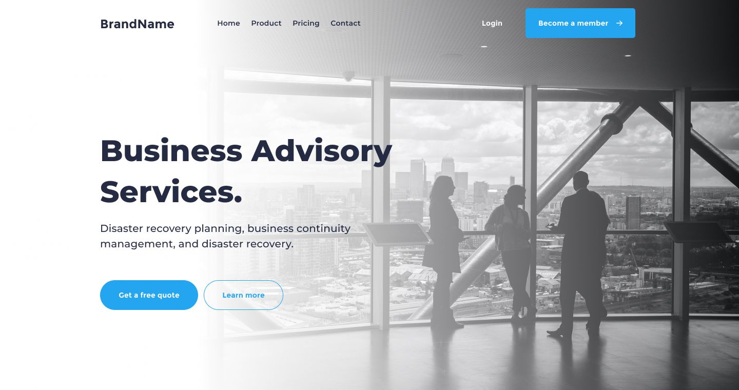
In this part, we’ll design the header element of our landing page. We’ll see how to use the Figma frame assets, create a gradient filter, use Unsplash plugin for free image resources, and how to use pre-made Figma styles to tackle typography problems. We’ll also learn how to use layout grids to align our components in a frame.
So without further ado, let’s get started.
Step 1 – Create the landing page art board
First, we need to build a simple frame to contain our landing page design. Let’s pick the frame tool, then go to the right sidebar and hit the Desktop Select. Pick the first frame desktop 1440. Now go to the Frame section in the right-hand sidebar and set the height of our frame to 760.
Convert the container frame into an Auto-Layout
Now we need to convert our art board to a dynamic frames with the help of the Auto Layout tool.
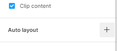
Select the art board and head to the right-hand sidebar. Go to the Auto layout section and hit the + icon to convert the frame into an Auto Layout.
Make sure the auto layout direction is vertical.

Also, set the paddings and space between value to 0.

Step 2 – Create the header container
With our landing page container done, let’s draw a simple frame for the header, and add a background image to it.
Let’s select the landing page art board. Then Pick the frame tool and Click on the top left edge of the frame and drag from side to side to draw the frame. You’ll see that our landing page art board is taking the same size as our new frame. This is the auto layout effect. we are not finished yet; we need to set the width and the height of our header frame.
Go to the right-hand sidebar in the frame section. Set the frame width to 1440, and the height to 760.
The frame resize settings
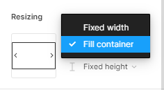
We need to set our frame to auto resize and fit the exact width of its container. This way, when we resize the landing page art board, the width of our header will auto resize to fit the width of the container art board.
First, select the header frame and go to the right-hand sidebar in the Resizing section.
Hit the first drop-down menu.
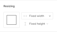
In the list option, select Fill container. Now, our frame is auto resizable.
Add the background image
Let’s select the frame layer, then right-click to open the Context menu and select plugins. Now choose Unsplash to fire up the Unsplash plugin.
If you have not already downloaded the Unsplash plugin, make sure to do so now right here
To add an image, hit the search tab and type Business in the search bar. Select an image in the search result to apply it to your frame.
We’ll pick the second image in the result, which is in black and white.
After picking the image, you can close the Unsplash plugin to see the image applied to the frame.
Add a Gradient Filter
Now we want to add a radial gradient fill that goes from left to right. The left side of the gradient will be a solid white, and the right side is going to be transparent.
Select once more the header frame, then go to right-hand sidebar. In the fill section, press the + button beside Fill to add a new fill. Now, hit the color square on the left side of the color code to trigger the color picker modal.
As you can see**,** a vertical line cut the frame in the middle with a color square on each side, it represent a vertical linear gradient, our goal is to change the gradient direction from vertical to horizontal**.**
Let’s select the top color square and drag it to the middle left edge of the frame. Now pick the bottom color square and drag it to the middle right edge of the frame to create a nice horizontal linear gradient.
Add Layout Grid Style (this part is optional)
A layout grid helps you define the underlying structure of your design and how each component in it responds to different breakpoints for responsive designs.
In our example, we have a set of Layout Grid styles based on the popular bootstrap framework breakpoint.
We’ll apply the Bootstrap grid on our container frame to make it easier for the frontend developer to convert our layout design to html easier.
Select the header frame, then go to the right-hand sidebar. In the Layout grid section, hit the (four dots) style icon. Now, pick Bootstrap desktop 1140px.
Step 3 – Add the Navbar
For our Navbar, we can save ourselves a decent amount of time by using a pre-built Navbar from the Essential Ui Assets library. There are six unique Navbar styles included in the library.
Add navbar Component
Now to choose a navbar for our project, head to the Assets Library In the left-hand sidebar. Hit the search bar on the top of the Assets section and type navbar style 2.
Pick the first navbar component in the search result and drag it to the container frame.
Now, go to the top section of the right-hand sidebar and hit align horizontal centers icon to center the navbar horizontally and align Vertical top to align it vertically.
Edit menu color Style
As you can see, our menu items [Home Product Pricing Contact] look faded against the background image. Let’s fix this contrast issue by changing each item’s color to a darker gray.
Hold command + shift or CTRL + shift for windows and click on the text layer of each menu item to select all four layers.
Now go to right-hand sidebar, in the Fill section, click on the style icon (four dots) beside the fill section. In the styles modal, select the text-color style.
We’ll repeat the same process for our login item. Select the login text layer, go to the Fill section, hi the style icon, and replace it’s color with the light-text-color style.
Add constraints
When designing for a multi-device landscape today, it’s important to consider the wide variety of screen sizes available across mobile, tablet, and desktop resolutions. Since not all designers use similar devices, designers need to consider how content works across multiple screen sizes.
To solve this user problem, Figma has developed a feature called Constraints that allows you to resize objects while maintaining spatial relationships at different sizes to best adapt to multiple screen sizes.
To apply Constraints to our component, select the Navbar layer, then jump to the Constraints section in the sidebar. In the Constraints section, we have two drop-down menu with a set of different constraints option. the first drop-down menu is set to left by default, this controls the horizontal constraint. The second menu controls the vertical constraints, and it is set by default to Top.
Now, we have to set the horizontal constraint for our component. Let’s Select the first ****drop-down menu, then choose Center. For the vertical constraint we’ll keep it at its default setting, we don’t have to change its value.
To see the magic of constraints at work, select the left or the right side of the frame and drag it.
Step 4 – Create the Headline
What fonts should we choose? What size should our fonts be? And what about vertical rhythm? All these questions will be answered in this part.
Create Text Layers
First, let’s create a simple text layer. Select the container frame, then pick the text tool. Now, click on the first left grid column of our header frame and start type our headline text, it will be: Business Advisory Services.
Add Text Style
Now, we’ll apply a text style that includes the font family, the font size, and text weight.
Select the text layer and go to right-hand sidebar in the Text section. Hit the style icon, and select the H1 style.
Add Color Style
Now, move down the Fill section and hit the style icon. Pick the text-color style. This will give our headline a nice carbon gray color.
Add constraints
Next we’ll assign constraints to our headline, so it’ll be responsive to our overall art board and grids.
Select the headline layer and head to the Constraints section in the right-hand sidebar. Hit the first drop-down menu (Left) to set the horizontal constraints. We’ll pick Center and keep the vertical constraints to Top.
Step 5 – Create the Sub-Headline
Let’s continue and create a new text layer underneath our headline, this will showcase the project’s services in more details.
First, select the headline layer, then hold command + c or Crtl + c to copy, then command + v or Crtl + v to duplicate. Now, move duplicated layer at about 30 pixels down.
Change Layer Style
Lastly, we need to change the current text style. Select the duplicated text layer and go to the Text section, select the style icon to trigger the styles list. Now, Select the H4 style.
Now , l add our sub-heading generic text: Disaster recovery planning, business continuity management, and disaster recovery.
Step 6 – Call to action Buttons
Now we’ll just add our call to action buttons. We’ll pick two button styles from our Essential Ui library.
Go ahead to the Assets Library In the left-hand sidebar. In search bar field type ****in btn-10. Select first component that shows in the search result and drag it to the container frame.
Align our button with the first grid column and keep a distance under our paragraph at about 40 pixels. Change the button text value to: Get a free quote.
Add constraints
Next, we’ll set the button constraints. head to the Constraints section. Hit the first drop-down menu and pick Center. Keep the vertical constraint to Top.
Now, let us go back to our Assets library to pick another component for our second button.
In search bar type in: btn-28. Select and drag the component to the container frame beside our first button. You can leave a gap space at about 10 pixels between the two buttons. Now, Change the button’s text value to: Learn More.
Set the same constraints setting as for the first button.
In the Constraints section, hit the first drop-down menu, and select Center.
Step 7 – Remove Grid style
We’ve achieved a lot at this stage. What we have to do right now is see how it all looks without the grid style.
Detach a Style
To detach the grid style, select the Header frame, then go to right-hand sidebar, in the Layout Grid section. Click on the detach style icon.

Now to hide the grid style, hit the eye icon beside the grid style.
Edit gradient style
One last thing, our learn more button looks faded and hard to see against the background image. We need to fix that by editing our white gradient filter.
Select the header frame, go to the Fill section and select Linear fill layer. Now, grab the left color square on the gradient and drag it slightly to the right. The more you move the color square to the right, the more our button looks better over the background image.
And we’re done with Part 1! We’ve come a long way, but there are still more parts to go. In the next tutorial of the series, we’ll be creating the Features block of our landing page. It will be as rich as this part, and will discover more Figma tips and tricks along the way.
Before you go
Feel free to visit our website captain-design.com where we are sharing generously +100 ready for commercial use Figma and HTML templates.
You’ll find three things to help you kickstart your next project’s design :
Next: How to design the features element of the landing page.

