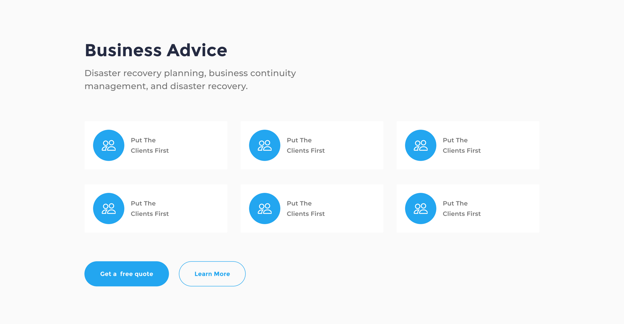
The features part will be about exposing the company’s best features.We’ll use six simple cards arranged in two rows to expose the company’s best features.
Step 1 – Create the features container
Let’s pick the frame tool, then go to the right sidebar and hit the Desktop Select. Pick the first frame desktop 1440.
Now go to the Frame section in the right-hand sidebar and set the height of our frame to 700.
Add Layout Grid Style (this part is optional)
A layout grid helps you define the underlying structure of your design and how each component in it responds to different breakpoints for responsive designs.
Select the Features frame, then go to the right-hand sidebar. In the Layout grid section, hit the (four dots) style icon. Now, pick Bootstrap desktop 1140px.
Add Color Style
Now, move down the Fill section and hit the style icon. Pick the light-gray-1 style.
That looks great, but we need to add the features frame to our landing page art board.
Let’s Select the features frame and drag it under the header frame. Release your mouse click when you see a bold blue line under the header frame. Once the frame is dropped inside the landing page art board, the overall container will resize automatically to fit the exact height of both the header and features frames.
The frame resize settings
We need to set our frame to auto resize and fit the exact width of its container. This way, when we resize the landing page art board, the width of our features element will auto resize to fit the width of the container art board.
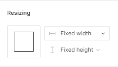
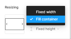
First, select the features frame and go to the right-hand sidebar in the Resizing section.
Hit the first drop-down menu.
In the list option, select Fill container. Now, our frame is auto resizable.
Step 2- Create our Features Headline
First, let’s create a simple text layer. Select the container frame, then pick the text tool. Now, click on the first left grid column of our features frame and start type our headline text, it will be: Business Advice.
Add Text Style
Now, we’ll apply a text style that includes the font family, the font size, and text weight.
Select the text layer and go to right-hand sidebar in the Text section. Hit the style icon and select the H2 style.
Add Color Style
Now, move down the Fill section and hit the style icon. Pick the text-color style. This will give our headline a nice carbon gray color.
Add constraints
Next we’ll assign constraints to our headline, so it’ll be responsive to our overall art board and grids.
Select the headline layer and head to the Constraints section in the right-hand sidebar. Hit the first drop-down menu (Left) to set the horizontal constraints. We’ll pick Center, and keep the vertical constraints to Top.
Step 3 – Create the Sub-Headline
Let’s continue and create a new text layer underneath our headline, this will showcase more details about the service’s features.
First, select the headline layer, then hold command + c or CTRL + c to copy, then command + v or CTRL + v to duplicate. Now, move the duplicated layer at about 30 pixels down.
Change Layer Style
Lastly, we need to change the current text style. Select the duplicated text layer and go to the Text section, select the style icon to trigger the styles list. Now, Select the H4 style.
Now, we can add our sub-heading generic text: Disaster recovery planning, business continuity management, and disaster recovery.
Step 4 – Add the Features items
To showcase our principal features, we’re going to use pre-made cards components from our Essential Ui assets.
Add the Cards Components
Go ahead to the Assets Library In the left-hand sidebar. Then select the search bar on the top and type card-item-4. Select and drag the first component to the features container frame. Align the card component at the left edge of the layout grid horizontally, leave about 40px of vertical space between the Sub-Headline and the card.
Add constraints
Next we’ll assign constraints to our component, so it’ll be responsive to our overall art board and grids.
Select the Card layer and head to the Constraints section in the right-hand sidebar. Hit the first drop-down menu (Left) to set the horizontal constraints. We’ll pick Center and keep the vertical constraints to Top.
Duplicate the cards
Now, we’ll duplicate this component into five additional part and distribute them into two rows, like we can see in the snapshot.
First, select the Card layer, then hold command + c or Crtl + c to copy, then command + v or Crtl + v to duplicate. Now, move the duplicated card at about 30 pixels to the right. Let’s repeat that one more time to create a third card.
Select the second Card layer, then hold command + c or Crtl + c to copy, then command + v or Crtl + v to duplicate. Now, move the duplicated card at about 30 pixels to the right.
One last thing, this time we’ll duplicate all the cards simultaneously to create a second row of cards. Select all three cards that we’ve just created, then hold command + c or CTRL + c to copy, then command + v or CTRL + v to duplicate. Now, move the duplicated cards at about 60 pixels to the bottom.
Step 5 – Call to action Buttons
Now we’ll just add our call to action buttons. We’ll pick two button styles from our Essential Ui library.
Go ahead to the Assets Library In the left-hand sidebar. In search bar field type in btn-10. Select first component that shows in the search result and drag it to the container frame.
Align our button with the first grid column and keep a distance under our cards at about 40 pixels. Change the button text value to: Get a free quote.
Add constraints
Next, we’ll set the button constraints. head to the Constraints section. Hit the first drop-down menu, and pick Center. Keep the vertical constraint to Top.
Now, let us go back to our Assets library to pick another component for our second button.
In search bar type in: btn-28. Select and drag the component to the container frame beside our first button. You can leave a gap space at about 10 pixels between the two buttons. Now, Change the button’s text value to: Learn More.
Set the same constraints setting as for the first button.
In the Constraints section, hit the first drop-down menu, and select Center.
Step 6 – Remove Grid style
We’ve achieved a lot at this stage. What we have to do right now is see how it all looks without the grid style.
Select the Header frame, then go to right-hand sidebar in the Layout Grid section. Now to hide the grid style, hit the eye icon beside the grid style.
And we’re done with Part 2! In the next tutorial of this series, we’ll be creating the Testimonials block of our landing page.
Before you go
Feel free to visit our website captain-design.com where we are sharing generously +100 ready for commercial use Figma and HTML templates.
You’ll find three things to help you kickstart your next project’s design :
Next: How to design the testimonials element of the landing page.