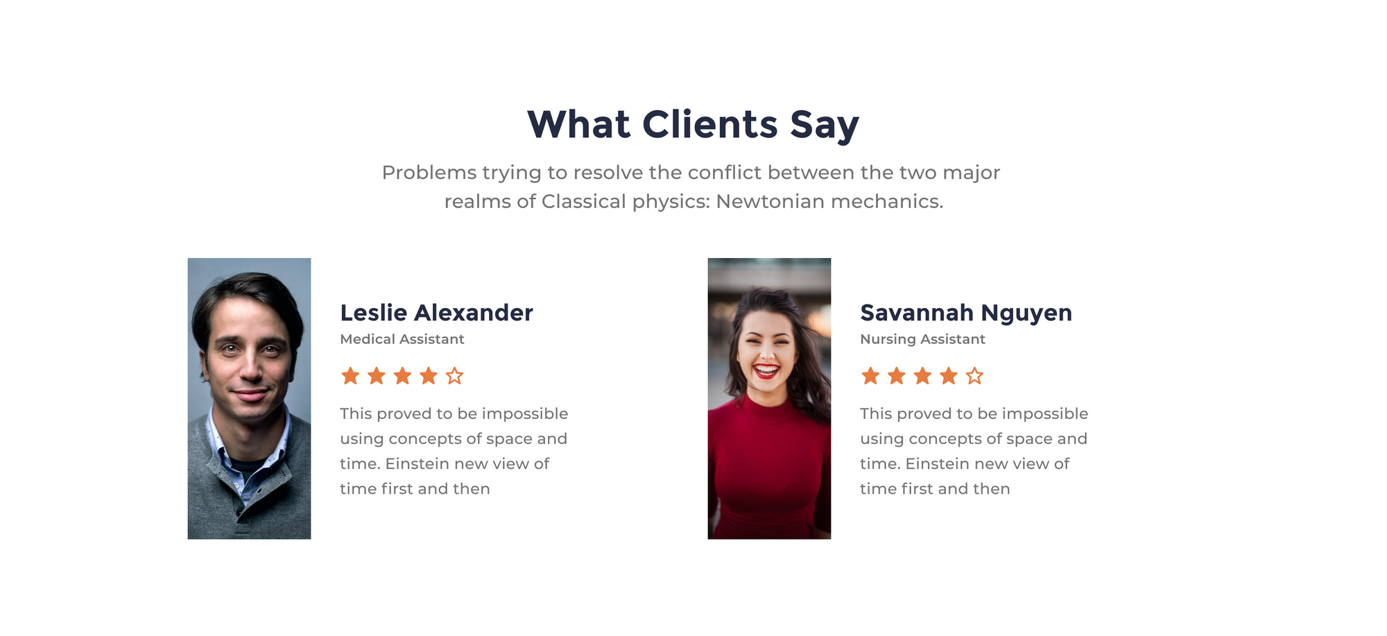
The Testimonials part will be about exposing best customers testimonial, This will show our users how other people are trusting us and maybe convince more clients to buy our services.
Step 1 – Create the testimonials container
Let’s pick the frame tool, then go to the right sidebar and hit the Desktop Select. Pick the first frame desktop 1440.
Now go to the Frame section in the right-hand sidebar and set the height of our frame to 660.
Add Layout Grid Style (this part is optional)
A layout grid helps you define the underlying structure of your design and how each component in it responds to different breakpoints for responsive designs.
Select the testimonials frame, then go to the right-hand sidebar. In the Layout grid section, hit the (four dots) style icon. Now, pick Bootstrap desktop 1140px.
This looks great, but we need to add the testimonials frame to our landing page art-board.
Let’s select the testimonials frame and drag it under the features frame, release your mouse click when you see a bold blue line under the features frame. Once the frame is dropped inside the landing page art-board, the overall container will resize automatically to fit the exact height of all the landing page elements.
The frame resize settings
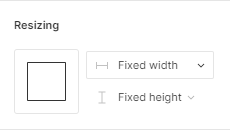
We need to set our frame to auto resize and fit the exact width of its container. This way, when we resize the landing page art board, the width of our testimonials frame will auto resize to fit the width of the container art board.
First, select the testimonials frame and go to the right-hand sidebar in the Resizing section.
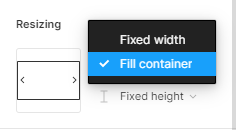
Hit the first drop-down menu.
In the list option, select Fill container. Now, our frame is auto resizable.
Step 2- Create our Testimonials Headline
First, let’s create a simple text layer. Select the container frame, then pick the text tool. Now, click on the center top part of our testimonials frame and start type the headline text, it will be : What Clients Say.
Add Text Style
Now, we’ll apply a text style that includes the font family, the font size, and text weight.
Select the text layer and go to right-hand sidebar in the Text section. Hit the style icon, and select the H2 style.
Add Color Style
Now, move down the Fill section and hit the style icon. Pick the text-color style. This will give our headline a nice carbon gray color.
Center Align the headline
Under the text style, hit Text align center to center our headline. Now, go to the top right-hand sidebar in the Alignment section and select Align horizontal center to center the text horizontally inside the frame. Once the text is centered, let’s move down to the position section and select the Y input. Now add the value of a 100. This will help us move the text layer at about 100px in the y axis.
Add constraints
Next we’ll assign constraints to our headline, so it’ll be responsive to our overall art board and grids.
Select the headline layer and head to the Constraints section in the right-hand sidebar. Hit the first drop-down menu (Left) to set the horizontal constraints. We’ll pick Center and keep the vertical constraints to Top.
Step 3 – Create the Sub-Headline
Let’s continue and create a new text layer underneath our headline,
First, select the headline layer, then hold command + c or CTRL + c to copy, then command + v or CTRL + v to duplicate. Now, move the duplicated layer at about 30 pixels down.
Change Layer Style
We need to change the current text style. Select the duplicated text layer and go to the Text section, select the style icon to trigger the styles list. Now, Select the H4 style.
Now, we can add our sub-heading generic text: Problems trying to resolve the conflict between the two major realms of Classical physics: Newtonian mechanics.
Step 4 – Add the Testimonials Cards
To showcase our client’s testimonials, we’re going to use pre-made cards components from our Essential Ui assets.
Add the Cards Components
Go ahead to the Assets Library In the left-hand sidebar. Then select the search bar on the top and type testimonials-card-item-6. select and drag the first component to the features container frame. Align the card component at the left edge of the layout grid horizontally, leave about 40px of vertical space between the Sub-Headline and the card.
Add constraints
Next we’ll assign constraints to our component, so it’ll be responsive to our overall art board and grids.
Select the Card layer and head to the Constraints section in the right-hand sidebar. Hit the first drop-down menu (Left) to set the horizontal constraints. We’ll pick Center and keep the vertical constraints to Top.
Duplicate the cards
Now, we need to create our second testimonial card. To do that, we’ll just duplicate the first component.
Select the Card layer, then hold command + c or CTRL + c to copy, then command + v or CTRL + v to duplicate. Now, move the duplicated card at about 30 pixels to the right.
Edit the cards content
Now, we can add our clients’ content. Here, I will use Unsplash to generate the client’s profile pictures and use the content reel plugin to generate a dummy text for our clients’ names and comments.
We’ll skip this part to avoid repetition, you can go back to tour first part in this tutorial, we’re we covered how to add an image to your design using the Unsplash plugin Here.
See more here on how to use the content reel plugin to generate text content for your design.
Step 5 – Remove Grid style
We’ve achieved a lot at this stage. What we have to do right now is see how it all looks without the grid style.
Select the Testimonials frame, then go to right-hand sidebar in the Layout Grid section. Now to hide the grid style, hit the eye icon beside the grid style.
And we’re done with Part 3! In the next tutorial of the series, we’ll be creating a call to action block of our landing page.
Before you go
Feel free to visit our website captain-design.com where we are sharing generously +100 ready for commercial use Figma and HTML templates.
You’ll find three things to help you kickstart your next project’s design :
Next: How to design the call to action element of the landing page.

