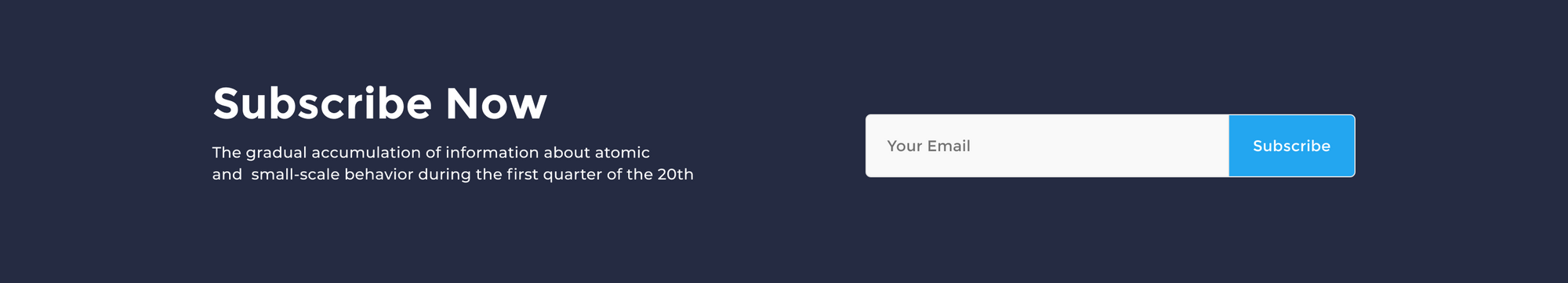
In this part, we’ll design a block where we encourage our visitors to subscribe to a newsletter.
Step 1 – Create the Call To Action container
Lets pick the frame tool, then go to the right sidebar and hit the Desktop Select. Pick the first frame desktop 1440.
Now go to the Frame section in the right-hand sidebar and set the height of our frame to 260.
Add Color Style
Now, move down the Fill section. and hit the style icon. Pick the dark-background-color style. This will give our call to action frame a dark mode look.
Add Layout Grid Style (this part is optional)
A layout grid helps you define the underlying structure of your design and how each component in it responds to different breakpoints for responsive designs.
Select the call to action frame, then go to the right-hand sidebar. In the Layout grid section, hit the (four dots) style icon. Now, pick Bootstrap desktop 1140px.
That looks great, but we need to add the call to action frame to our landing page art board.
Lets Select the call to action frame and drag it under the testimonials frame. Release your mouse click when you see a bold blue line under the testimonials frame. Once the frame is dropped inside the landing page art-board, the overall container will resize automatically to fit the exact height of the overall landing page elements.
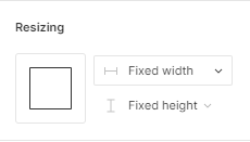
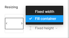
The frame resize settings
We need to set our frame to auto resize and fit the exact width of its container. This way, when we resize the landing page art board, the width of our call to action frame will auto resize to fit the width of the container art board.
First, select the call to action frame and go to the right-hand sidebar in the Resizing section.
Hit the first drop-down menu.
In the list option, select Fill container. Now, our frame is auto resizable.
Step 2- Create the call to action Headline
First, let’s create a simple text layer. Select the container frame, then pick the text tool. Now, click on the first left grid column of our call to action frame and start typing our headline text, it will be: Subscribe Now.
Add Text Style
Now, we’ll apply a text style that includes the font family, the font size, and text weight.
Select the text layer and go to right-hand sidebar in the Text section. Hit the style icon, and select the H2 style.
Add Color Style
Now, move down the Fill section. and hit the style icon. Pick the light-text-color style.
Add constraints
Next we’ll assign constraints to our headline. Select the headline layer and head to the Constraints section in the right-hand sidebar. Hit the first dropdown menu (Left) to set the horizontal constraints. We’ll pick Center, and keep the vertical constraints to Top.
Step 3 – Create the Sub-Headline
Let’s continue and create a new text layer underneath our headline.
First, select the headline layer, then hold command + c or Crtl + c to copy, then command + v or Crtl + v to duplicate. Now, move the duplicated layer at about 30 pixel down.
Change Layer Style
Lastly, we need to change the current text style. Select the duplicated text layer and go to the Text section, select the style icon to trigger the styles list. Now, Select the Paragraph style.
Now , we can add our sub-heading generic text: The gradual accumulation of information about atomic and small-scale behavior during the first quarter of the 20th.
Step 4 – Add the call to action email input
To give our visitors a space where they can add there emails to subscribe, we’re going to use pre-made forms components from our Essential Ui assets.
Add the Cards Components
Go ahead to the Assets Library In the left-hand sidebar. Then select the search bar on the top and type form-group-9. select and drag the first component to the features container frame. Align the card component at the right edge of the layout grid horizontally and make sure it is well centered vertically in the container’s frame.
Now, let’s some extra layers that we don’t need for this component. Select both the component title (Join Us) and the small text layer under the form input and remove them.
Add constraints
Next we’ll assign constraints to our component, so it’ll be responsive to our overall art board and grids.
Select the form input layer and head to the Constraints section in the right-hand sidebar. Hit the first drop-down menu (Left) to set the horizontal constraints. We’ll pick Center and keep the vertical constraints to Top.
Step 5 – Remove the grid style
Select the Header frame, then go to right-hand sidebar in the Layout Grid section. Now to hide the grid style, hit the eye icon beside the grid style.
And we’re done with Part 4! In the next tutorial of this series, we’ll be creating the footer block of our landing page.
Before you go
Feel free to visit our website captain-design.com where we are sharing generously +100 ready for commercial use Figma and HTML templates.
You’ll find three things to help you kickstart your next project’s design :