Let’s talk about the cool stuff in the new Penpot 2.0! We’re giving our thoughts on the video they just released, where they spill the beans on what’s coming. We’ll break down the updates they’ve announced in a way that’s easy to understand, so you can get a good idea of what’s in store with Penpot 2.0.
Before exploring the new features in Penpot 2.0, take a look at our Ultimate Guide to Mastering Design with Penpot for a solid foundation in using the tool.
Check out the complete video for an exclusive preview
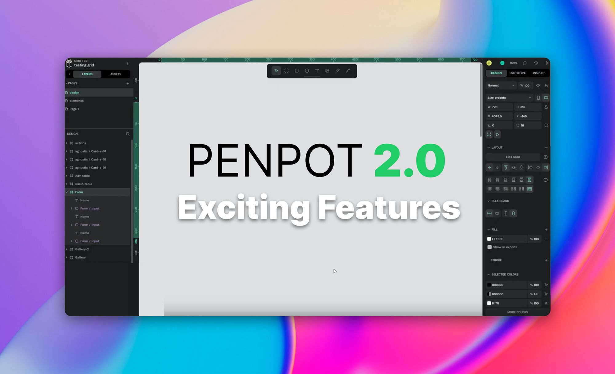
1- The Editor Interface Gets a Fresh Look
Penpot 2.0 brings a new, modern look to the Editor interface. The buttons now have a rounded design, making the whole experience more stylish and visually pleasing.
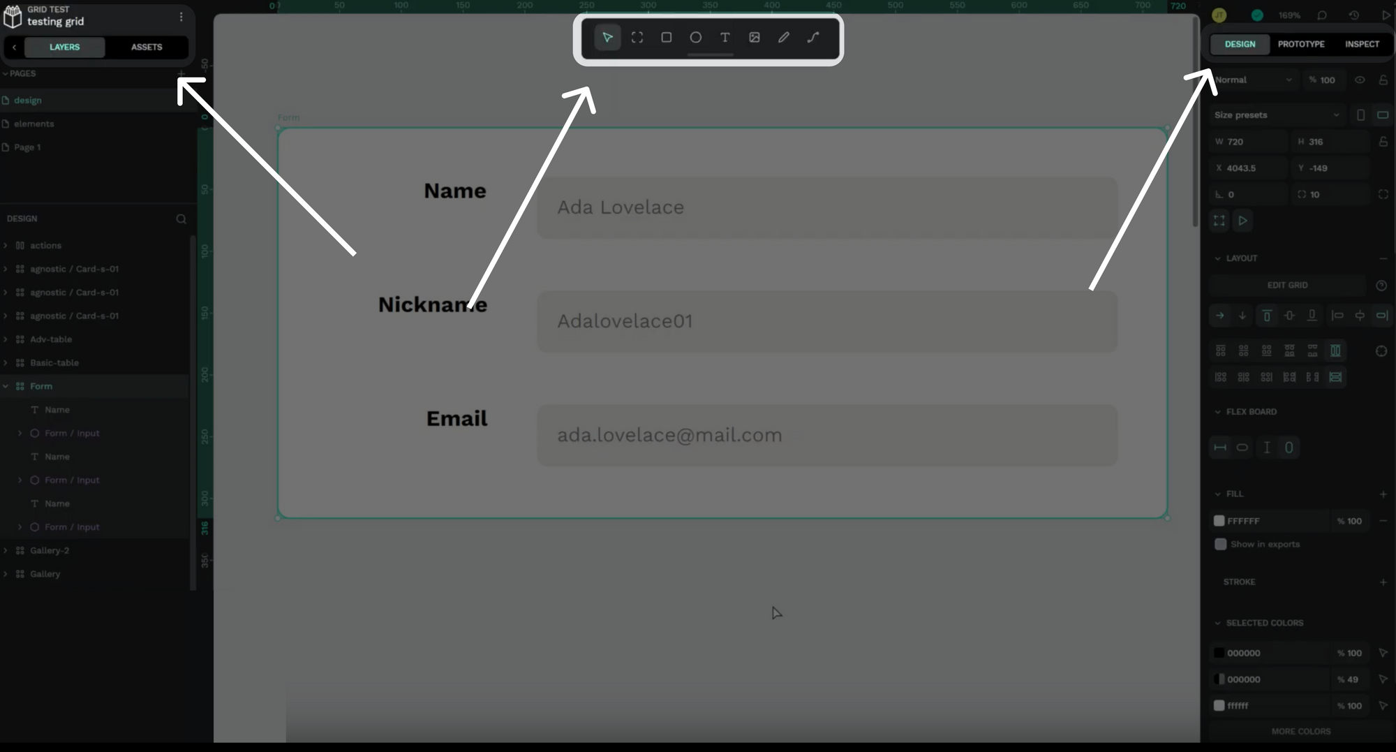
2- Toolbar Makeover for Easier Use
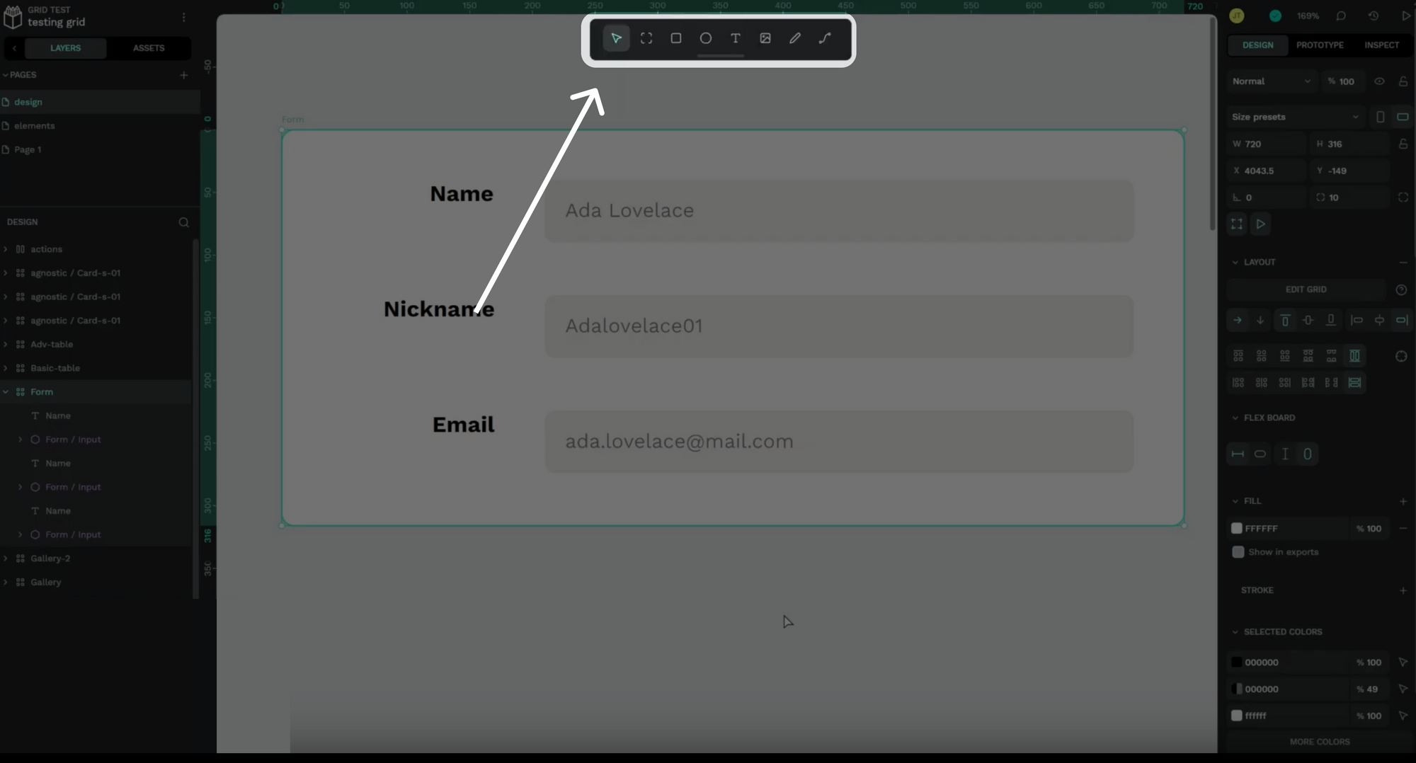
In version 2.0, the toolbar has undergone a big change. Instead of being on the left side, it now sits neatly at the center-top of the editor. This not only improves the overall appearance but also makes the editor more user-friendly. Placing the toolbar here makes it easier to use, streamlining the design.
3 – New Features in the board’s setting section
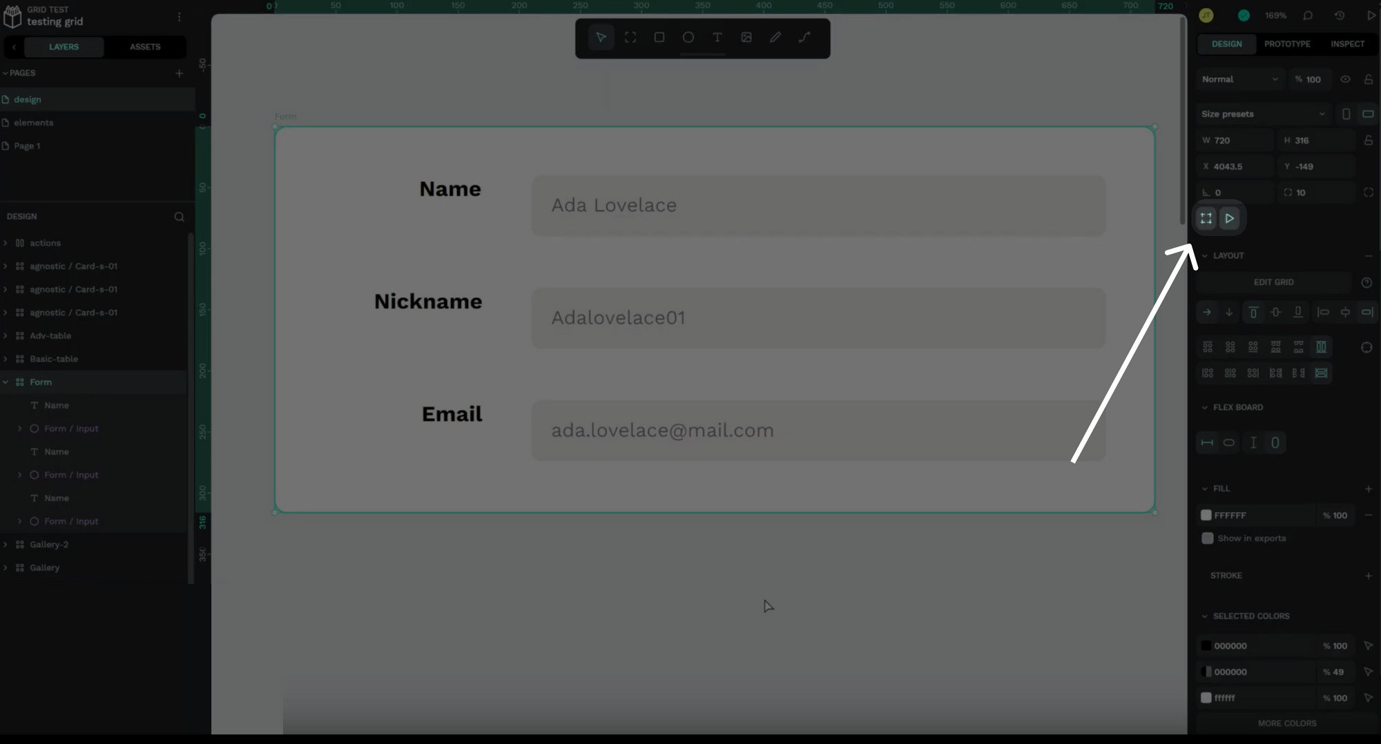
In the new version we can see two intriguing additions to the tool-set. The initial button, featuring a frame icon, appears to mirror the functionality of Figma’s ‘zoom to fit’ button – note that this is just an assumption of the writer and can be proven false. The adjacent play button, however, remains shrouded in mystery. As we eagerly anticipate getting hands-on experience, we look forward to unraveling the capabilities concealed behind this enigmatic feature. Stay tuned for an in-depth exploration of its functionalities.
4 – Grid Layout Takes Center Stage
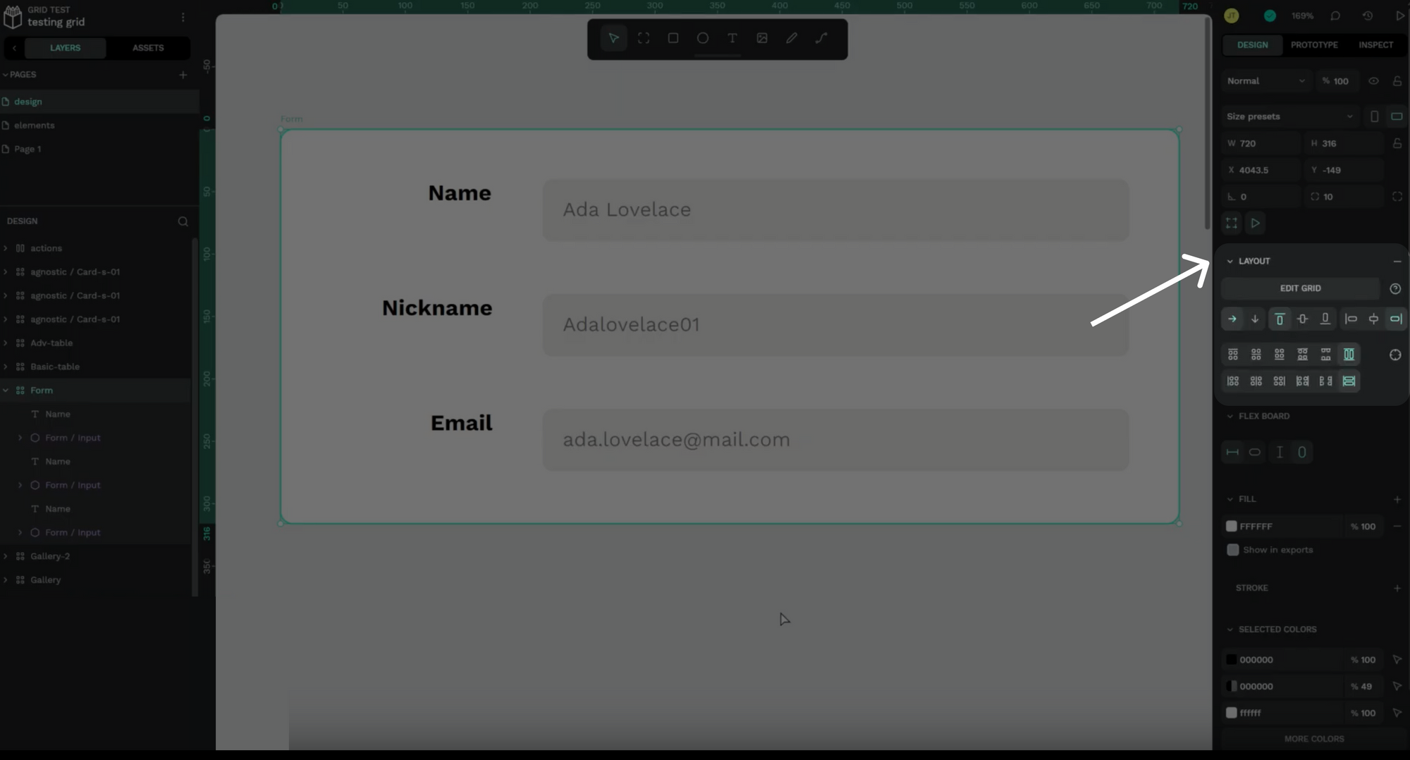
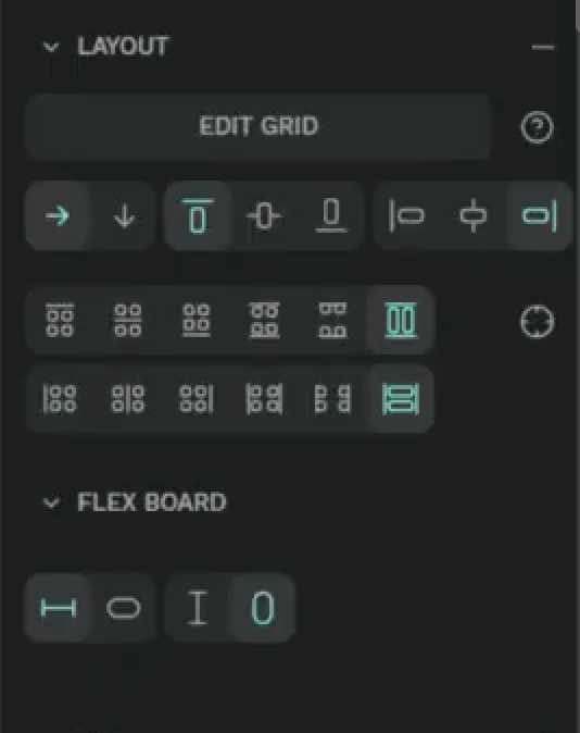
In this 2.0 version, a standout feature takes center stage—the grid layout. The accompanying video demonstrates the ease of adding rows and columns. The grid layout allows both automatic and manual positioning, providing users with flexibility and control. With the grid, users can experiment with rows and columns, effortlessly dragging and dropping components into grid cells.
5 – Code Insights: CSS and HTML
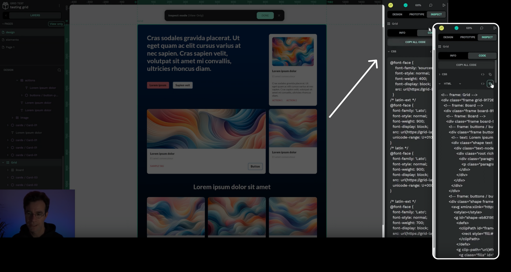
Penpot 2.0 goes beyond design with code generation. Users can access the CSS and HTML code for their designs. The Inspect Code feature provides a HTML version of components and CSS styles.
6 – Component System Update: Component Swapping
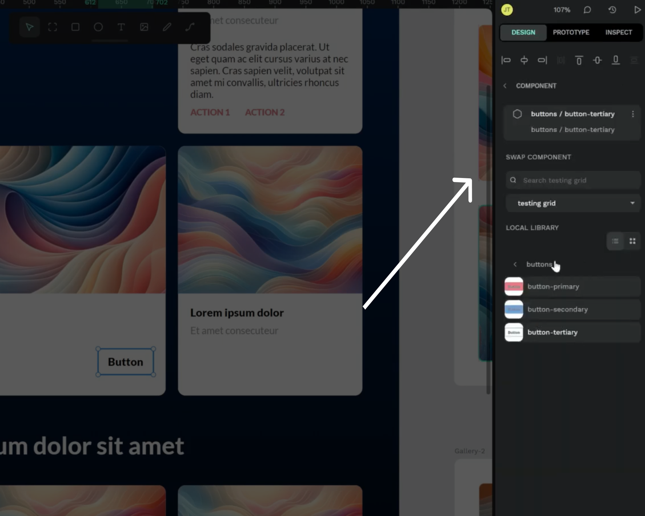
Penpot introduces a change to its component system in version 2.0. Users can now seamlessly swap between different components.
Penpot 2.0 Release Date
The release date hasn’t been announced yet, but in the video, the Penpot team promises to share more content showcasing the 2.0 features.
Excited about Penpot 2.0? Deepen your understanding of the platform by returning to our Penpot Tutorials: The Ultimate Guide to Mastering Design with Penpot for more tips and techniques.
Conclusion
In conclusion, the upcoming release of Penpot 2.0 is set to bring a wave of exciting changes. From a revamped interface to powerful new features, designers can look forward to a fresh and enhanced creative experience. Stay tuned for the official release.