This article is part of a series dedicated to providing a clear overview of UX design for beginners, primarily based on the work of Jesse James Garrett in his book, “The Elements of User Experience: User-Centered Design for the Web.”
If you’ve ever found the world of user experience (UX) a little confusing, you’re not alone. First, UX encompasses a wide range of concepts, from user research to information architecture, which can initially feel overwhelming. Second, it involves interdisciplinary knowledge, requiring an understanding of psychology, design, and technology, which can be daunting for those new to these areas. Additionally, UX often involves subjective elements, as what makes a good user experience can vary from person to person.
Furthermore, the rapid evolution of technology and user preferences adds an extra layer of complexity. But I’m here to make it simpler for you.
In this article, I’ll provide you with a basic understanding of how products are made while keeping the user’s experience in mind. By the end of this article, you’ll have a clearer idea of what user experience really means.
Before diving into simplifying user experiences, it’s a great idea to first explore the basics of UX design in our Complete Guide to Becoming a UX Designer.
The Essence of User Experience in Product Design
Product design is often perceived in terms of two main dimensions:
1- Aesthetic Appeal: Many people associate product design with how visually pleasing a product is. This includes factors like the look and feel of a product.
2 – Functional Performance: Others perceive a well designed product as a product that effectively performs its intended tasks, while poorly designed products are ones that fail to meet their premises.
But there’s more to it than that. It’s also about how people use it.
Think of a chair. It should look good and be comfortable to sit in. A table should be sturdy. In these simple cases, a good product is one that works well.
But as things get more complicated, like modern phones with lots of features, it’s not just about the basics. It’s about making sure everything works together so people have a great experience using the product.
That’s where user experience designers come in. They make sure the product meets people’s needs and is easy to use. They make sure all the parts fit together, so using the product is enjoyable and efficient.
Understanding the User Experience of a Product

A product’s user experience is shaped through a series of layered decisions that come together to create the final product.
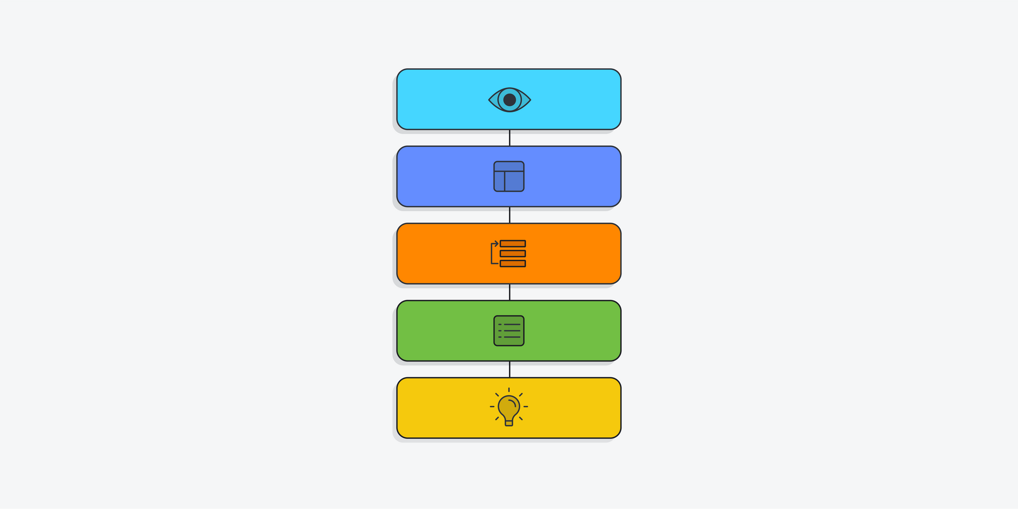
Designing an excellent website involves thinking about these layers: what people see on the surface, the framework that supports it, how it’s set up inside for easy use, the useful features it offers, and the overall plan that defines its purpose and goals.
Here are the key layers involved:
- Surface (The Exterior): Think of a website like the outside of a house. It’s the first thing you notice, with images, text, and interactive elements. Some things, like buttons, work directly, while others, like logos, make it look good.
- Skeleton (The Framework): Beneath the surface is the website’s skeleton, like a house’s frame. It decides where things like pages, links, images, and navigation go. It helps you move around the website easily.
- Structure (The Layout): This is like how rooms are arranged inside a house. It determines how you go from one place to another on the website, like moving from the homepage to a product page. It shapes how you use the website.
- Scope (The Features): This is what the website can do, like the useful stuff in a house. For example, an online store might let you save your address for future orders. These features make the website more helpful.
- Strategy (The Purpose): Just as a house is built for a reason, a website has a strategy. It’s the big plan that decides what the website should achieve, like selling things or providing information. It also thinks about things like ads or what users can add, depending on its goals.
Designing a great website is like building a well-planned house, where you think about these layers: what’s on the outside, the strong structure underneath, the smart layout inside, the helpful features, and the big plan that guides its purpose and goals.
The Five Plane framework of User Experience

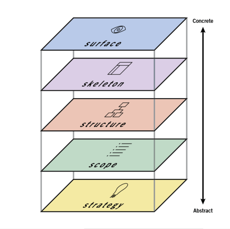
The “Five Planes” is a UX framework developed by Jesse James Garrett in his book “The Elements of User Experience: User-Centered Design for the Web.” This framework simplifies the process of implementing UX in our products. It allows us to address each aspect of a product’s user experience more efficiently and effectively.
Let’s use a store website as an example to explain the Five Planes of User Experience:
- The Strategy Plane (Store Goals): This is about understanding what the store wants and what shoppers need. It includes what the store wants to sell (business goals) and what shoppers look for (like product info). The strategy makes sure the website meets these goals for a good shopping experience.
- The Scope Plane (Features and Content): This is where we decide what the website can do. We plan the features, like a product catalog and checkout. We also decide what information to show, like product descriptions and prices. Together, these make up what the website will include.
- The Structure Plane (Organizing the Experience): Here, we organize the website so shoppers can find things easily. For things you can do on the website, we figure out how it works, like adding items to the cart. For finding information, we make sure the website’s layout and menus help users find what they want.
- The Skeleton Plane (Designing the Interface): This part has three jobs. We make sure information is clear and easy to understand. We design how the website looks and how you interact with it, like clicking buttons and filling out forms. We also create menus and filters to help users move around the website.
- The Surface Plane (Look and Feel): This is all about making the website look good. We pick the colors, fonts, images, and how things are arranged on the page. The goal is to make the website attractive and easy to use.
To sum it up, applying the Five Planes of User Experience to a store website means making sure it fits the store’s goals, deciding what it can do, making it easy to navigate, designing how it looks, and creating a pleasant experience for shoppers. This makes the overall user experience better.
Now that you’ve learned how to simplify user experiences, continue your UX design journey with our Complete Guide to Becoming a UX Designer for more in-depth guidance.
Conclusion
if you’ve ever found the world of user experience (UX) a bit overwhelming, you’re not alone. However, I hope this article has made it all much more approachable for you. We’ve taken the complex concepts of UX and broken them down into digestible ideas, emphasizing that it’s not just about appearances; it’s about crafting an enjoyable experience for users. We’ve introduced the practical Five Planes framework, and through our example of a store website, demonstrated how each plane contributes to user-friendly product design.
Now that you’ve got this basic knowledge, you’re ready to start learning more about UX and making your products better. So, take what you’ve learned and keep going. Your journey into the world of UX is just beginning!


