For a complete breakdown of organizing and managing Figma files, check out our Figma File Management for Beginners: A Comprehensive Guide.
Using Text Styles in your design helps you build better typography hierarchy. It enables you to maintain consistency in your design process and to provide your teammates or clients with a thorough understanding of the typography used in the design.
Here in this short post, I will use the Essential UI Pro Figma file as an example to show you how I create and organize font styles.
Setting up font styles
Before I begin designing a single button for my project, I often set up all of my font styles.
To begin, I create ten different font styles. Each font style will be assigned a font face, font size, line height, and font weight. The font styles are named after the HTML heading levels: H1, H2, H3, and so on.
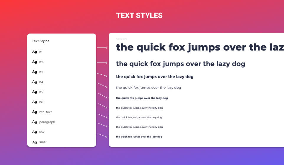
By creating a set of font styles in advance, I can establish and control my typography hierarchy easily.
Now, Let me show you a concrete example of how I setup font styles from a UI kit I made called Essential UI pro.
Essential UI pro

The Essential UI Pro is an UI Kit, with 500+ Figma and HTML components, Ui Elements, pre-built layouts and more. Consequently, when I created the essential UI kit, I knew it would be a massive file with hundreds of UI elements. Since I was creating this file not just for myself, but also to make it available to other designers and creatives, I had to establish a typography hierarchy.
Essential UI pro Text Styles
Here a list of the Text Styles used in the Essential UI Pro.
H1
This Text Style will be used for the key headline.
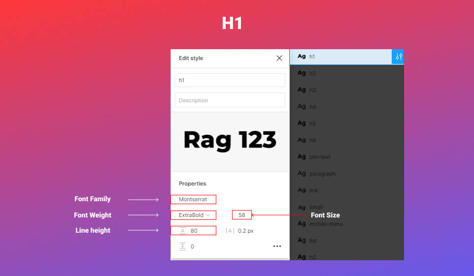
Now, here’s a look at the H1 text style in action.

H2
This is the Style I’m using for the second headline.
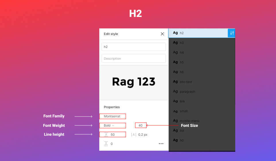
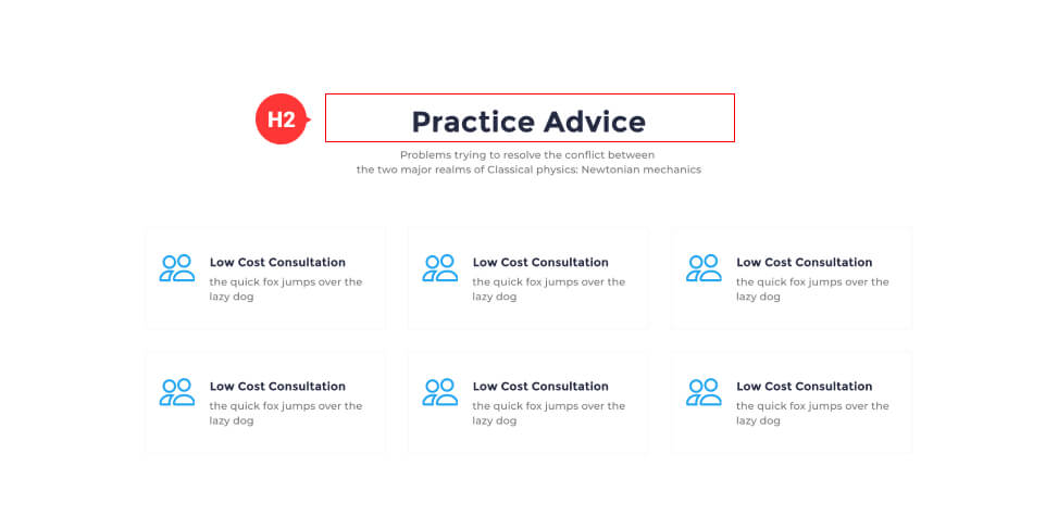
Let’s see the H2 text style in application.
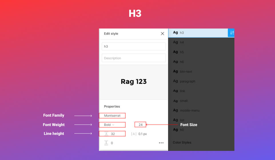
H3
This is the Text Style I use for the titles.

H4
For the sub-headline, I employ this Text Style.


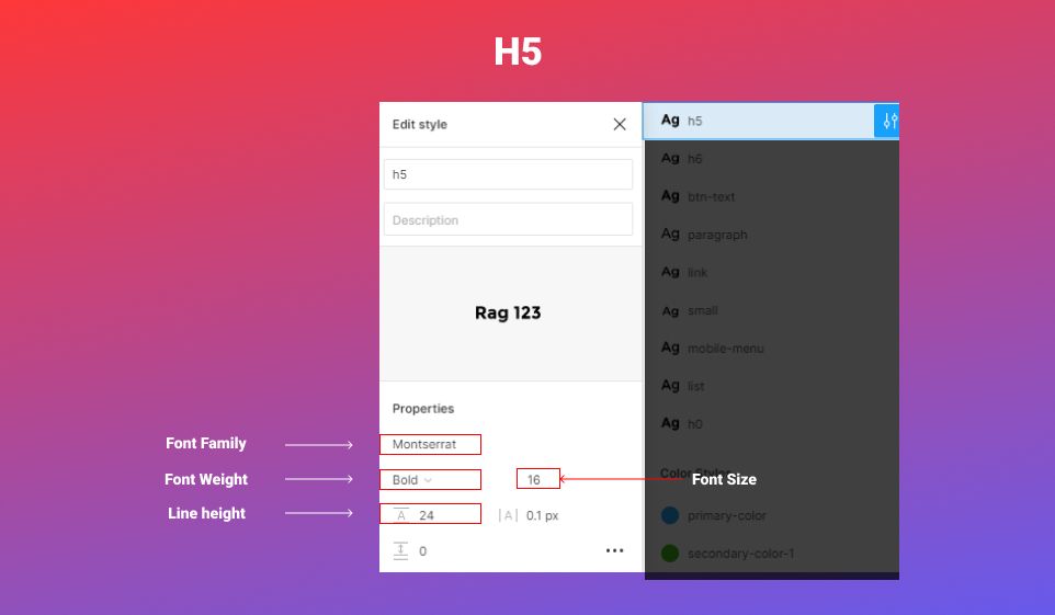
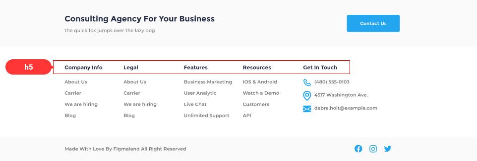
H5
This Text Style will be used for small titles
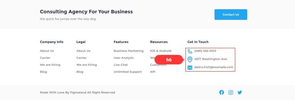
H6
This is the Text Style I use with smaller titles.

Paragraph
I employ this Text Style for paragraphs.


Link
This is the Text Style I use for links.


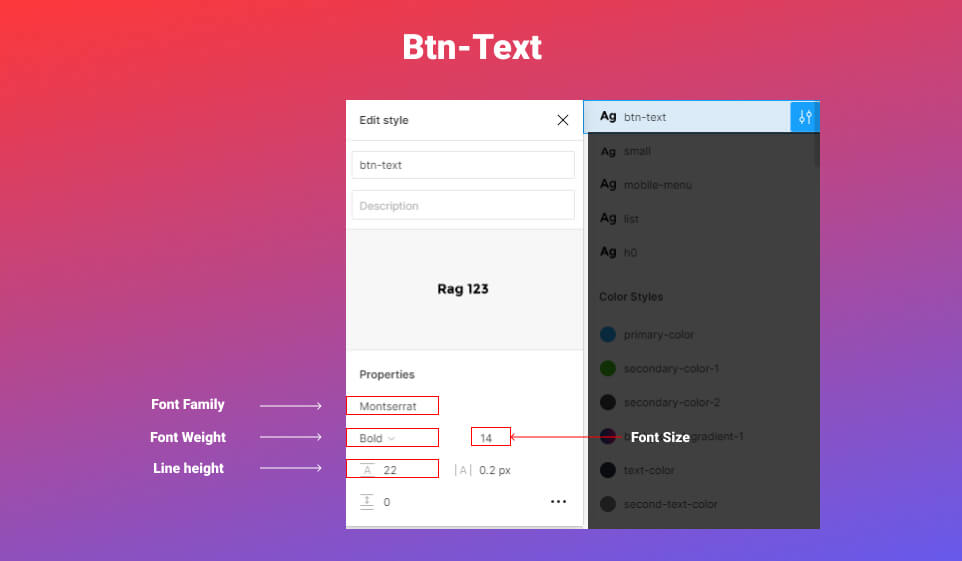
Btn-text
This Text Style will be used for the buttons.

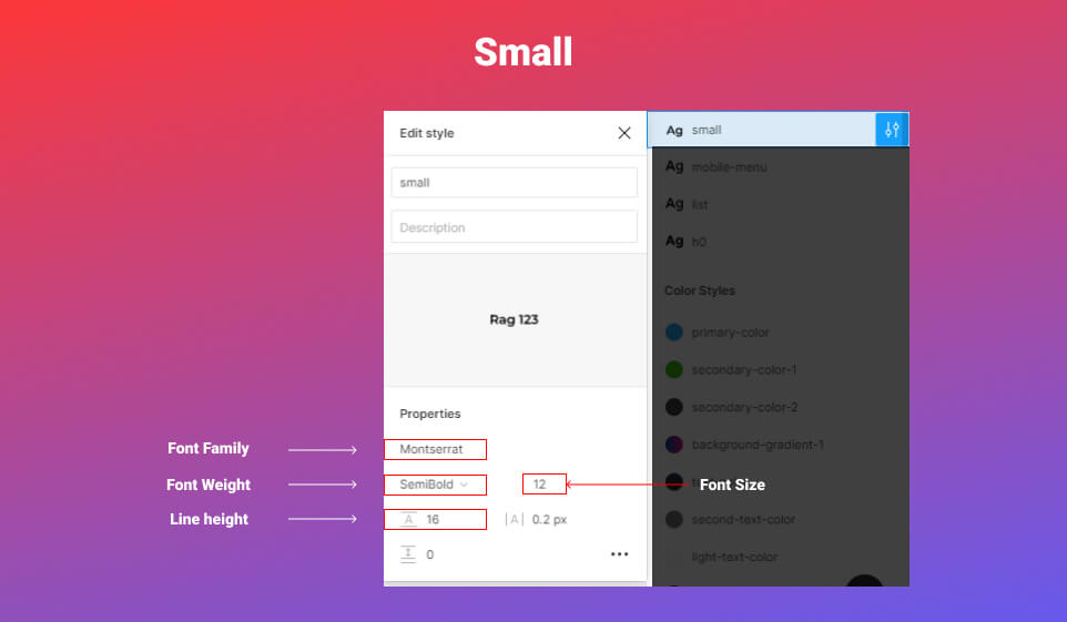
Small
This style will be used for smaller Text Style
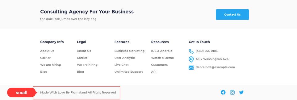
Once you’ve set Text Styles in your file, you won’t have to worry about typography in your design. You won’t have to go back and choose a font size, font weight, and line height any time you make a new text layer. All you need to do is add the appropriate Text Style to your text layers.
Now you have a clear idea of how you can organize the Text Style for your design.
I hope you found this short tip helpful. Thank you so much for your time and soon I will be back with a few short tips.
